The NYT Games app is debuting a new redesign to help users discover games and track their progress more easily. The redesign comes nearly a year after the New York Times renamed its games-focused app from “NYT Crosswords” to “NYT Games” to better represent its growing family of games. The redesign, which features new game card designs and streamlined navigation, is the company’s next step in building out its gaming hub.
NYT Games product design director Jennifer Scheerer told TechCrunch in an interview that the company redesigned the app to convert it from a place that was initially just for crosswords into a hub for all of its games. The previous version of the app was primarily designed for crosswords, and as the company added more games, the team felt the app outgrew its previous design and needed to accommodate the growing portfolio of games.
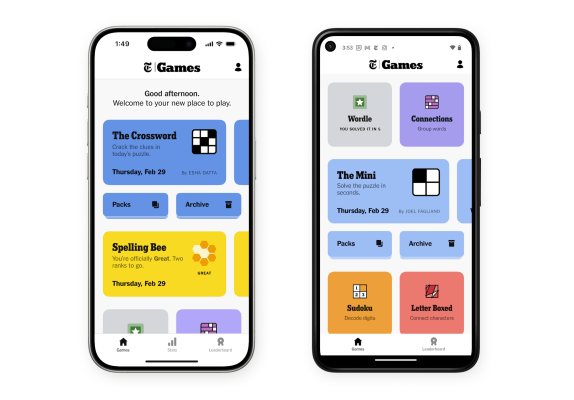
The redesign aims to convey a more technologically modern and inviting atmosphere to users. NYT Games principal product designer Lian Chang told TechCrunch that the redesign caters to both old and new players.
“We want new players to get a sense of the breadth of all the games, so we used a lot of color,” Chang said. “The brand icons are very clear and we streamlined the typography. So, people coming in for the first time should be able to discover the games that they want to play. For people who have played a lot of our games, we wanted the feel to be more functional. The game cards on the feed are helpful for discovery when games haven’t been played yet.”
As soon as you start playing a new game, the game card reflects the user’s progress to make it easier for them to see what they’ve already played or how far along they are in a puzzle. Chang says the redesigned game cards incentivize players to come back to a game and finish it. The idea behind the redesigned game cards was to not only be inviting for discovery purposes, but also be functional.
The company also wanted to make navigation simpler by adding all of its games, archives and packs in one place to make it easier for users to get to the games they want to play.
“What we had before was crossword-focused and all the other games were sort of in a horizontal scroll,” Scheerer said. “What we’re trying to do is give a list of all of the games we have to make it a little easier to find a new game, and not hide them. So I think this gives room to make it easier to add new games and add more features for games as we go.”
The old design of the app had five tabs at the bottom, while the redesigned version only has three. Chang says the team tested different numbers and configurations of tabs to see what worked best. After testing different options, the team decided to only feature tabs for “Games,” “Stats” and “Leaderboard” to streamline the app’s homepage.
The redesign also features personalized greetings that are meant to set a warm and welcoming tone for players. The greetings change over the course of the day and are responsive to factors like whether you’ve opened up a game first thing in the morning or are coming back in the evening to play some more.
As for the future, Chang and Scheerer say they will continue to listen to feedback from users as the company builds out its gaming hub, noting that the redesign is just the beginning of the work the Games team wants to do.