
This week, we’re taking a look at a pitch deck from Rypplzz (pronounced “ripples”), a spatial technology startup that recently raised $3 million. Rypplzz uses radio waves to provide location tracking since they are supposedly more precise and easier to work with than GPS. Venues like museums and sporting arenas can use its tech to help guide visitors through their space or deliver information depending on their location.
I have to admit, this deck didn’t set me alight, so I was a bit surprised by its success. Still, it’s worth exploring what could be improved here, so let’s dig in!
We’re looking for more unique pitch decks to tear down, so if you want to submit your own, here’s how you can do that.
Slides in this deck
Reading Rypplzz’ nine-slide deck might leave you a bit surprised. First, it doesn’t have much of the information you’d expect to see in a deck used to raise $3 million. There’s no slide about the team, none about the problem it’s tackling, no business model or pricing information, no competitive analysis, and no email to contact the CEO. As you’ll see below, the deck fails to answer many of the questions an investor would ask. Still as I’ve said before: Your deck is just one part of the fundraising puzzle.
The deck is also hefty, weighing a whopping 33MB — an awful lot for nine slides. As a rule, a pitch deck should never exceed 20MB because many email servers don’t like big attachments.
Here are the slides in the deck, minus some client names that the company redacted:
- Cover slide
- Product overview
- How it works
- Disrupting the augmented reality industry
- Market applications
- Physical and cyber security
- Current GTM partners/clients
- Investment proposition
- Closing slide
Three things I didn’t completely hate
I’m not going to sugarcoat this one: I honestly struggled to find three good slides that had useful information in an accessible form. This section is usually called “Three things I love,” but that would not be entirely honest in this case.
Still, it wasn’t all bad.
Exploring some use cases

[Slide 6] The text here is as legible as a doctor’s handwriting. Image Credits: Rypplzz
That said, I did enjoy the two panels on the side here. Painting a picture of how a customer might use the product is a great way to help investors envision the various ways the new tech could be applied.
Product overview
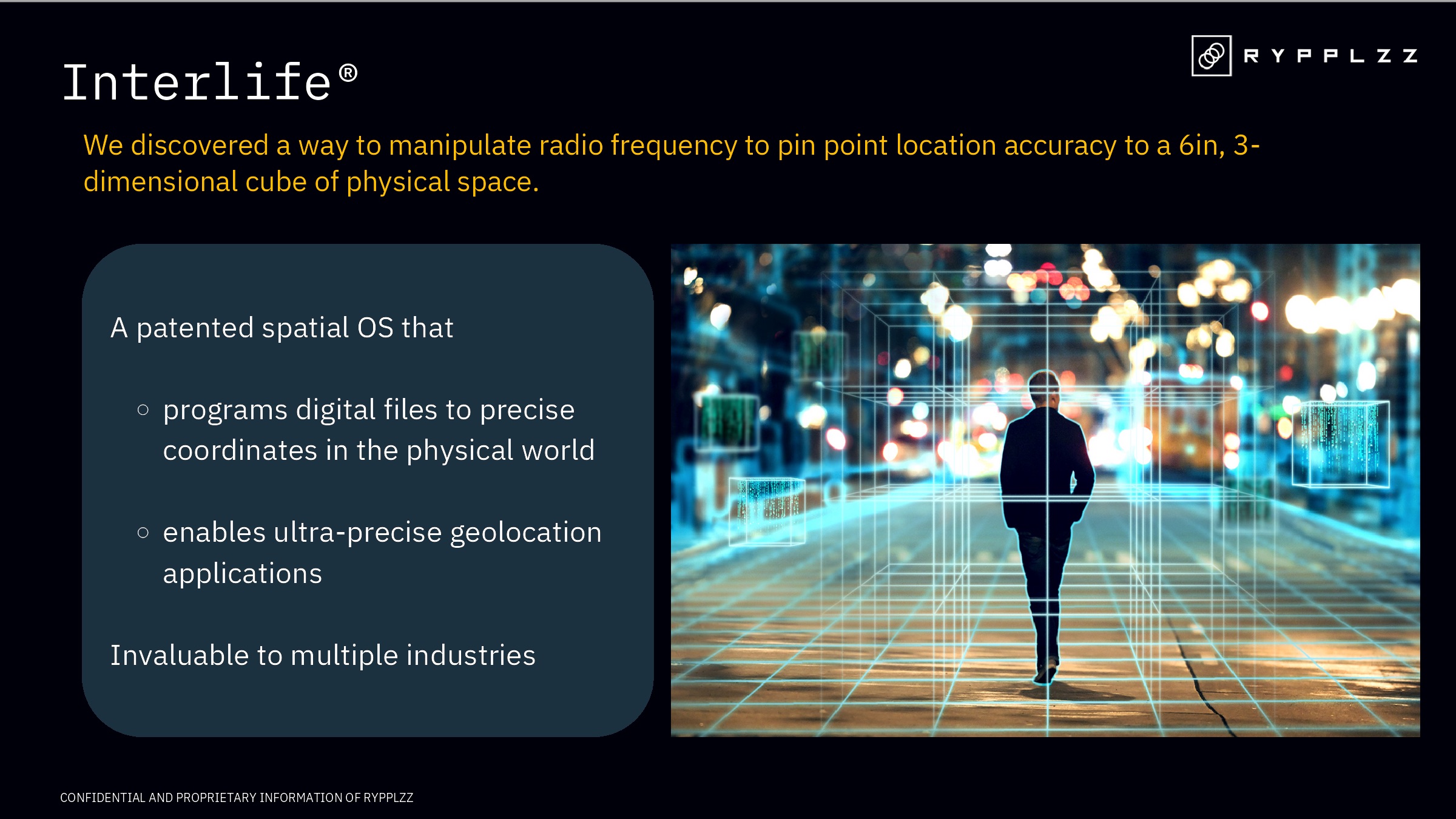
[Slide 2] Taking a closer look at the product. Image Credits: Rypplzz
While this slide explains what the product is and its capabilities, it falls short of being a comprehensive product slide. Investors often look for details like the product’s unique features, its development stage, and how it is different from the competition. Enhancing a product slide with these details can elevate the pitch and make it more compelling.
I do love the simplicity of this slide, though. It’s short, crisp and product-forward. It does make me wonder why they did it so, however. It’s great that the product can be useful for “multiple industries,” for example, but that would have been a great opportunity to share some examples.
The ask and use of funds

[Slide 8] Straight to the point. Image Credits: Rypplzz
Of course, the “use of funds” part of this slide leaves quite a few things to be desired. It’s way too fuzzy:
- “Fulfill existing deployment contracts”: Be specific. How many? How much revenue will be unlocked once those contracts are fulfilled?
- “Capitalize on immediate opportunities”: That’s so vague and generic that literally every startup that has ever put together a deck could add that to their pitch. Which opportunities? Why? How does that de-risk the company and drive growth?
- “Stand up the infrastructure”: Well, obviously.
- “Additional patents”: Great, but how many and why?
In the rest of this teardown, we’ll take a look at three things Rypplzz could have improved or done differently, along with its full pitch deck!
Three things that could be improved
If I were an investor looking at this deck, it would’ve raised a whole heap of questions, a veritable field of red flags. Here are some of the ones that shone most brightly:
How does it work, though?
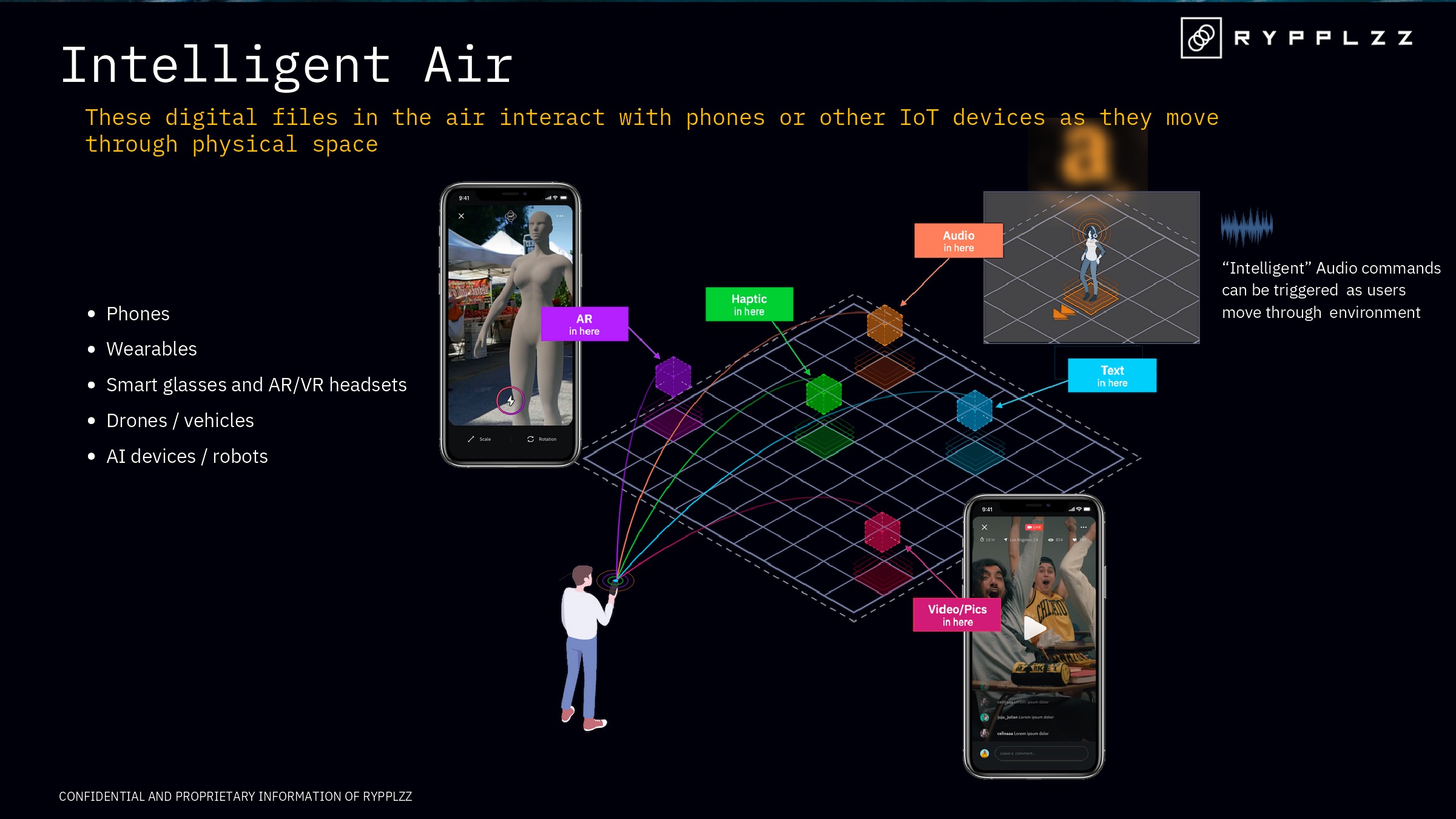
[Slide 3] This is an utter waste of a slide. Image Credits: Rypplzz
It just doesn’t make sense. Digital files in the air? What does that mean? What is the user experience here, and what is the user benefit? Also, what does that list on the left mean? Wearables? Drones? Robots? What are they doing? Why and how?
Maybe I’m missing something major here, but all of this simply left me feeling like one giant, life-size shrug emoji. If you understand what’s going on here, please send me a postcard.
In the end, I was so exasperated that I fed the slide into ChatGPT to see if it could make sense of it. The resulting word soup confirmed that I wasn’t going doolally: There’s not enough substance here to figure out what the company is trying to do.
Startups, don’t be like this.
And what are you going to use it for?
After slide 3, I was a bit miffed that I still had no idea what the company was planning to put into the world. However, there are many different ways of slicing a narrative, so I hoped that reading how the startup envisioned its technology in use would make things clearer.
Dear reader, it did not.
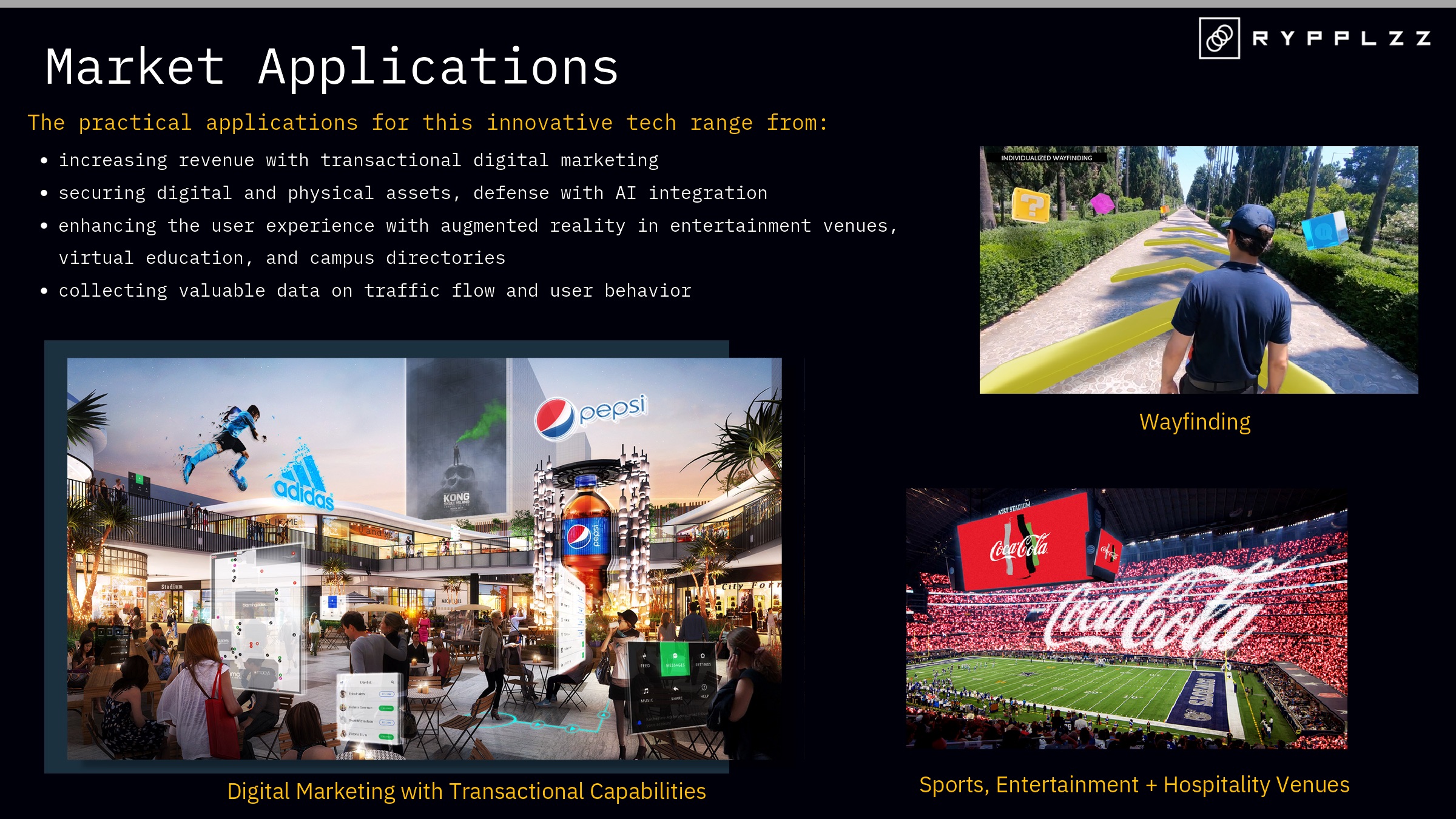
[Slide 5] I haven’t felt this stupid in a long time. Image Credits: Rypplzz
Assuming that’s what the product does. I still have absolutely no idea.
The company also says the product has a bunch of practical explanations, but it’s all fuzzy here:
- “Increasing revenue with transactional digital marketing”: What does transactional marketing mean? Revenue from who? How?
- “Securing digital and physical assets”: Those are two very different things. It’s one thing to prevent someone from stealing an ATM; preventing a bank account from being hacked is a very different task. It’s unclear how this product can help secure both, and what “defense with AI integration” involves.
- “Enhancing the user experience”: Well, yes, but to what end? What is the user journey here, and what are the user benefits?
- “Collecting valuable data on traffic flow”: This is the only point that makes sense to me, but many companies have already done that — either visually via cameras or by tracking the Wi-Fi or Bluetooth addresses of devices moving through a space.
As a founder, it’s your job to ensure that potential investors can clearly and easily understand what you’re doing and can envision a huge potential exit. Confusing the crap out of people is the wrong way to go about that.
Current GTM partners
Now we’re getting somewhere! Traction! Yesss!
Except . . .

[Slide 7] This could be a good traction slide. Instead, it is . . . not. Image Credits: Rypplzz
The slide names some of its current customers, but it doesn’t include critical elements such as revenue trends or growth statistics. This omission makes it difficult to assess the company’s traction: Are these paying customers? If so, are they on contracts? How valuable are those contracts? What is the chance of those contracts growing and evolving?
The slide includes some numbers that appear to be related to market sizes, but it’s not entirely clear what these numbers represent and how they were calculated. It’s crucial to provide context and explain such figures so investors can meaningfully understand the market’s potential.
Still, I’m most frustrated by the header: It mentions “GTM” (go-to-market), but the slide has no sign of a go-to-market plan. This discrepancy might lead one to misinterpret the slide’s intent and content. In fact, the slide seems to mash together a bunch of elements that would have been more effective if they were separated into distinct slides.
It would have been much better to create slides focused on specific aspects like traction, market size and go-to-market strategy, each with a clear and targeted message. Yes, you’ll end up with a few more slides, but I’d rather have a bigger, clearer deck than a series of impenetrable slides.
Overall, I’d have sent Rypplzz back to the drawing board and encouraged the team to put together a more accessible version that would explain clearly what it was trying to accomplish, for who, why and what the underlying tech is. As it stands, this is possibly the worst deck I’ve seen, and that’s saying something. It baffles me beyond words that the company successfully raised a round.
The full pitch deck
If you want your own pitch deck teardown featured on TC+, here’s more information. Also, check out all our Pitch Deck Teardowns and other pitching advice, all collected in one handy place for you!