I haven’t seen a lot of agriculture tech startups submit their pitch decks for this series, so I was delighted to get one from Phospholutions, which just closed a $10 million round, bringing its total funds raised to $32 million.
The team initially said they used the deck to raise a Series B round, which confused me, but upon reading the press information more carefully, it seems they made a mistake. I would usually let people get away with this kind of stuff, but this deck is riddled with issues that could have been avoided by simply paying more attention to detail.
We’re looking for more unique pitch decks to tear down, so if you want to submit your own, here’s how you can do that.
Slides in this deck
Parts of Phospholutions’ deck are pretty heavily redacted, which makes it hard to get the full picture, but there’s still plenty to get into.
- Cover slide
- Problem slide
- Market context slide
- Commercial opportunity slide
- Solution slide
- Benefits slide
- Product slide
- Sustainability benefits slide
- Competition slide
- Value proposition slide
- Competitive price comparison slide
- Margins slide (redacted)
- Go-to-market slide
- Funding history slide
- Short-term objectives slide (redacted)
- 5-year forecast (redacted)
- Series B use of proceeds (redacted)
- Team slide
- Current investors slide
- Summary slide
- Closing slide
Three things to love
Phospholutions’ pitch deck is a captivating showcase of innovation and strategic insight, embodying the essence of an effective pitch. It is a harmonious blend of compelling storytelling, clear value propositions and persuasive data points that together create a compelling narrative.
To P or not to P
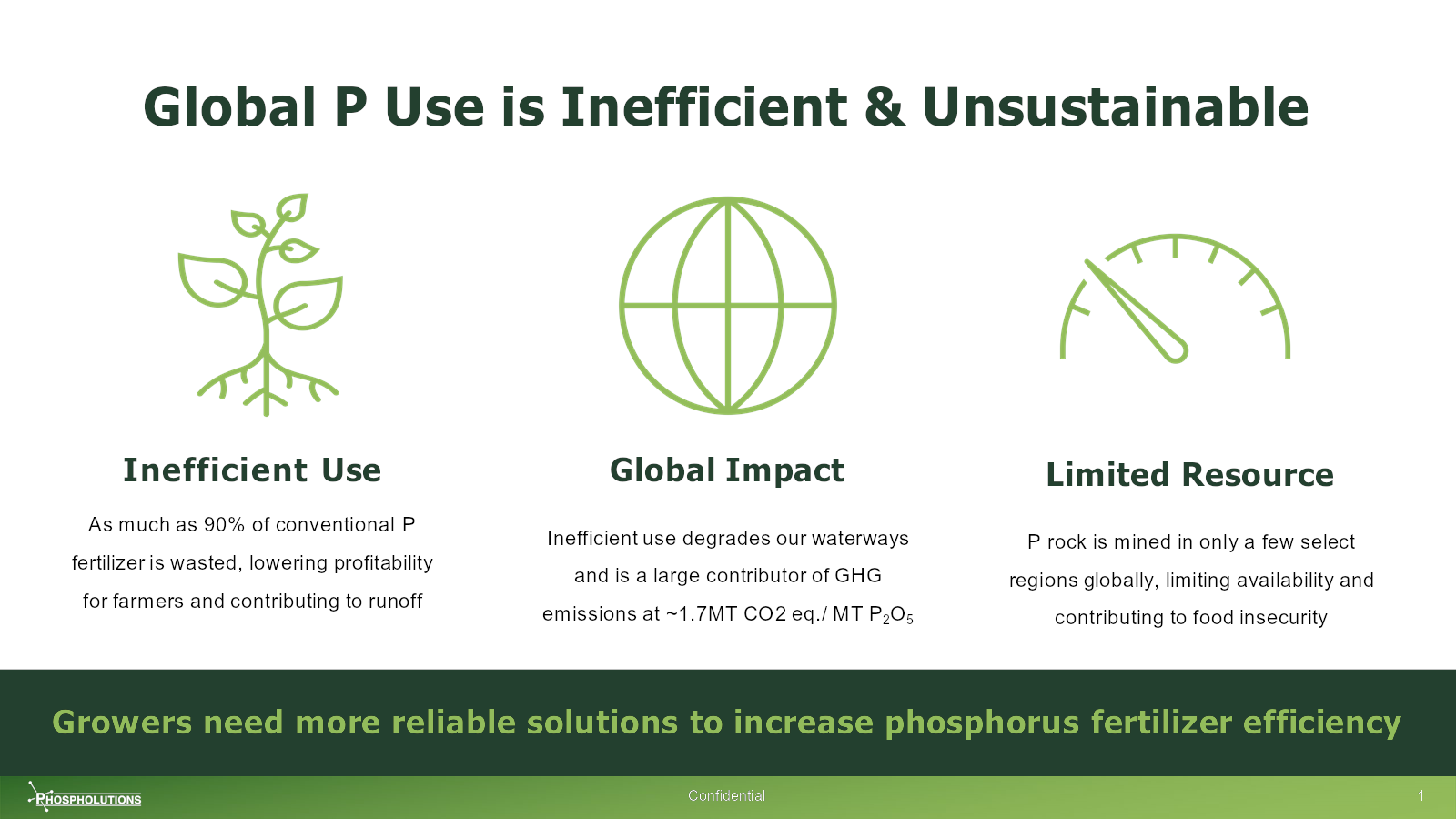
[Side 2] Clarity right out the gate. Image Credits: Phospholutions
Investors who are familiar with ag tech probably know this well — the market has a few incumbents that have done well over the years, and if Phospholutions has an innovative take on this problem, it’ll be an obvious investment to say yes to.
I like the simplicity of the graphics. I like that the company hints at the impact of the problems (“lowering profitability for farmers” and “inefficient use degrades our waterways”) in addition to mentioning the problems themselves. All very good storytelling points.
The bottom line, “Growers need more reliable solutions . . .” suggests a solution-oriented approach and communicates what needs to be done. Given that this is a pitch deck, it’s obvious what’s about to happen next.
There’s quite a bit of info on this slide, but I like how each point leads logically to the next, creating a narrative flow that helps lead the eye and prompts the reader to stay engaged. It’s also scannable, so you can quickly absorb the content, too. Very clever.
A couple of small quibbles: I know that P stands for phosphorus, but the writer in me keeps stumbling over abbreviations that aren’t explained. Also there’s no shortage of room on this slide, so while of course GHG stands for greenhouse gases, you can afford to spell it out. And “~1.7MT CO2 eq / MT P2O5” is a lot of alphabet soup to throw on an early slide.
I’ll get off my soapbox now, but attention to detail matters!
Contextualizing the near and medium term
I rarely see startups do this, which is a shame, because it helps build narratives very well:

[Slide 3] “What happens if we don’t address this problem.” Image Credits: Phospholutions
Segmenting the content into the “Today,” “Short Term,” and “Long Term” buckets lets the reader understand how the market dynamics will change over time. It’s good storytelling, but it also does something more important: It suggests that the founders have an eye on the future and are skating toward where the puck is going rather than where it is. Investors like to see founders who have an eye on the future.
The other storytelling win here is that while it is not explicit in this slide, it sets the stage for taking action: Action that Phospholutions is positioned to provide, of course.
Real impact
The deck spends a bit too much time on the product, in my opinion. But the flip side is that it gets a lot of things extremely right. This slide, in particular, does a lot of the heavy lifting:
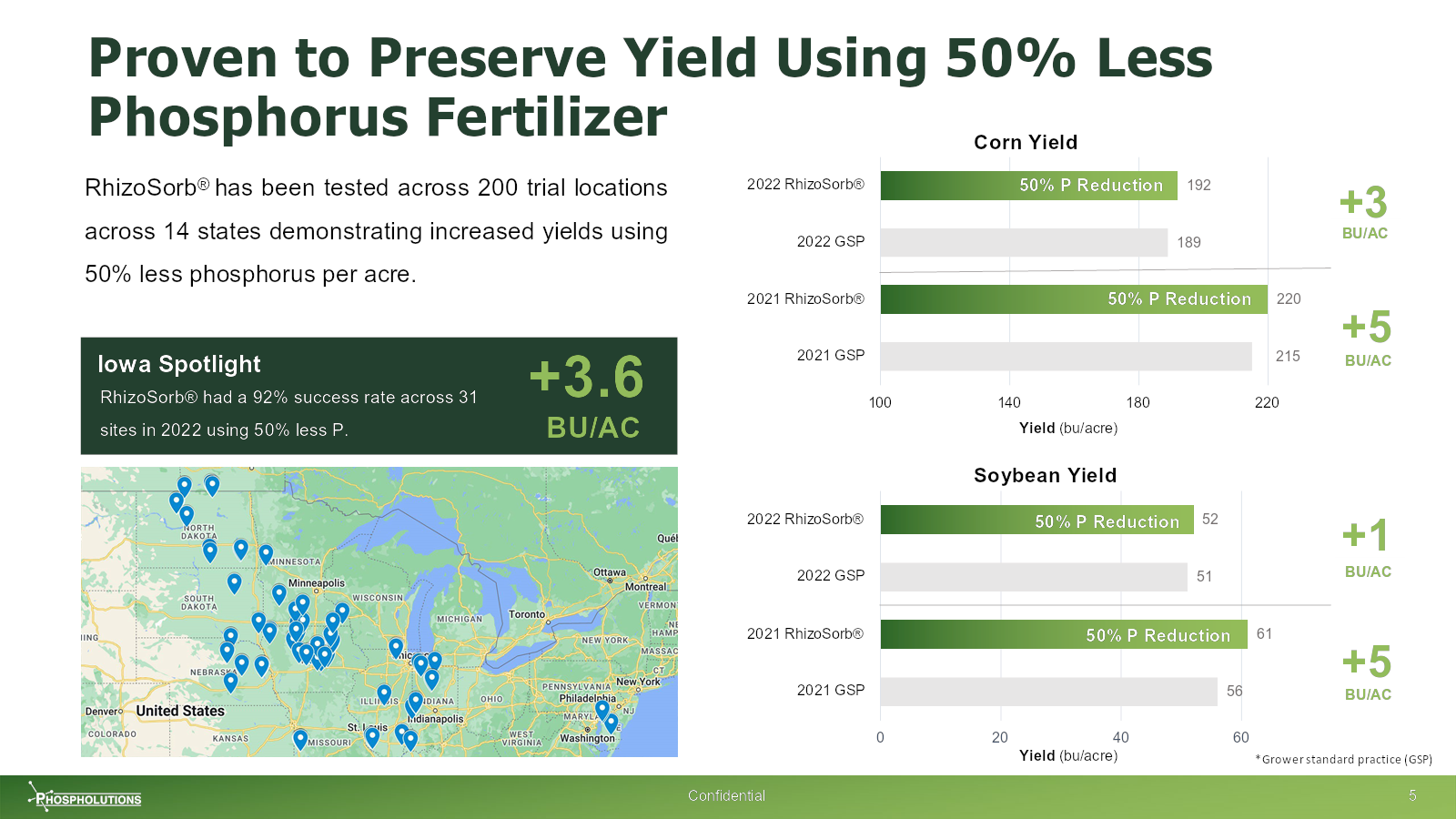
[Slide 7] Backed by data. Yummy. Image Credits: Phospholutions
The thing I like about this set of slides, however, is that it really goes deep into the proven efficacy. If an investor asks for more information, there is a lot of it.
In the rest of this teardown, we’ll take a look at three things Phospholutions could have improved or done differently, along with its full pitch deck!
Three things that could be improved
The deck starts off quite well, but then it sputters out of steam about halfway through.
Attention to detail
A typo or two isn’t going to prevent an investor from investing. But the truth is, if the deck has so many mistakes that it starts to become noticeable, it reflects poorly on the founders.
Page 2 of the pitch deck is labeled as slide 1, which is confusing, because most PDF viewers let you easily jump to another page. Pages 4 and 5 are both numbered 3, then on page 17, the numbering goes from 15 to 18, to 17, then back to 18 again. Most presentation design packages automate the page numbering, so it’s beyond me how this happened.
Maybe it’s a small thing, but trust me on this: When investors are discussing the ins and outs of a pitch deck, they’ll be referring to page numbers. That’s not a good time to introduce frustration. When the page numbers don’t match up, it makes communicating about a deck confusing.
[Slide 10] This is unnecessarily hard to read. Image Credits: Phospholutions
I know I’m pointing out the little things, but it all adds up.
Too much detail, and not enough
The team slide is vital. This is not how to do it:

[Slide 18] H’okay, then. Image Credits: Phospholutions
But fine, since you’ve given me all of these names, I’m going to look for discrepancies. And guess what? I found many. There are a ton of mismatches between job titles and what’s on this slide (of course, it’s possible that some people got promotions or new titles since the fundraise), and there are a bunch of other little problems as well.
The lesson here is that if you put something on a slide, make sure a simple Google search can’t disprove it. Some venture firms have a lot of associates doing due diligence, and many of them are absolute sticklers for details.
There’s another blunder here: The deck highlights that they don’t have a VP of R&D. For a tech startup raising from VCs, that’s a fantastic way to shoot yourself in the foot. Tech is important for tech investors.
The biggest problem is that nothing on this slide convinces me the senior leadership is the right team to run this company. A more effective way to do this would be to pull out the three or four key personnel who are going to move the needle for Phospholutions, and then highlight why they are uniquely positioned to take the company to the next level. Highlight how they are part of your competitive advantage.
Where’s your traction?!
This deck does have a number of redactions, so it’s entirely plausible that there is a slide with traction information, so take this one with a pinch of salt. . . .
Still, I’m very confused why the traction information isn’t presented front and center. The company appears to be shipping products, so production yields, sales graphs and other historical metrics should be included in great detail. The redacted slides seem to be focusing more on the future. An investor would consider that a pretty serious flaw, especially because this company’s been operating for seven years or so.
The full pitch deck
If you want your own pitch deck teardown featured on TC+, here’s more information. Also, check out all our Pitch Deck Teardowns and other pitching advice, all collected in one handy place for you!