We are a good 47 pitch decks into our Pitch Deck Teardown series, and one piece of feedback we’ve gotten frequently is that it’s easy to be a critic: What would we have done?
Well, we’re not ones to turn away from a challenge here at TechCrunch+. So for this week’s pitch deck teardown, we’re going to try something different.
About six months ago, we went through a pitch deck by a company called Supliful. We celebrated the pitch deck for being very good, but we may have poked a little bit of fun at it for being riddled with spelling mistakes and other silliness. At its heart, though, the deck was good.
So for this week’s teardown, I buddied up with the team at Trulytell (with an assist from their designer, Jake Muller) to improve Supliful’s deck until it became the perfect pitch deck.
Okay, we didn’t quite get it 100% perfect. There are still some issues, and in this post, we will take them apart to learn what could be improved and how we’d do that.
We’re looking for more unique pitch decks to tear down, so if you want to submit your own, here’s how you can do that.
Slides in this deck
- Cover slide
- Traction slide
- Summary slide
- Problem slide
- What makes a great CPG brand slide
- Solution slide
- Product slide
- Case study slide
- Business model slide
- Market slide
- Predicate businesses slide
- Competitor slide
- Testimonial slide
- Team slide
- Ask slide
- Operating plan slide
- Closing slide
The first five slides
We’re going to do things differently this week: I’m going to break down every single slide in detail and explain why they work and what works about them. I’m also going to explain what could be improved upon or where investors may bring up hard questions.
So we will cover the first five slides here and we’ll stick the remaining 15 behind the paywall. Yes, you should absolutely subscribe to TechCrunch+: Did I mention that we have nearly 50 sample pitch decks, complete with commentary, and an additional 30 to 40 articles breaking down every imaginable aspect of pitching and pitch decks?
If you’re a founder raising money, this is the most bang for your buck you’ll get. Go on, subscribe. It makes sense to.
With that out of the way, let’s do this!
Slide 1: Cover slide
![[Slide 1]](https://techcrunch.com/wp-content/uploads/2023/05/SupplifulPitchDeckTechCrunchPitchDeckTeardown-slide-0001.jpg)
[Slide 1] H’okay, that’s a sweet earth you might say. Let’s go! Image Credits: Supliful/TechCrunch/Trulytell
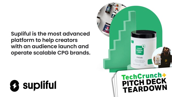
- It shows a summary of what the business is about (“the most advanced platform to help creators launch and run CPG brands”).
- It shows how much they’re raising ($1 million).
- It shows the goals of the fundraise (“grow to $13 million ARR at $2.4 million monthly GMV”).
- The photo illustrates what the company actually does: “Your design here,” along with an influencer.
- Between the lines, you realize this is a B2B2C company, assuming that influencers and content creators are businesses.
What works about this slide: It clearly sets the pace for what’s to come. It imparts a lot of information that would enable an investor to get to a quick “no” in case the round size, industry or overall business idea is unappealing to them.
What could be improved: This company is based in Riga, Latvia, which is in north-eastern Europe. That might “disqualify” it for a lot of investors who have location as part of their investment thesis. We decided not to include that on this slide and made sure to use slide 2 (traction) to show off what the company is currently doing. It’s a little sneaky, perhaps, but we figured we didn’t want to prejudice investors unduly — let’s get them excited about the company and its potential!
We could also have specified that this is a B2B2C company, but we figured an astute investor might figure that out given the info here.
We hope the graphic on this slide tells an important part of the story, but there may be better ways to illustrate Supliful’s core business model.
Finally, I spent some time considering if we should spell out what CPG (consumer packaged goods) stands for. But I figured if an investor needed to google CPG, there’s no way they would invest in this space, so I left it as the slightly obscure TLA it is.
Slide 2: Traction slide
![[Slide 2]](https://techcrunch.com/wp-content/uploads/2023/05/SupplifulPitchDeckTechCrunchPitchDeckTeardown-slide-0002.jpg)
[Slide 2] Up and to the right. Image Credits: Supliful/TechCrunch/Trulytell
My take is always: If you have revenue, it means you’ve proven you can pull off the hardest part of building a startup. It almost doesn’t matter what else is wrong in the business, if you are making sales, you’re on to something. Once you have traction, the question becomes how much it costs to acquire new customers, what those customers are worth and how big the market is.
Opening with a traction slide requires you to explain what the traction represents. This slide looks pretty simple, but it conveys a lot of data: Sharp growth, some cumulative figures and some lovely indications of a company on a steep growth trajectory.
What works about this slide: There was a dip in revenue, but it turns out the company had a great reason for that: It had to throw a merchant off the site for being dishonest. The dip in revenue is bad, but highlighting it with the arrow and an explanation goes a long way toward ameliorating concerns. The revenue dipped the month before, too, which isn’t addressed, but the graph shows explosive growth in the six months since then.
In addition, I like how this graph shows revenues and not gross merchandise value (GMV). It would have been easy to “pump” the numbers by quoting GMV here, but the founders (and sophisticated investors) know that metric holds little meaning.
What could be improved: It could be argued that some of these metrics are vanity metrics. Cumulative gross revenue is a tricky one: Yes it’s important, but the growth curve is so steep that it shows a skewed picture that’s actually not in the company’s favor.
The “33% of orders are by subscribed customers” figure could do with some explaining, but you have the opportunity to talk about how subscribed customers lead to recurring revenues with a voice-over.
Slide 3: Summary slide
![[Slide 3]](https://techcrunch.com/wp-content/uploads/2023/05/SupplifulPitchDeckTechCrunchPitchDeckTeardown-slide-0003.jpg)
[Slide 3] In summary… Image Credits: Supliful/TechCrunch/Trulytell
What works about this slide: Honestly, I would probably exclude this slide from a send-ahead deck and just copy and paste the mission and the four bullet points into an email to get a would-be investor to open the deck. But I love showing off, clearly and simply, why someone would want to keep reading and invest their $1 million.
What could be improved: There’s a damn typo on the slide! The cover slide and the financials show that the company is raising $1 million, but this one says $2 million.
As we were working through the operating plan (second-last slide), we decided that the financials were looking good enough that we only needed to raise $1 million and we changed it, but we forgot to change it here. Would it have been easy to go back and fix that and re-export the slide? Yes, but I want to illustrate that mistakes do happen, even when you have a lot of smart people trying to make the “perfect” pitch deck.
Slide 4: Problem slide
![[Slide 4]](https://techcrunch.com/wp-content/uploads/2023/05/SupplifulPitchDeckTechCrunchPitchDeckTeardown-slide-0004.jpg)
[Slide 4] So what’s the problem? Image Credits: Supliful/TechCrunch/Trulytell
Creating a consumer packaged goods brand is possible — you can white-label or formulate your own — but bringing a new product to market, then branding, manufacturing and dealing with the logistics of shipping it can be an expensive and time-consuming nightmare.
That’s the problem Supliful addresses, and the fear it alleviates is beautifully outlined at the bottom of the slide: What if I spend $25,000 and a year of my life to create something that won’t be worth the while?
What works about this slide: Selling by way of alleviating a fear works really well. I like that the problem statement is concise (“time-intensive and costly”) and it gives us specific reasons why the process is difficult. Simple, clean and easy to understand.
What could be improved: A lot of investors have been bitten by companies trying to market to “influencers.” It’s a very amorphous demographic that’s relatively hard to market to. My worry here is whether, upon reading this slide, an investor might go, “So what?”
Another, more important problem I have is the potential environmental impact angle: “Do we really need more brands selling stuff?” But I suppose if that’s at the forefront of an investor’s mind, no amount of pitching will get them to change their mind.
Slide 5: What makes a great CPG brand
![[Slide 5]](https://techcrunch.com/wp-content/uploads/2023/05/SupplifulPitchDeckTechCrunchPitchDeckTeardown-slide-0005.jpg)
[Slide 5] So, er, what? Image Credits: Supliful/TechCrunch/Trulytell
However, the point here is that Supliful solves a really specific problem at the intersection of two industries: Taking care of the product manufacturing, branding and manufacturing is one industry, and taking care of billing, logistics and the rest of the operations stack is another. The companies on the left are well-known, successful brands in the former industry, and the ones on the right are successful logistics companies.
It’s an unusual slide to have on a pitch deck, but I love it for this “perfect pitch deck” because it illustrates clearly that you are not limited to the 15-16 slides that are typically recommended. If you need a slide or two to tell a part of the story that is specific to your company, industry or market, then go for it. Just ensure that you have a deep understanding of why you are including it.
In my pitch coaching practice, I often have to ask my clients, “What are you trying to convey here?” and “Is there a way to tell this story on one of the ‘standard’ slides?” If you have a clear answer for the first question and respond to the second one with a resounding “no,” chances are that you’ll have to get a bit creative with a less-standard slide.
One warning, though: If you find yourself having four or five nonstandard slides, something is probably off with the overall narrative or you’re getting too deep into the weeds.
What works about this slide: This slide plants the seed for some truly huge opportunities. The 3PL (third-party logistics) brands on the right are very successful businesses, and building on their huge followings, the brands on the left are interesting market challengers to keep an eye on. Supliful is attempting to convey that it is the “right” company to unlock these business models.
What could be improved: I suspect this story could be told without this slide, but I wanted to keep it in so I could use it as an example.
In the rest of this article, we’ll take our proverbial X-ray machine to the next 15 slides of this deck.
Slide 6: Solution slide
![[Slide 6]](https://techcrunch.com/wp-content/uploads/2023/05/SupplifulPitchDeckTechCrunchPitchDeckTeardown-slide-0006a.jpg)
[Slide 6] So here’s what we do. Image Credits: Supliful/TechCrunch/Trulytell
What works about this slide: It does a good job of outlining how you build this type of company as well as the value proposition to the users: No minimum order quantities (MOQ), no upfront cost and the company takes care of the heavy lifting to make it accessible to influencers.
What could be improved: I think this slide is a little too close to being a product slide. It gets specific about what the solution is rather than zooming out a bit more. However, because the problem statement and the “What makes a great CPG brand” slides are doing part of the work, it made sense to be a little more precise.
Slide 7: Product slide
![[Slide 7]](https://techcrunch.com/wp-content/uploads/2023/05/SupplifulPitchDeckTechCrunchPitchDeckTeardown-slide-0007b.jpg)
[Slide 7] What’s the product? Image Credits: Supliful/TechCrunch/Trulytell
I like this slide because it shows, in simple terms, what a customizable brand looks like. It also shows off what the product does: You formulate your products, slap on a brand and let the platform take care of the rest.
Best of all, the company resists the temptation to talk too much about the product. That’s excellent: it’s often tempting to err in the other direction.
What works about this slide: It doesn’t get too bogged down with the details. Especially for an early-stage company, the product can vary and evolve pretty rapidly. It should, in fact. There’s always the temptation to brag about the recent technology hurdles you’ve overcome, but that is a fast-moving goal.
A far better approach is to include screenshots of what you’ve got working and show off the functionality currently available. I also like that this slide explains that Supliful is selling a solution and not a product. It talks more about why you need the functionality (choice and lack of hassle) and less about the specific features.
What could be improved: I don’t love these screenshots. I know Supliful has come a long way since these graphics were made, but I wanted to remain true to the status of the product when this fundraise was happening.
Slide 8: Case study slide
![[Slide 8]](https://techcrunch.com/wp-content/uploads/2023/05/SupplifulPitchDeckTechCrunchPitchDeckTeardown-slide-0008c.jpg)
[Slide 8] Aaah! A case study! Image Credits: Supliful/TechCrunch/Trulytell
But there’s a reason why so many companies rely on case studies and testimonials as part of the sales process. In this case, it shows an extraordinary result for one of the company’s brands.
What works about this slide: It’s encouraging to see that one brand can have fantastic results!
What could be improved: If a startup puts a case study in front of me, I’m always assuming that it’s about the best customer it has. I immediately want to ask about the #2, #10 and #50 customer. There’s no real way around that (I’m a skeptic at heart, I suppose) except showing a case study and revealing the average (or interquartile mean, if you really want to lop off the outliers) numbers as well.
Case in point: Supliful claims earnings of $320,000, but it also says in slide 2 that its total GMV over the first 11 months was $890,000. Now I’m curious whether the numbers match up. If Kuhr “earned” $320,000, that means he would have represented a significant percentage of all the revenue flowing through the platform. The company claims on slide 3 that it has 310 influencers on the platform, which would indicate that a long tail of merchants are making very little money and that this business model isn’t as viable as we first thought.
I could have dropped this slide from the deck. Yes, the numbers are impressive, but on first glance, it appears that Kuhr is an outlier in an ocean of underperforming merchants. Startups may be an industry of outliers, but I find myself questioning if this business model makes sense if the remaining 300-odd content creators are dividing up the remaining $500,000 or so of GMV among themselves. Doing the math, it hardly seems worthwhile.
So, be careful with what you put on your slides and think about how the story you are telling could be inferred.
Slide 9: Business model slide
![[Slide 9]](https://techcrunch.com/wp-content/uploads/2023/05/SupplifulPitchDeckTechCrunchPitchDeckTeardown-slide-0009d.jpg)
[Slide 9] Image Credits: Supliful/TechCrunch/Trulytell
What works about this slide: Simple is best. Charging sellers a subscription to use the platform means that you have downside protection. It costs money to support sellers, so it’s a good idea to ensure you get some revenue even out of inactive or low-activity sellers. I also believe it’s an incentive: If someone gets billed every month, they are reminded that they need to promote their brands to get the most out of this service. The 33% markup is just good business, as it means Supliful benefits from the upside when a seller does well.
What could be improved: Not much. I am curious why there are two subscription tiers so perhaps the company could say a little more about that.
Slide 10: Market slide
![[Slide 10]](https://techcrunch.com/wp-content/uploads/2023/05/SupplifulPitchDeckTechCrunchPitchDeckTeardown-slide-0010d.jpg)
[Slide 10] Let’s talk about market sizing. Image Credits: Supliful/TechCrunch/Trulytell
It’s the nature of the beast — it’s really hard to estimate how nascent markets evolve. Because it’s an underexplored market, a bottom-up approach seems to make sense, which is what I tried in the white box on the top right, but it’s pretty hand-wavy.
What works about this slide: Given the company’s current traction, I hope that the investors would agree that “this is a big and growing market” and then move on to the next slide. However, I’m not sure we’ll get away with it that easily.
What could be improved: It’s crucial to understand the dynamics of venture capital. You need to show that you are building a company in a space that can provide VC-sized returns. My gut tells me that this is possible, given that there are a lot of influencers and many of them are willing to work hard to sell products. If they have a chance to build their own brands, that’s even better.
But this is also where I must say that I’ve never knowingly bought anything recommended by an influencer and I don’t understand the market dynamics here. E-commerce is huge and so is influencer marketing. Creators are amassing tons of followers and those followers have money. I’m just not 100% sure how to weave all of those points together into a coherent narrative. If someone has an idea for sizing this market, you know how to find me. I’d love to tell a more coherent story here.
I know one thing, though: This market-sizing slide makes more sense to me than the one Supliful used in its original deck, which claimed a $8 trillion total addressable market:
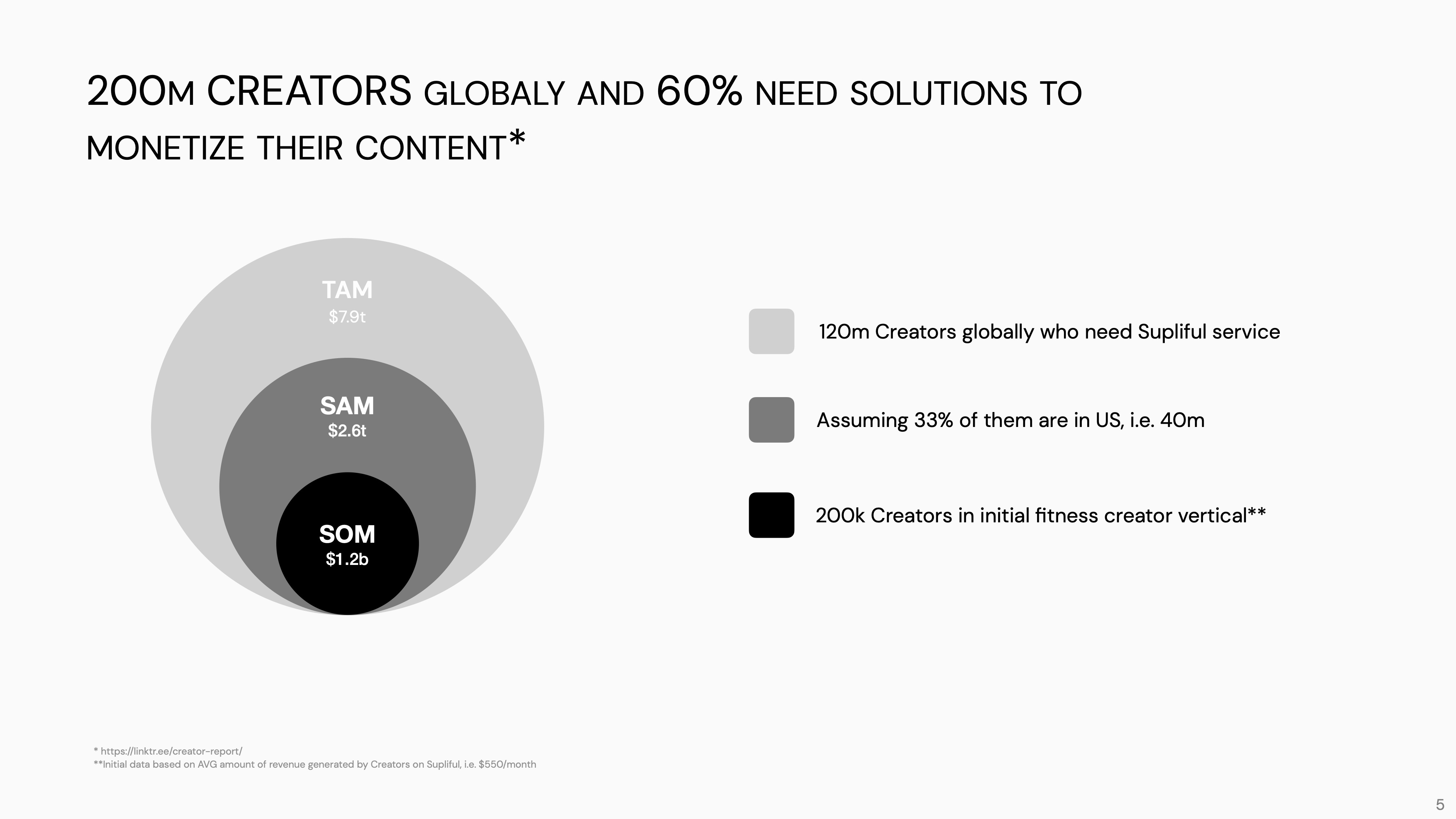
Wait WHAT? Image Credits: Supliful
I’m sorry, but you do have to sense-check your numbers. There’s absolutely no way Supliful’s total addressable market is within 10% of the entire planet’s healthcare spend. This slide feels so insanely, ludicrously wrong, it made me wonder where this calculation came from.
Slide 11: Predicate businesses slide
![[Slide 11]](https://techcrunch.com/wp-content/uploads/2023/05/SupplifulPitchDeckTechCrunchPitchDeckTeardown-slide-0011c.jpg)
[Slide 11] Another interesting slide! Image Credits: Supliful/TechCrunch/Trulytell
I think this slide is a bit redundant and defensive, but it does have the benefit of being able to say, “Hey, look, it worked in this industry; we’re applying the same tech and learnings to a new industry.” Not a bad approach at all.
What works about this slide: For storytelling, saying “X is successful so we can be successful, too” and “Look, it ain’t like we’re reinventing the wheel here” can be powerful.
What could be improved: Two print-on-demand businesses based in Latvia seem like an oddly niche set of predicates to use. It feels like Supliful is being a little shy here. My read is, they’re saying something like, “Hey! Look! These other Latvian businesses did great! We can do great in an adjacent space!” and maybe it is right.
We took off the “Latvia” labels here, but I’m curious if another line of business could be an option. I’d probably rethink or lose this slide, but I wanted to leave it in as another example of a type of slide that is rare but can work well in a deck.
Slide 12: Competitor slide
![[Slide 12]](https://techcrunch.com/wp-content/uploads/2023/05/SupplifulPitchDeckTechCrunchPitchDeckTeardown-slide-0012b.jpg)
[Slide 12] Image Credits: Supliful/TechCrunch/Trulytell
What works about this slide: I like showing off that there are competitors in a space but highlighting that they are approaching a market differently.
What could be improved: On our first few slides, we talk about how hard and complex it is to roll up your own CPG brand, so that’s obviously a potential “competitor” to add to this list. But for the sake of simplicity, I think this works well. We did miss a major competitor, though: Pietra raised $15 million two years ago, and another $16 million just a couple of days ago. Whoops.
This goes to show that it can be hard to find competitors, but as a founder, it’s definitely a good idea to keep an eye out.
Slide 13: Testimonial slide
![[Slide 13]](https://techcrunch.com/wp-content/uploads/2023/05/SupplifulPitchDeckTechCrunchPitchDeckTeardown-slide-0013a.jpg)
[Slide 13] Reiterating those value props. Image Credits: Supliful/TechCrunch/Trulytell
It’s a cheap trick, sure, but it works. Bear in mind that VCs are not your customers, so choose your testimonials to ensure they reflect the kind of results and reactions your would-be investors would like to see.
What works about this slide: It’s such a good way to highlight the value propositions one more time. Just skim the words in bold here and you’ll see what I mean. The excitement in these testimonials help reinforce that this is a much-needed product for the target audience.
What could be improved: I’d lose it from the presentation deck, but I think in the context of this deck, it helps pace the story, especially because I know that my least favorite slide is coming up.
Slide 14: Team slide
![[Slide 14]](https://techcrunch.com/wp-content/uploads/2023/05/SupplifulPitchDeckTechCrunchPitchDeckTeardown-slide-0014a.jpg)
[Slide 14] This is hard. Image Credits: Supliful/TechCrunch/Trulytell
This slide is as good as we can make it, but it still isn’t great.
What works about this slide: It exists and it kind of needs to. I also like the “+8,” indicating the overall team size, which in turn helps give an idea of how far along this company is in its journey.
What could be improved: We see an ex-VC, a digital marketer and a full-stack developer. Those skill sets are tangentially important, but they don’t scream, “oh my lord, yes, this is 100% the right team to build this company.” Honestly, the only way around this fundamental problem is to have extraordinary traction. And hey, guess what? We do! In case you were wondering, that’s why the traction slide is second in this deck and the team slide is buried way back here.
If I were working with Supliful as a pitch coach and the company didn’t have traction, I’d probably try to talk them into not raising money at all. I’d say: “Explain to me why you are better positioned to do this than anyone else in the world.”
Also, well, you know:
Slide 15: The Ask slide
![[Slide 15]](https://techcrunch.com/wp-content/uploads/2023/05/SupplifulPitchDeckTechCrunchPitchDeckTeardown-slide-0015b.jpg)
[Slide 15] YASS. Image Credits: Supliful/TechCrunch/Trulytell
- Say how much you are raising.
- Say, with SMART (specific, measurable, achievable, relevant, time-bound) goals, what you are going to accomplish with that money.
This slide does exactly that: It sets a major overarching goal ($13 million ARR within 12 months) and backs that up with stepping stones along the way: Full self-serve, custom formulations, and a piece of tech to kill the biggest operational burden for logistics and shipping-heavy companies — customer support.
What works about this slide: Everything. This is how you do an Ask slide. Without the Ask slide, the deck is useless, and the vast majority of founders get it wrong.
What could be improved: Nothing. It’s such sweet perfection that I’m going to crack open a bottle of champagne and sob in relief for a moment.
Slide 16: Operating plan slide
If you’ve been reading this column for a while, you’ll have heard me rant and rave about operating plans and their absence time and time again.
Now, Supliful is a pretty rare company in that it actually shows its real financials, in public, to the world. I used those numbers to extrapolate an operating plan of sorts:
![[Slide 16]](https://techcrunch.com/wp-content/uploads/2023/05/SupplifulPitchDeckTechCrunchPitchDeckTeardown-slide-0016c.jpg)
[Slide 16] Sniff. So beautiful. Image Credits: Supliful/TechCrunch/Trulytell
What works about this slide:
- Most numbers are rounded to two significant digits, which greatly helps with readability. If the investors want to dig in deeper, they can open the actual spreadsheet.
- It shows that the company can back up its claims and plans with actual numbers.
- It shows that the company knows what’s important: Marketing spend drives customer conversion, which drives the number of creators on the platform, which drives GMV, which drives gross revenue and ARR.
- It looks a lot prettier than the Google Sheets mess I would have happily pasted into the deck:
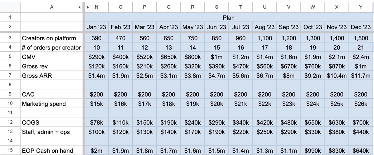
This, dear readers, is why they don’t let Haje design things. Image Credits: Haje Kamps /TechCrunch
What could be improved:
- The numbers on the graphic are left-aligned, which makes it a tad harder to read.
- The numbers aren’t fully consistent: From July to August, it switches to list end-of-period cash on hand from millions to thousands, but thousands of thousands is silly. That was a mistake I should have caught (and did catch in my screenshot above), but there was no easy way to update it.
- It might have made sense to list staff numbers.
- We could’ve examined whether the CAC should shift throughout the period.
- The marketing spend is a little shy for a company like this. If you’re turning over a million dollars of revenue per month and you’re only spending $20,000 a month on marketing, you’re doing it wrong.
Overall…
This operating plan isn’t perfect and there’s a good reason for that: It’s excruciatingly hard to build an operating plan for a business you’re not running yourself. I don’t understand the full set of levers that are in play in this business and I don’t know the internal market dynamics.
Still, I hope you’ll forgive me and only poke a moderate amount of fun at this. The important thing is that you get an idea of the kind of information investors expect to see on an operating plan slide.
Slide 17: Closing slide
![[Slide 17]](https://techcrunch.com/wp-content/uploads/2023/05/SupplifulPitchDeckTechCrunchPitchDeckTeardown-slide-0017d.jpg)
[Slide 17] Hey, this looks familiar. Image Credits: Supliful/TechCrunch/Trulytell
What works about this slide: It does the trick.
What could be improved: It’s common to have your contact details on the last slide, but strictly speaking, that isn’t necessary. Usually, decks are forwarded via email, so the people reading the deck likely have your details. Still, it can’t hurt to add an email address so maybe do that.
If you want your own pitch deck teardown featured on TC+, here’s more information. Also, check out all our Pitch Deck Teardowns and other pitching advice, all collected in one handy place for you!