Uber has broken up with the bits and atoms logo it unveiled in 2016. This morning, the company updated their website and app with a brand spankin’ new logo as part of a rebrand it’s rolling out in the coming months.
The move comes two days after Uber tapped former Coca-Cola executive Rebecca Messina to lead marketing efforts.
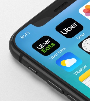
Characterized by its use of all-caps and thick, bold strokes, the ride-hailing giant’s branding has always felt a bit hostile. Its new font, also unveiled today, is much more modern and friendly. And finally, Uber has done away with UBER and welcomed Uber.
The latest logo is the company’s simplest yet. A spokesperson told TechCrunch they want to be “easily recognizable,” which is why they are dumping the symbol and going for the most straightforward imagery possible.
“We’re excited to unveil a new, simplified logo for the Uber app that brings back the U … and is scalable across the 660 plus cities we serve,” they said.
This is at least the fourth logo Uber has cycled through in its roughly nine-year history (even the company spokesperson wasn’t quite sure how many logos they’ve had). The first I can remember was just the U, then it was the bits and atoms logo. Here’s a look, from newest to oldest.
[gallery ids="1711398,1711397,1711396,1711421"]
Uber has been working on the updates for the last nine months, presumably under CEO Dara Khosrowshahi’s lead. He’s been at the company as CEO for just over a year now and has spent a good chunk of that time cleaning up founding CEO Travis Kalanick’s mess. A rebrand only makes sense when you are trying to shed a company of its less-than-stellar reputation.
Worth $62 billion, Uber is the most valuable private company in the world.