If you’re an avid user of Twitter on mobile, then you’ll notice that the microblogging service has changed how it displays links in its iOS and Android apps. URLs are out, replaced instead by a card-like format that displays stories much like Facebook does. Update: Twitter points out that this is not a new format per-se, instead it’s bringing the ‘Twitter Summary Cards’ into the main timeline.
The new format makes things less complicated for end users. Not only is the URL gone — just click on the card to open the link — but the new display allows Twitter to show more information about a link to users before they open it.
That does impinge on your timeline — bigger cards means you see less information on your screens — but it certainly looks a lot slicker and is more informative to boot.
Beyond users, this is good news for advertisers, who gain more real estate to make stronger calls to action from Promote Tweets. Twitter recently made videos and GIF autoplay in timelines, giving Promoted Tweets more life, and the card format is another subtle move to woo advertiser budgets.
The change is also notable when you consider the findings of a new report from Pew, which found that Facebook and Twitter are increasingly being used by Americans to get their serving of news online.
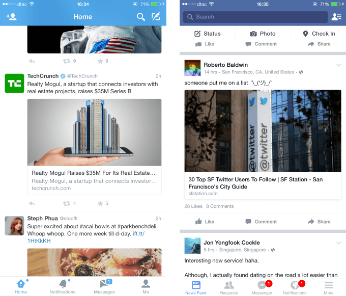
Links displayed on mobile in Twitter (left) versus Facebook (right)