
Your first slide is obviously important for a pitch deck. First impressions count and having a solid introduction goes a long way. It seems that founders often forget that the last slide is just as important.
There’s a simple reason for that: Investors easily look at hundreds of slide decks per month, and it’s hard to remember them all. Sure, startup names are often catchy and pretty self-explanatory (Lyft, DoorDash), but it’s hard remember that Orange refers to a car-charging company not the fruit. Companies often give shorthand summaries of the businesses they’re working with. In the case of Orange, it might be, “You know, the company that puts chargers in apartment buildings.” Everyone around the table goes, “Aaaah, yes,” and the conversation continues.
As a founder, you have an opportunity to influence how someone summarizes your company. The way to do that is by reinforcing your message on the first and last slides. What is a good shorthand for your company? Are you Dollar Shave Club for underwear? Are you Turo for caravans? Are you Freshbooks for plane ownership? Well, those are all helpful shorthand — but you can get more creative, too!
You need a closing slide
When pitching, you start with your best stuff first and go from there. The last slides are generally where you show weaknesses. If you don’t have a closing slide, your greatest weaknesses might be left up on the screen while you talk with investors and answer questions. As you can see, that’s not a great way to prime the pump, and you’ll end up getting grilled on your financials, team, go-to-market or whatever you added to the end of the deck as an afterthought. Instead, set yourself up for success with a good closing slide. Remind your audience who you are and what your company will do.
In this story, we are diving into the 45+ pitch deck teardowns done so far, and pickimg apart some of the closing slides from our library of pitch deck examples. Top tip: It’s 100% worth subscribing to TC+ just to get these teardowns and our incredible library of pitch advice. But then again, I wrote most of it so I’m hella biased. Still. Subscribe. Go on. It’ll be the best fistful of dollars you spend this year, I promise.
Some examples of closing slides that work

Alto’s closing slide. Image Credits: Alto Pharmacy
Alto raised $200 million to make a better pharmacy. Choosing to end with a slide that inspires rather than puts a shadow on any conversations is one thing. But choosing the succinct “a better pharmacy” rounds out the slide to make it an A+. See the full pitch deck teardown.

Glambook’s closing slide. Image Credits: Glambook
Glambook’s pitch deck teardown has a bunch of good things about it, including this last slide. It recaps the pitch well, includes some visuals to help tell the story and includes contact details. Perfect.

Mi Terro’s closing slide. Image Credits: Mi Terro
Although this last slide could stand to be a little more explicit, it’s still clear, to the point and includes lots of contact information. That design, however, leaves something to be desired. See the full pitch deck teardown.
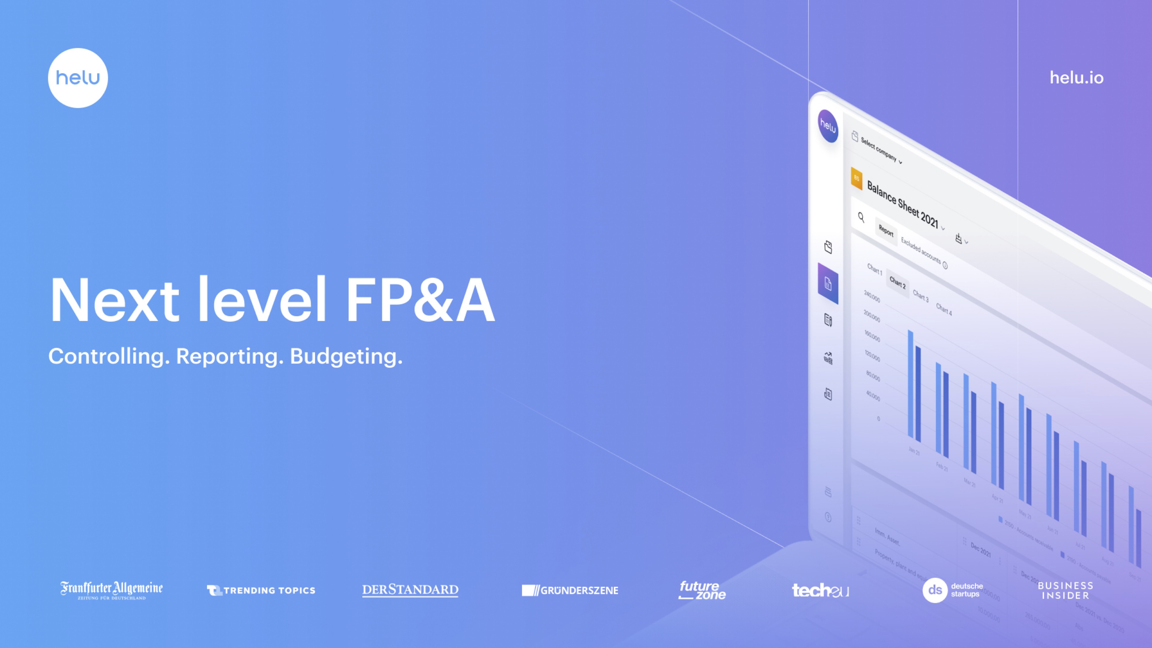
Helu’s closing slide. Image Credits: Helu
Helu’s closing slide is clean, simple, and it even includes a screenshot of the product. The logos at the bottom are a little unnecessary, perhaps. Adding contact information might’ve been better, but it’s still a good way to end a presentation. See the full pitch deck teardown.
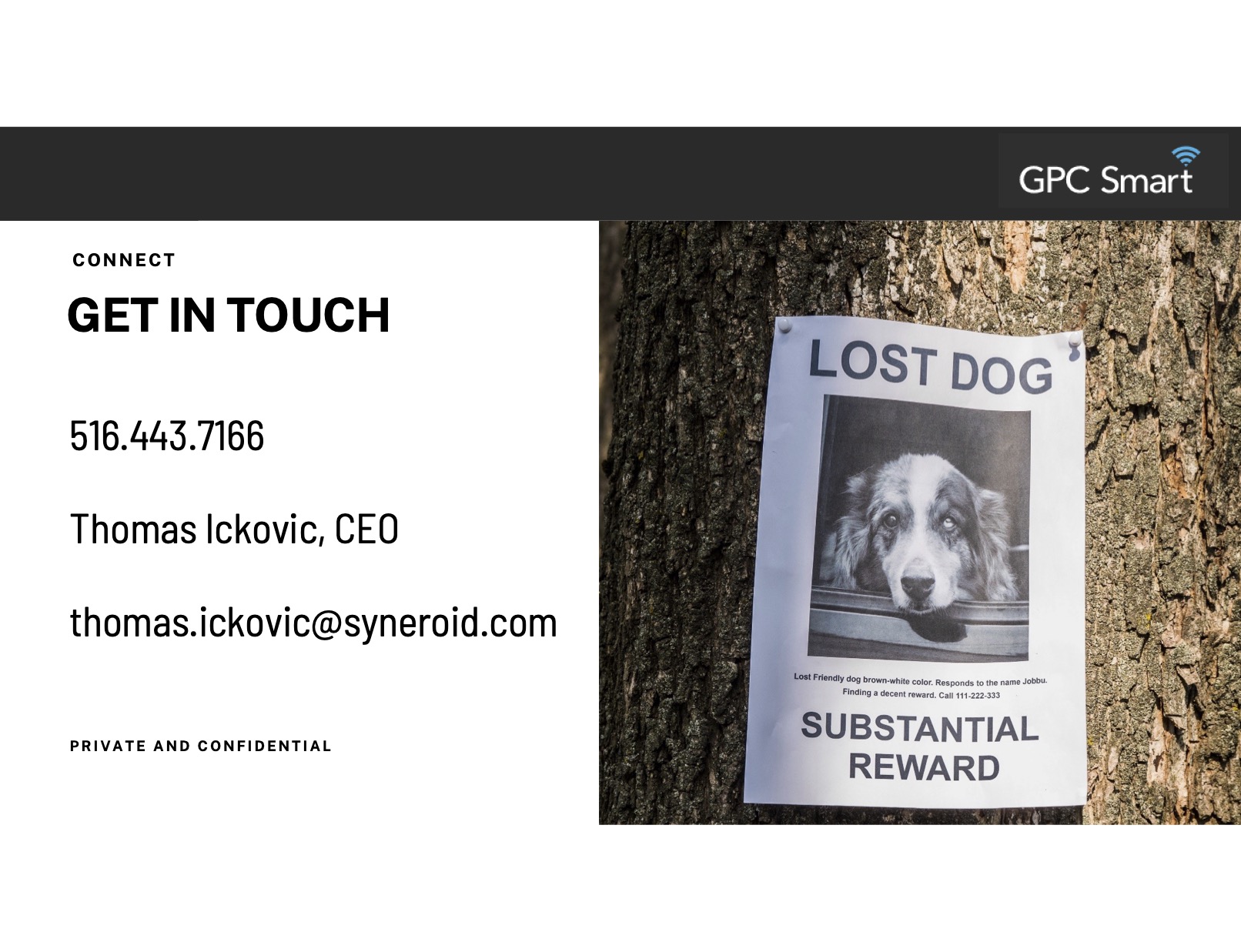
Synaroid’s closing slide. Image Credits: Syneroid
Gotta admit, I didn’t love GPC’s deck overall, and “get in touch” on its own doesn’t really mean anything here. But having the “lost dog” poster as a visual reminder what the company does is inspired. It’s a good reminder that there’s more than one way to tell this part of the story.

Sateliot’s closing slide. Image Credits: Sateliot
Not a good look to have a typo in your own URL, and the wonky grammar might be a result of a language barrier, as this company is based in Spain. But the message is still clear: “Connecting IoT devices from space” makes for a great summary. See the full teardown.

Juro closing slide. Image Credits: Juro
I mean, it can’t get much clearer than this. But …
Unfortunately, this is actually the first slide, not the last. The last slide just says “Juro.” I wish that the deck concluded the way it started: With a crisp message that comes across remarkably well. and I wish they had used this one as the last slide again. Don’t be afraid for your first and last slide to include the same information. If that helps communicate your message, keeping it simple is best. See the full teardown.

Scrintal’s closing slide. Image Credits: Scrintal
If you can’t remember what Scrintal does, the line “give any — and every — idea the potential to become the next big thing” is a little too abstract. But if you remember that it’s “a web app that combines mind mapping with the power of networked note-taking,” this reminder is actually helpful. I put it in the “yes” column, because it gets the job done if you remember the rest of the deck. See the full teardown.
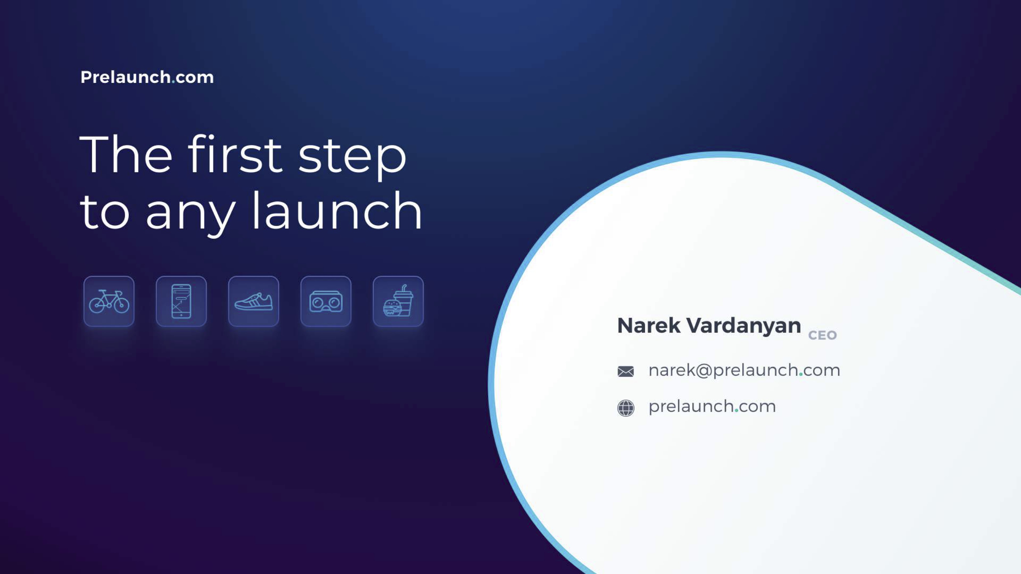
Prelaunch’s closing slide. Image Credits: Prelunch
Prelaunch is building a product to help hardware founders get feedback from customers earlier in the product development process. “The first step to any launch” is more slogan than description, but I think it works! The rest of the pitch deck is pretty solid and worth a look, too.
This ain’t go good

Diamond Standard’s closing slide. Image Credits: Diamond Standard
Diamond Standard’s closing slide is an org chart that isn’t even that good of an org chart, let alone one that’s used as the last slide. Why is it here? What is the story? Unclear. Lots of lessons to learn from the the full pitch deck, too.

Smalls’ closing slide. Image credit: Smalls
You are welcome! But, er, what do you do? (In the full pitch deck the cover slide just says “Smalls” and is equally as cryptic.) What is the point of this slide? A missed opportunity to remind your audience what you do. The company makes cat food, so an easy way to say that is “better cat food.” Makes a lot more sense than “thank you.”
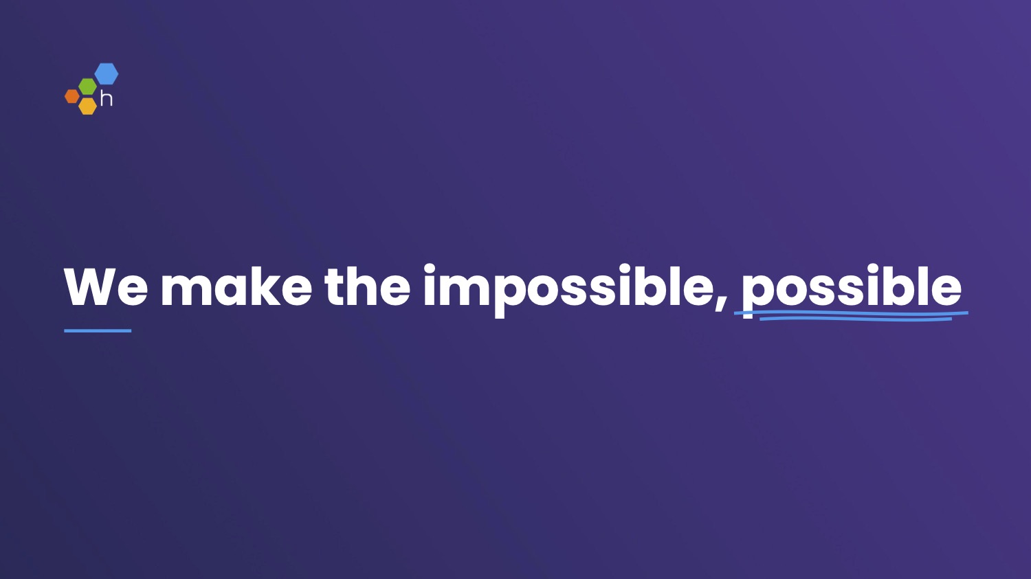
Honeycomb’s closing slide. Image Credits: Honeycomb
This one doesn’t quite work for me, because the slogan is so generic. In fact, “we make the impossible possible” could work as the closing slide for almost all of these companies. See the full teardown.

Lunchbox’s closing slide. Image Credits: Lunchbox
Lunchbox gets partial credit for being called “lunchbox,” so investors probably don’t need an additional cue as to what they do once they’ve been introduced to the concept. I love the bold design language, too. Even still, “let’s get cooking” doesn’t say much. Do you make microwaves? Are you a cooking school? Neither, it turns out, which isn’t great for a $50 million Series B.

Minut’s closing slide. Image Credits: Minut
Gorgeous slide. But can you guess what Minut does? House paint? The company makes sound and smoke detectors aimed at Airbnb hosts.

Arkive’s closing slide. Image Credits: Arkive
Arkive has the honor of making me (!) excited (!!) about crypto (!!!), which is no easy feat. This slide, though, is utterly useless. Luckily the full deck is much better.
In conclusion: Have a conclusion
Most decks have 14 to 20 slides, which should include a cover slide and a closer. Together, that means that up to 10% of your slides are these bookend slides. Make ’em count, and think about your audience (you need to understand how VC works). Then think about what impression you want to leave your investors with. Make sure your slides do the heavy lifting, every time, and if they don’t, keep iterating until they do!