There’s no shortage of “upskilling” startups out there, but it’s rare to see one raise a $41 million round. That’s what Spanish startup StudentFinance pulled off a couple of weeks ago. Today, we are taking a closer look at the pitch deck the company used to make that happen.
We’re looking for more unique pitch decks to tear down, so if you want to submit your own, here’s how you can do that.
Slides in this deck
StudentFinance shared a slightly redacted slide deck; it removed sensitive revenue, cost and unit economics slides. Everything else is as pitched.
- Cover slide
- Mission slide
- Opportunity slide
- Problem slide
- Solution slide
- Value proposition slide part 1
- Value proposition slide part 2
- Business model slide
- Technology slide
- Metrics slide
- Road map slide (labeled “expansion” slide)
- Geographic expansion slide (labeled “expansion” slide)
- Growth history and trajectory slice (labeled “expansion” slide)
- Team slide
- Contact slide
Three things to love
To raise a $41 million round, a company needs solid traction and a huge market. I’m unsurprised to see that those parts of the story, in particular, were very well covered.
Clear, bold mission
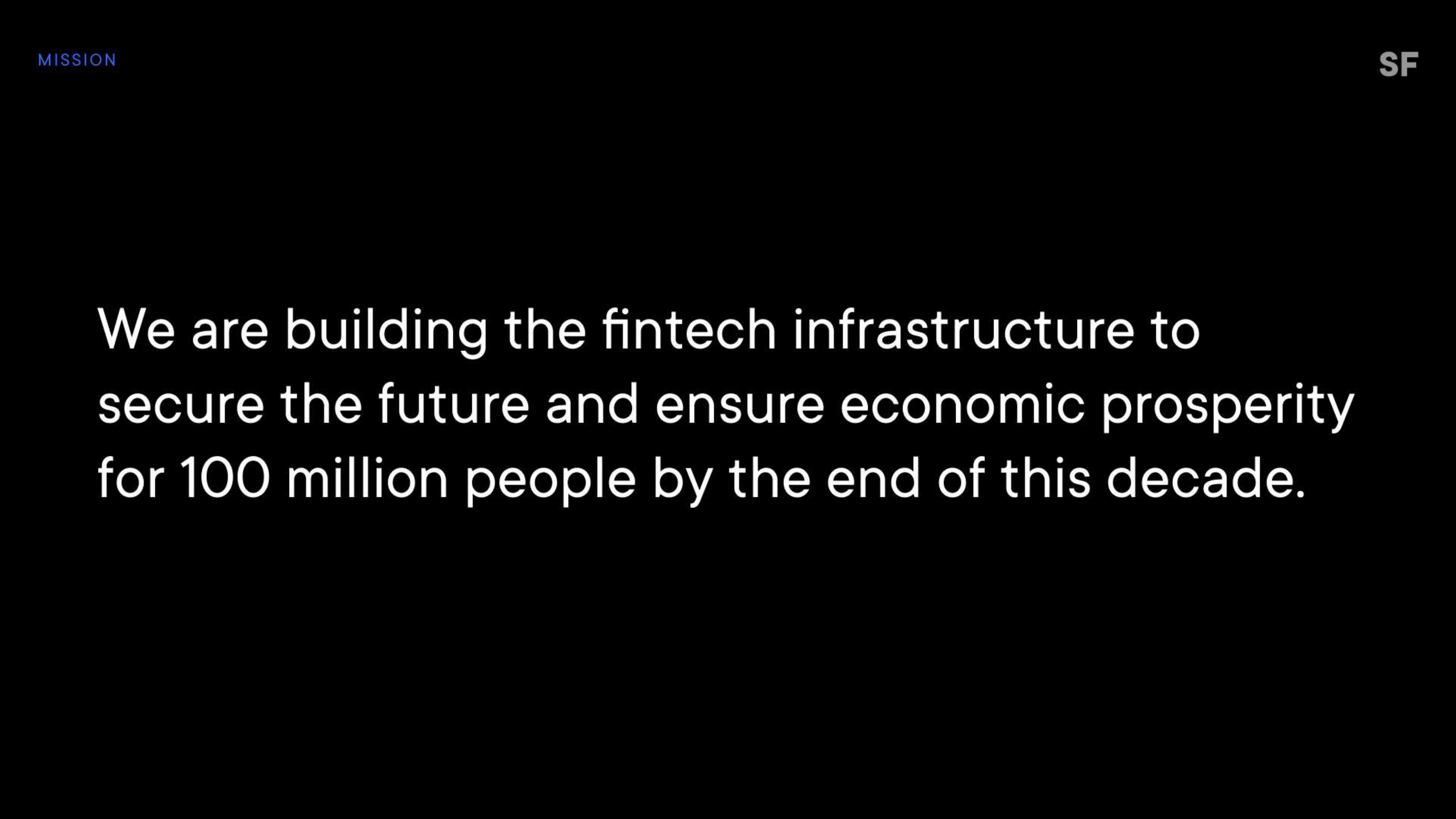
[Slide 2] Off to a solid start. Image Credits: StudentFinance (opens in a new window)
This slide invites investors to join the journey, something all startups should do when pitching. What is the big goal, the big change you want to see in the world? Bring that to life, and you’ve made a great first impression.
A clearly formulated problem space
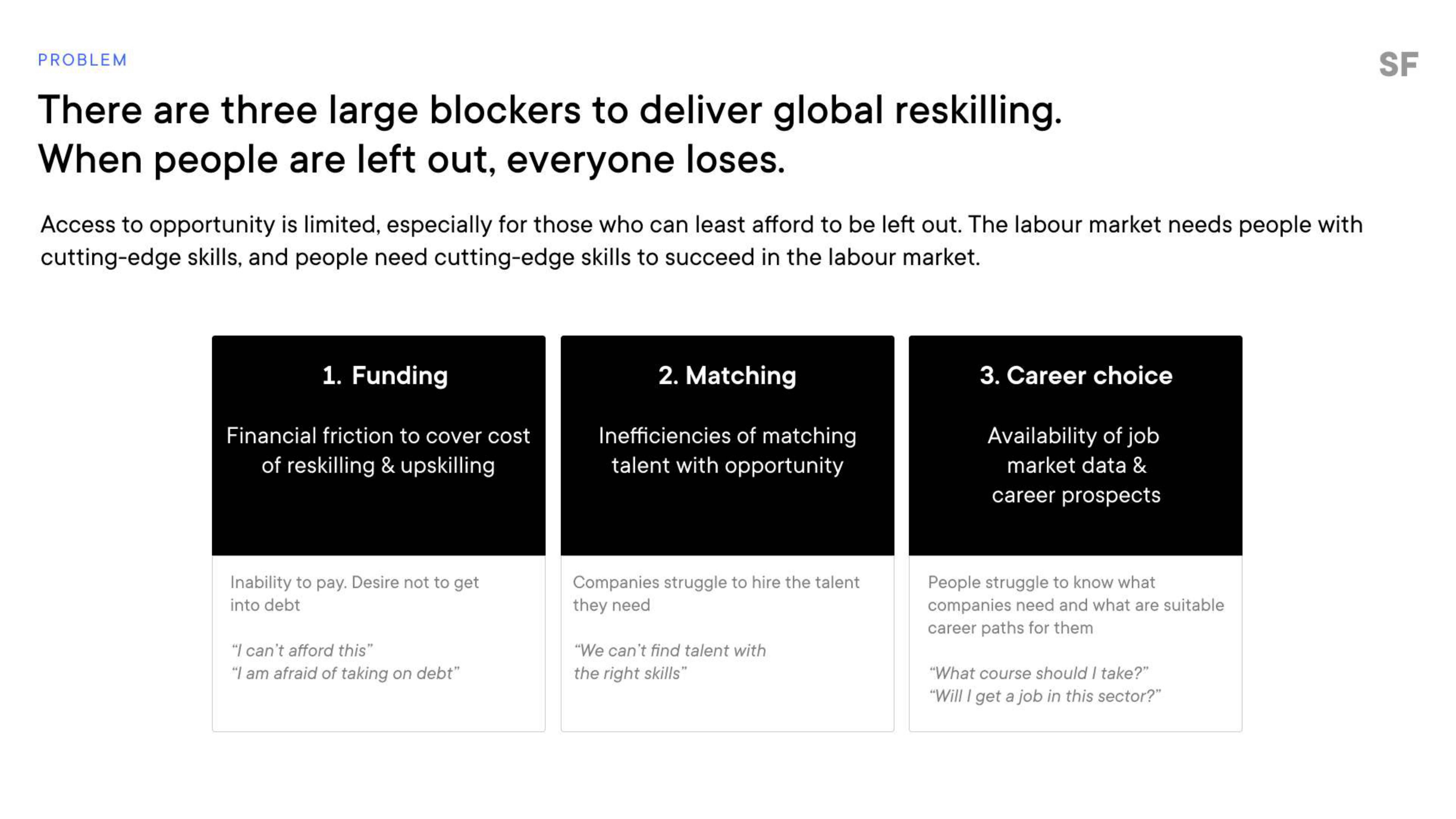
[Slide 4] Gotta love a clear problem. Image Credits: StudentFinance
Breaking down the problem into three easy-to-grasp segments like this is particularly elegant. Funding is an obvious one‚ people are worried about money — but finding jobs and getting career guidance are less obvious slices of this challenge at first glance. Bringing it to life by using the short example questions underneath helps humanize the problem. All very well done.
Promising early metrics
For a company raising more than $40 million, I would have expected pretty beefy metrics. Of course, I have nothing to benchmark it against, so I don’t know if these metrics are actually good or great, but the investors must have seen something. The win here, though, is identifying and reporting on metrics that seem key to the company:
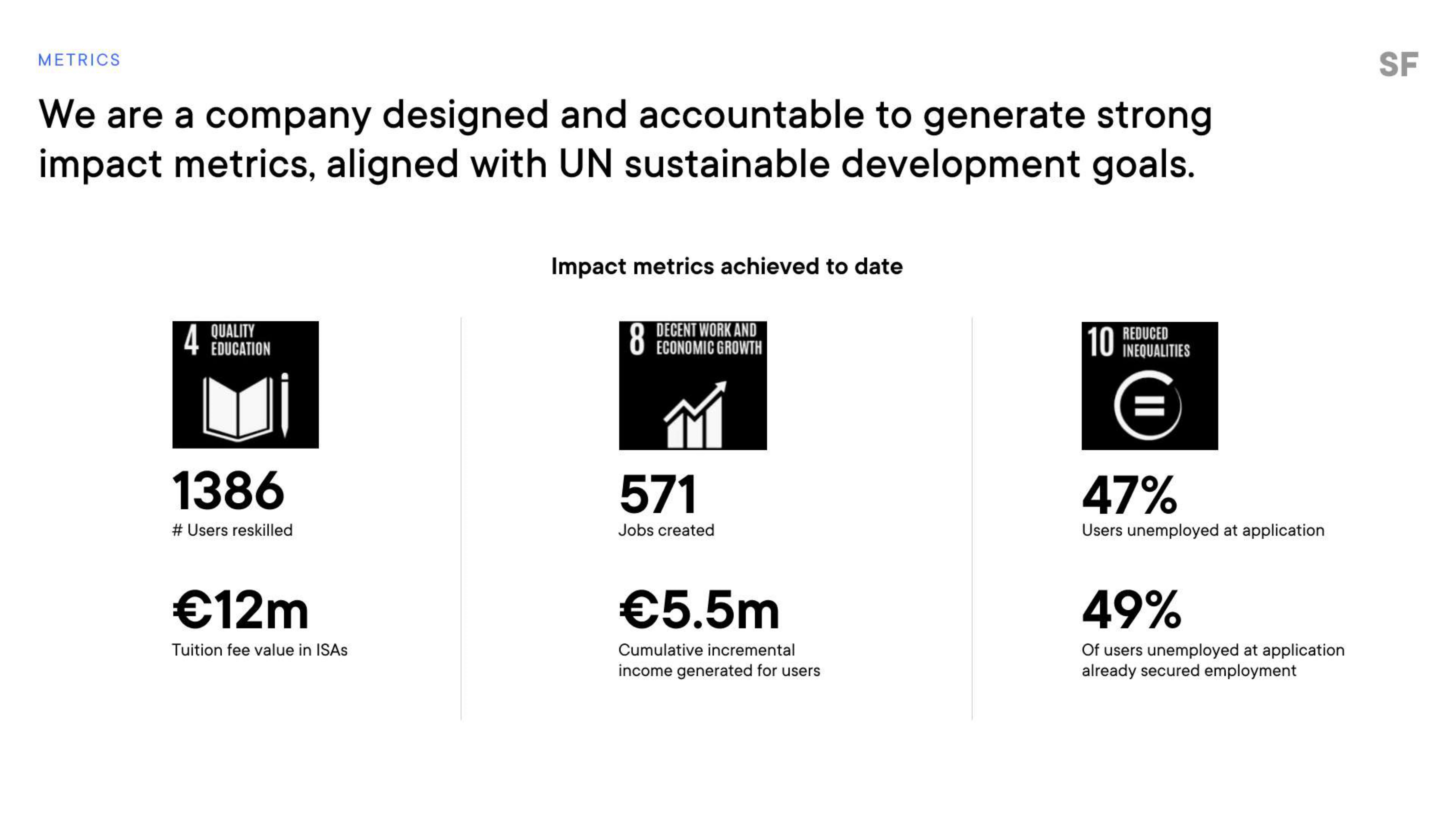
[Slide 10] Metrics, metrics, metrics. Image Credits: StudentFinance
Some crucial numbers are missing here, and in any other circumstance, I would give the founders a hard time.
You can tell a lot from a company’s metrics — both the KPIs themselves, of course, but also the figures that a company believes are key to its growth. StudentFinance overlaps these metrics on the UN sustainable development goals, which is a great way to signal how it can be a force for good in the world. Again, elegantly done.
The number of people reskilled and the value of tuition fees are both crucial numbers (although I can’t figure out what ISA stands for, so perhaps there’s an opportunity for a tweak there). Job creation, salary generation and finding that half of the folks who go through the program land jobs are all key indicators that make a lot of sense.
Some crucial numbers are missing here, and in any other circumstance, I would give the founders a hard time, but the team already let me know that “sensitive revenue, cost and unit economics slides” had been removed — and those are exactly the type of metrics that I would like to see here.
In the rest of this teardown, we’ll take a look at three things StudentFinance could have improved or done differently, along with its full pitch deck!
Three things that could be improved
Raising $40 million after only having served 1,400 or so customers is objectively impressive; it’s clear that this is a valuable market. Having said that, the company did stumble a couple of times in this deck. Here are the ones that stood out the most:
Business model could be clearer
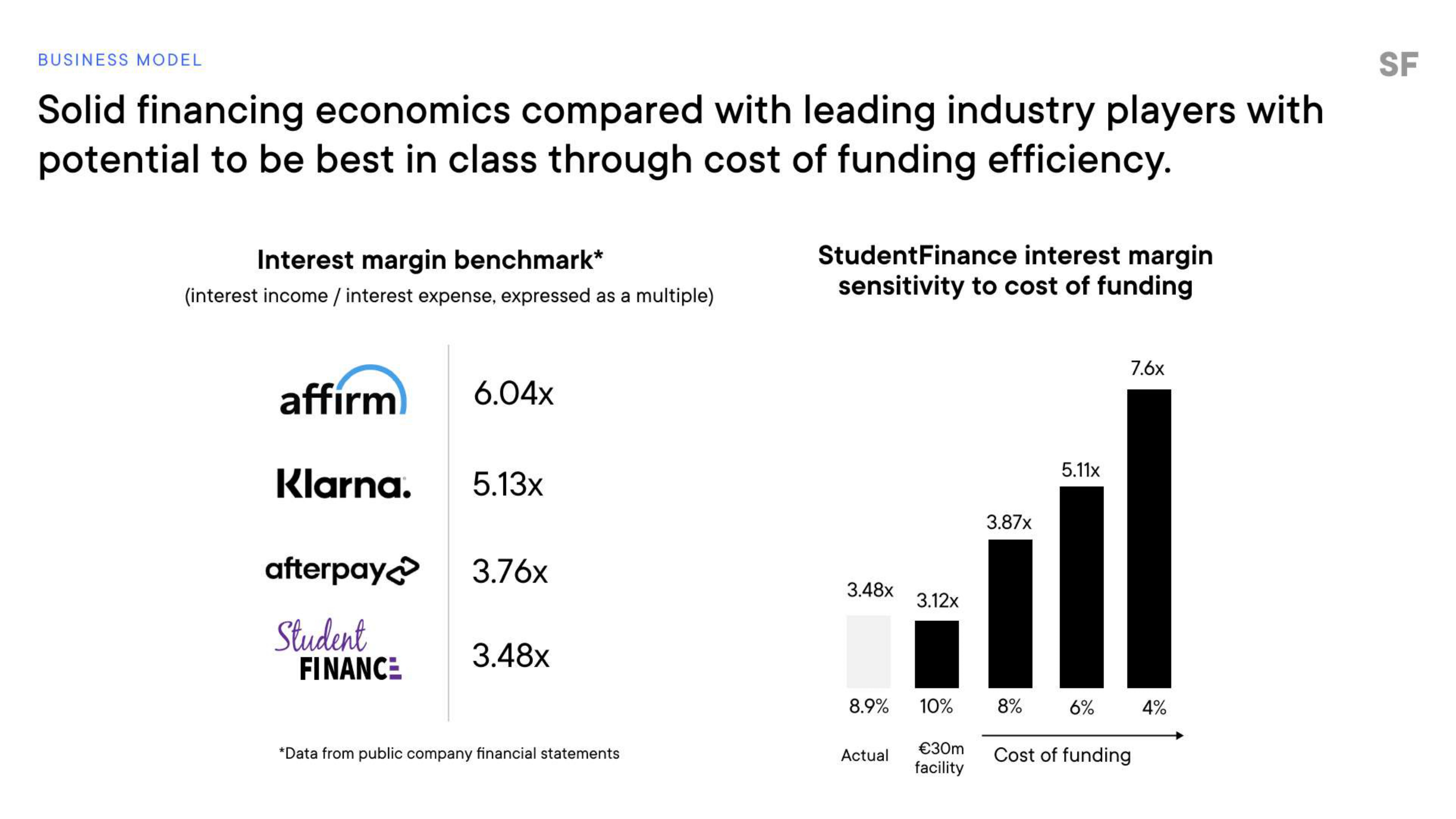
[Slide 8] So the business model is … what? Image Credits: StudentFinance
Second, the interest margin sensitivity to cost of funding ratio is slightly confusing. I get that as the interest margin goes up, the cost of funding goes down (maybe?), but the company fails to connect the dots.
Neither of these charts really describes what the business model is. How does the company make money? How much does it make on average per customer? What is the cost of delivering the service? How much does it cost to acquire a customer?
Crucially, I think I gather that StudentFinance does financing, but if that’s the case, then it becomes a risk calculation: What is the risk of someone defaulting on the loans? All of these are aspects of the business model that I’d have liked to see here.
I’m willing to grant that it’s possible that some of this information was redacted, but it’s valuable for slides to stand on their own. When you are clicking back and forth in a slide deck, you sometimes need to show off a particular aspect of your narrative. Slides shouldn’t rely on previous slides to make sense.
So, what’s the technology?
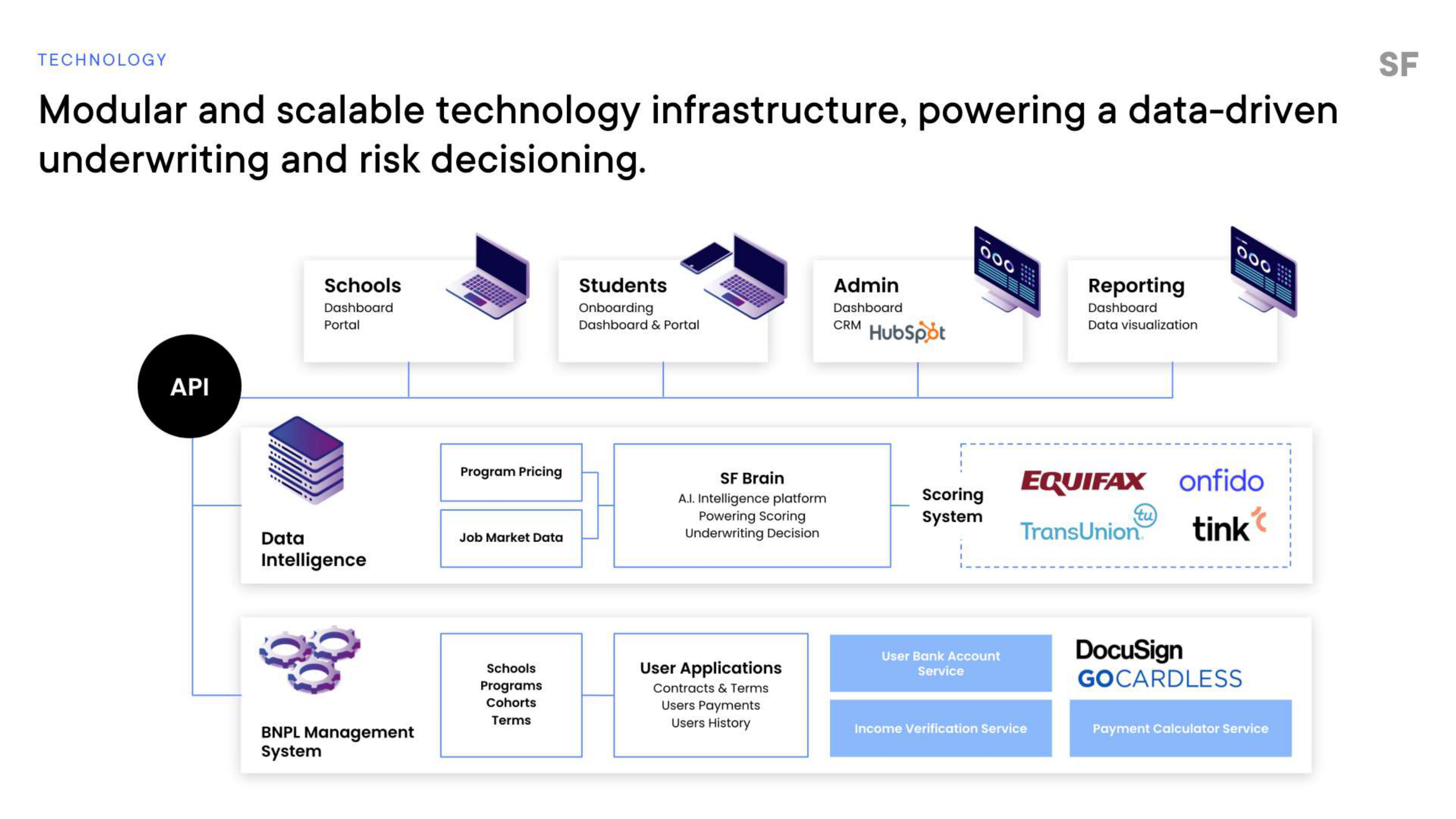
[Slide 9] The tech stack is complex — but it’s not clear why. Image Credits: StudentFinance
The word “API” on the left is confusing: Are these StudentFinance’s APIs or APIs it interfaces with? How does it interface with schools, students, admins and reporting? What has been developed by StudentFinance and to what end?
The thing I keep stumbling over here is that, even after reading this slide, I have very little clarity about how much of this tech stack has been developed by the company and which parts are interfacing with external providers, etc.
I get that this is a tech startup, with the benefits to scaling and growing the company that come with that, but in a bizarre way, this slide is both too detailed and not detailed enough. I wonder if this could have been solved by having two slides — one that’s the architectural overview showing all of the components of the company’s system and a second slide detailing how it interfaces with technologies outside of the company.
StudentFinance also doesn’t have screenshots of its product, marketing materials or the user experience for students, which further seems to indicate that the product may not be live or complete — which is a faux pas in a world where the company is raising money to scale.
Show, don’t tell
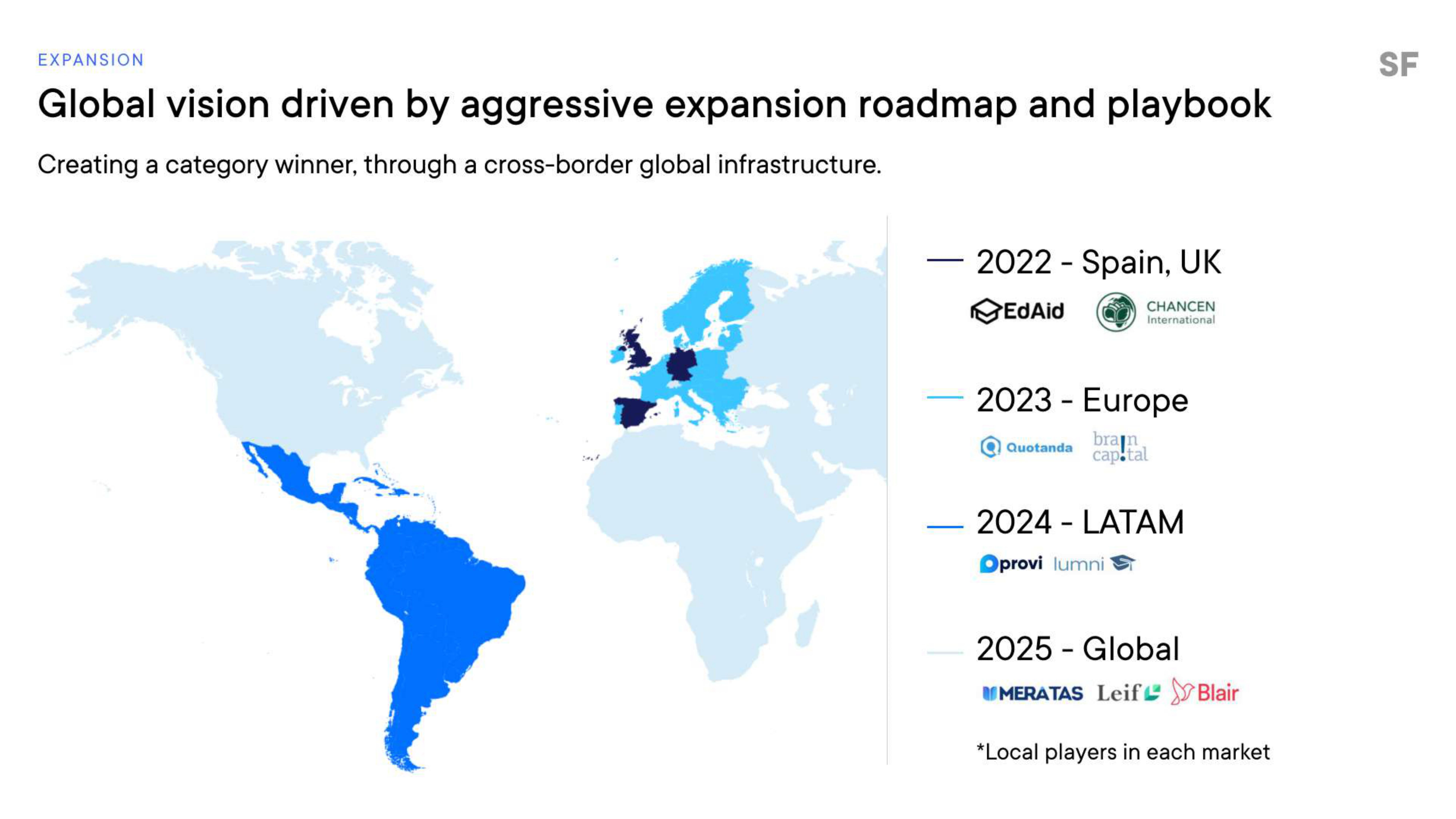
[Slide 13] This seems more like a goal than a plan. What’s the plan? Image Credits: StudentFinance
Reading this slide, I see “We will launch in Europe, then Latin America, then globally” without giving any details about how — which means it’s very hard to ascertain whether that plan is feasible. Finance industries are regulated and limited in so many different ways, and education and employment markets vary vastly from region to region. In a nutshell, when presented with this slide, I find myself wondering what the actual plan is.
A better way to present this might be to have a more detailed plan for how the company is planning to go after Europe, along with a timeline and approach for training delivery partners, financial partners and the playbook for how it’s planning to roll these out, and then have a looser plan for a global rollout. Without details, this simply doesn’t strike me as believable — it seems undercooked at best and naive at worst.
For startups, the thing to learn from this slide is to present information with the right amount of granularity: In the short term, break down your plan with some detail. In the longer term, give more vague and hand-waving outlines — and that’s OK, as long as those vague plans fall outside the timeline of the current fundraise. If it’s for the Series B, it’s safe to say, “This is a problem for another day.”
The full pitch deck
If you want your own pitch deck teardown featured on TC+, here’s more information. Also, check out all our Pitch Deck Teardowns and other pitching advice, all collected in one handy place for you!