We’ve seen attempts at gathering all cards (credit, debit, loyalty, etc.) in one before, but Card Blanch claims to have a fresh take on the concept and closed just shy of half a mil worth of angel investments with a very elegant deck. The company gets a few parts of the slide deck right that we rarely see done well, so that’s wonderfully refreshing. Let’s dive right in!
We’re looking for more unique pitch decks to tear down, so if you want to submit your own, here’s how you can do that.
Slides in this deck
Card Blanch’s deck consists of just 12 slides, and the team tells us that it is exactly as pitched without redactions.
- Cover slide
- Problem slide
- Market size slide
- Solution slide
- Product slide
- “How it works” slide
- Competition slide
- Revenue model slide
- Market opportunity slide
- “Next steps” — the ask slide
- “Your whole wallet in one card” — value prop slide
- “Complete spending analytic in one place”— summary slide
Three things to love
The graphic designers over at Card Blanch deserve a raise; this is one of the best-designed decks I’ve seen in a hot minute. Let’s take a peek at the highlights:
Well, that’s a big enough market

[Slide 3] Of course there’s a huge market size … Image Credits: Card Blanch
Store cards, loyalty cards, credit cards — they all have different advantages (otherwise, the average American wouldn’t be carrying six cards with them all the time). I love how this slide presents the data simply and cleanly. And the “text flows behind the person” design is a very nice touch indeed.
If your market is huge and obvious, you can get away with a market slide like this. One thing, however: This is probably a very mature and rather plateaued market. I doubt there’s a lot more growth to be had in this industry. That means that to really stand out, you have to offer an enormous customer benefit. Can Card Blanch pull that off?
Awesome “ask” slide
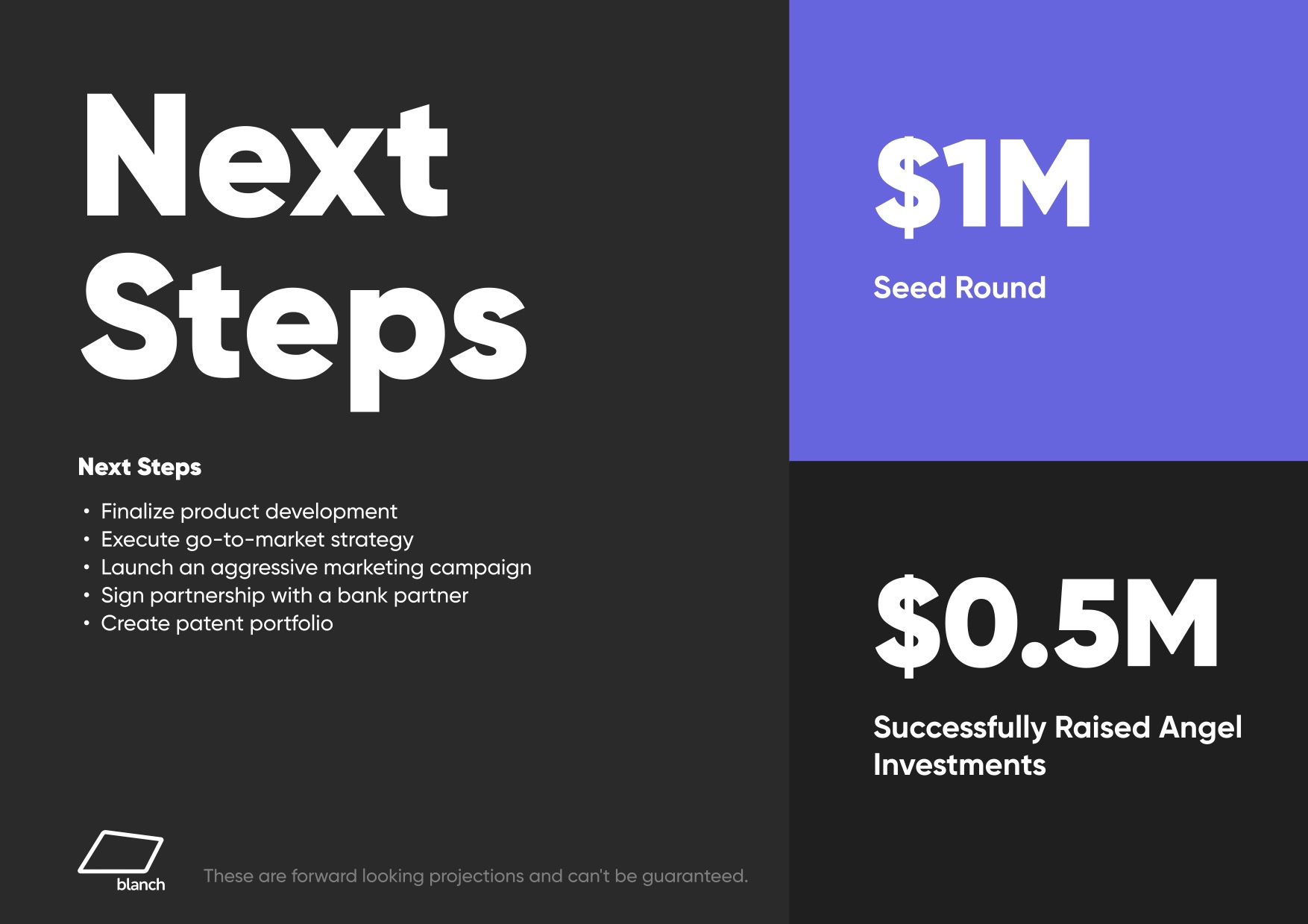
[Slide 10] This is a good “ask” slide. In fact, it’s so good that we added it to our article that focuses on that very slide. Image Credits: Card Blanch
I wish the slide used SMART — specific, measurable, achievable, relevant and time-based — goals. This list is great, but none of the milestones are specifically measurable (product development will never be finalized; go-to-market will never be complete; “aggressive” doesn’t mean anything without numbers attached, etc.) or has specific deadlines attached. Still — it’s rare that I see slides that are even this good, so I figured I’d celebrate it nonetheless.
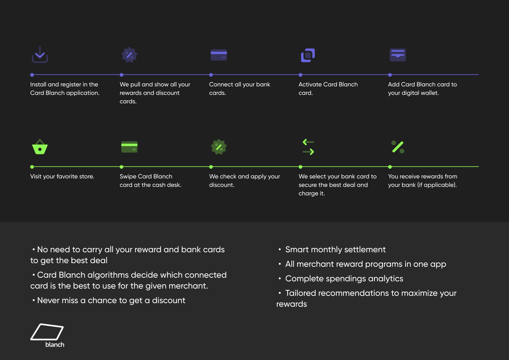
So easy to understand
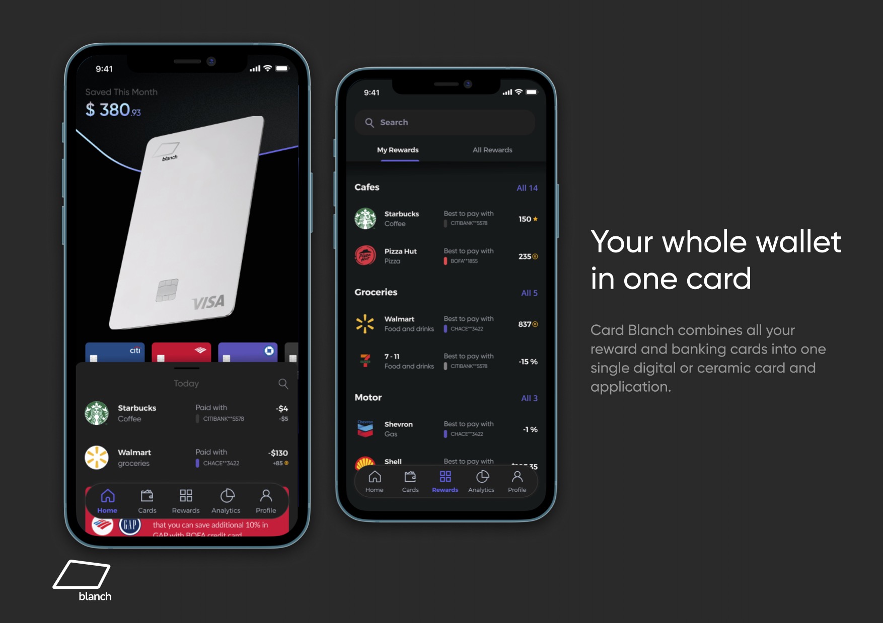
[Slide 11] Really good product-driven storytelling. Image Credits: Card Blanch
If your would-be investors are going through your deck to see if you’re trying to defraud them, that’s not a great first impression.
What Card Blanch really masters is telling its story through design mockups. The full story of how the product works — paying with the right card in the right place to maximize card benefits — fits into four elegant screenshots. (Slide 12 includes the rest.)
It’s a really good storytelling device because the founders can give a voice-over of how it all works. Or will work?
That’s a quirk about this pitch deck: Nowhere in the deck is it stated how much of this is actually built and how much is mock-ups and good ideas. That’s not uncommon in pre-seed/angel stage pitch decks, to be clear, but in a world where investors are trying to ascertain how much risk is in the startup, including an update about what has been done so far would be helpful.
In the rest of this teardown, we’ll take a look at three things Card Blanch could have improved or done differently, along with its full pitch deck!
Three things that could be improved
The biggest challenges with this pitch have nothing to do with the pitch itself but with whether the business makes sense in the context of the competitive space of cards.
Card Blanch is about to start gunning for a slice of $144 billion worth of transactions, and the incumbents aren’t simply going to let Card Blanch steal their lunch. There’s not enough in this deck that makes me think, “Yes, I believe these founders can execute on this specific idea.”
Is this even possible?
[Slide 6] That looks awesome! But is it possible? Image Credits: Card Blanch
There’s nothing in the deck as to whether Capital One (whose Venture card continues to be a contender for the best credit card, according to sites that review such things) will “accept” that a payment for a flight, say, which attracts 5x points if you use your Venture card, counts toward your points bonus. The way credit cards and their reward programs are designed is a little obtuse on purpose. Card Blanch is going after the very business models that make credit cards so profitable, and I cannot imagine that they’ll give in easily. Put differently: I am not convinced that Card Blanch is going to be able to deliver on its promises.
The other big thread that springs to mind for me is fraud risk. Card issuers are always on the lookout for cloned or stolen cards, and Card Blanch putting themselves in the middle there could get complicated. What if the card itself is stolen?
I’ve not spent a lot of time awash in the worlds of fintech, so perhaps all of these questions are showing my lack of expertise — entirely possible — but I’d have loved to see the company develop some software that can answer some of the very hard questions here. For all I know, the founders have developed a beta version of this card that simply switches between two payment cards for now. A Shell card for when you fill gas and an Amex for everything else, perhaps.
In any case, the absence of any of these milestones in this pitch deck is making me worried, and as an angel investor, I’d have a lot of questions before I’d invest.
Wait, you’re going to make how much money?
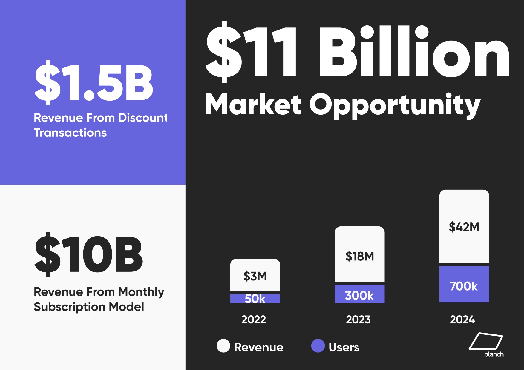
[Slide 9] Hellooooo market opportunity. Image Credits: Card Blanch
Whenever I come across huge claims like that, I find myself reaching for Google to see how those numbers connect with the larger picture. What I found ain’t pretty: Globally, there are around 1.2 billion credit card holders, so what Card Blanch is saying is that it expects every single credit card holder in the entire world will pay the company $8 or so. All I can say is, if you can pull that off, that’s amazing, and I need to see a go-to-market plan. Not least because there is none in this pitch deck — which is another oversight.
Also, these graphs are horrible and don’t make sense — 300,000 should be 6x taller than 50,000; it is not. And 18 million is 6x more than 3 million. In other words: If you’re going to use graphs, use graphs. These numbers and shapes don’t relate to each other in a way that’s meaningful. These charts not making sense actually made me go through the rest of the deck to see if there were other visual shenanigans in the name of storytelling. If your would-be investors are going through your deck to see if you’re trying to defraud them, that’s not a great first impression.
Who is behind this‽
A while back, I talked with the DocSend team about the slide decks that work the best. They concluded that 100% of successful slide decks (i.e., ones that had raised money) included a team slide. I was surprised to have found the apparent exception.
Investors at the earliest stages are looking hard at the due diligence of a deal, and at the early stages, investments fail due diligence for one of two reasons: The market is too small or the founders don’t have a good fit with the problem they are trying to solve. In this slide deck, there’s no team slide at all, which is a Texas-sized red flag for me and, I would hazard, for most investors.
A team slide answers three questions: Who are you? What have you done before? Why are you the perfect founder to start this company? Analyzing that is a crucial part of evaluating an investment. The website itself doesn’t have an “about us” page, either, which further makes me suspicious.
If the people behind this company had deep experience in loyalty cards, were ex-VPs at American Express or had other relevant experience, that de-risks the investment somewhat. Instead, a bit of Googling reveals that the company’s founder and CEO ran a digital development agency for a decade or so. That’s impressive, and it de-risks some of the development risk (and it also explains why the deck is so good looking). But there’s no apparent domain expertise or experience relevant to the market the company is aiming for — which makes me very twitchy as an investor.
The full pitch deck
If you want your own pitch deck teardown featured on TC+, here’s more information. Also, check out all our Pitch Deck Teardowns and other pitching advice, all collected in one handy place for you!