[Update: the Music tab has been relocated] Google’s Play Store has gotten a big visual makeover, the company announced today, with changes that include a cleaner look-and-feel, new navigation, an easier way to to see app information and more. Most notably, however, is that Google has taken a page from Apple’s playbook with the priority given to its two distinct sections for apps and games. It has also removed the “Music” tab from the top-level navigation, likely ahead of planned changes to Google Play Music and YouTube Music.
Though the redesign is in keeping with Google’s Material Design philosophy, it’s hard to miss Apple’s influence here — from the brighter, whiter and cleaner layout to the new navigation and updated app detail page layouts, among other things.
With Apple’s huge App Store revamp in 2017, the company made several changes to refocus user attention away from top charts and rankings to editorial content, stories and tips, recommendations and curated collections. As a part of this redesign, it created two separate tabs for Apps and Games in the App Store app’s main navigation to better direct users to the type of app content they wanted to browse.
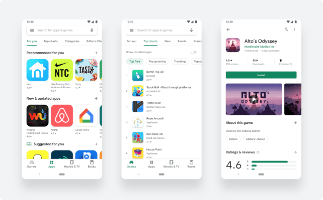
The Play Store had already broken out Apps and Games before today, but they had been part of a much larger navigational element at the top of the home page.
The new design now relocates the Play Store’s main navigation to the bottom of the screen, just like on the iOS App Store. It also distills navigation to just four tabs: Games, Apps, Movies & TV and Books. (Music is gone).
Google says its decision to create two main tabs for apps and games will help it to “better serve users the right kind of content.”
Within the Games and Apps sections, users can browse into other sections, including Google’s personalized “For You” suggestions and Top Charts, and more. Here, you’ll find the same sections the Play Store had before (like “New,” “Events,” “Premium,” etc.) — they’ve just been relocated within the new tabs instead of existing as a second-level navigation bar on the Play Store homepage.
When the user finds an app or game they’re interested in, the updated store listing page layout will now surface richer app information at the top of the page and a bigger call-to-action button (e.g. “Install”).
This, too, is similar to iOS, where key details about the app or game — like its rating or age range — are at the top of this app detail page.
The store also features Google’s new icon system, where apps have a uniform rounded square shape. Apple has always enforced standardized app icons.

The Play Store makeover had already leaked earlier this year, thanks to enterprising developers who got their hands on Google’s tests and published screenshots.
As for the Music tab’s relocation, Google already confirmed it was planning to replace Google Play Music with YouTube Music, and shut down Google Play’s artist hub this April in preparation for that. With the removal of the Music tab from the new Play Store, the completion of this merger appears to be imminent.
Update: The Music tab has been relocated, says Google… it’s a bit buried now
In Google’s announcement today about the redesign, it showed off the new look with a photo (see top photo above).
It’s pretty odd that the app being showcased in Google’s photo, Alto’s Odyssey, is an Apple Design Winner that launched on iOS first — as did its precursor, Alto’s Adventure. When coming to Android, the game development company worked with Android publisher Noodlecake on its Android ports.
In other words, not only is this a non-exclusive game, it comes from an iOS-first shop. Sure, it’s a great game. But that’s also a pretty weird pick on Google’s part.
The Google Play Store has more than two billion monthly active users, Google said in its announcement. The new version of the Play Store is rolling out now.