
When scaling a paid acquisition channel, you should constantly question whether you’re spending in the most efficient way possible. If you’re scaling spending across various channels, it’s more than likely that you’re facing rising costs. But how do you know where and when to draw the line?
In this short article, I’ll discuss when to start measuring diminishing returns and how to use a simple regression analysis to find optimal spending levels.
Weekly performance trends
If you’re scaling any paid acquisition channel by 5-10x weekly, then it becomes important to maintain the pulse on the following metrics:
- Cost per thousand impressions (CPM)
- Customer acquisition cost (CAC)
- Ad frequency (for paid social)
As paid costs scale, the number of impressions being served naturally increases, which causes CPMs to rise. If your CPMs are rising this usually means that your CACs and ad frequency are rising as a byproduct. A spreadsheet with those metrics laid out on a weekly basis will help you identify large upticks in costs, which can then guide your future budget allocations.
Regression analysis
If you’re looking to get analytical and have a minimum of 90 days of data at varying levels of spending, a regression analysis is your answer. What is regression analysis? In non-technical terms, it’s a way to measure the relationship of one variable to another. This empowers marketers to understand how two marketing metrics relate to one another, such as affiliates signed and conversions, or revenues and paid spend.
What’s great about this kind of analysis is that it provides a clear depiction of what your optimal expenditure is at the paid channel level. During my days at Postmates, we scaled our driver acquisition budget from less than $50,000/month to $3M/month, and had to run regression analyses on a regular cadence to ensure optimal spending per channel and geography. Below is a quick summary on how to get a regression analysis set up with the following inputs on a weekly level:
- Spend
- Customer acquisition cost (CAC)
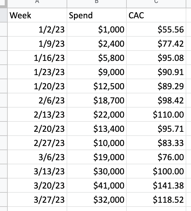
Example data inputs for regression analysis. Image: Jonathan Martinez
Once you have this data input on your spreadsheet (I’m using Google Sheets here), highlight all the data and select the Insert drop-down, followed by Chart. In the Chart type area that shows on the right pane of the screen, scroll until you find the Scatter option. Select Scatter. Add “CAC” to the X-Axis and “Spend” on your Series. Finally, go to the Customize tab, find Series, click on it, and then scroll down to find the Trendline toggle.
From there, you should have something that looks like what I’ve created below:
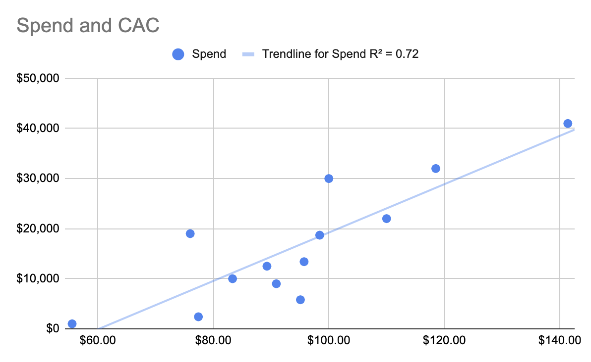
A regression analysis sample. Image: Jonathan Martinez
From this graph it is clear that we have around $90 CAC at spending levels of $5,000 – $15,000. When we spend $30,000, CACs only rise to $100. That’s only one week’s datapoints though, which could have been an anomaly. Ideally, we would prefer to have had a cluster of spending data points at $30,000 in the $100 CAC range.
My next steps based on this data would be to scale to $30,000 in spend to see if we can maintain CACs below $100. A ~10% increase in CAC for a 3x increase in spending levels and conversions would be a great success.
As more data-points start to fill the scatter plot, it becomes much easier to decide on where to draw the line on spending for specific channels or geography. Conversely, it helps to guide the light to where opportunities may be present.
Instead of spending too much on paid acquisition, know that you have the regression analysis’s ability now stored in your growth toolbelt to make more informed budget allocation decisions.