Most of the pitch deck teardowns to date (here’s a handy list of the more than 30 we have published so far) have been for institutional funding rounds, typically in the millions or tens, even hundreds of millions of dollars raised.
Those are interesting to look at, of course, but I also know that many of you will be much earlier in your journey. I’ve been looking for a good example of an angel deck to share with you, and I found just that in Laoshi‘s angel deck. The company tells me it raised $570,000 at a $5 million cap for its very early-stage language-learning app, explicitly targeted at Chinese tutors and their students.
The deck ain’t fancy, and it isn’t perfect, but the company claims it was successful, so let’s take a look at what it got right — and what could’ve been improved.
We’re looking for more unique pitch decks to tear down, so if you want to submit your own, here’s how you can do that.
Slides in this deck
Laoshi’s deck consists of 11 main slides and four appendix slides.
- Cover slide
- Problem slide
- Market slide
- Solution slide
- Competition slide
- Road map slide
- Team slide
- Teacher growth slide
- Teacher retention slide
- Summary slide
- “Contact us” slide
- Appendices cover slide
- Appendix I: Viral effect slide
- Appendix II: Business model slide
- Appendix III: “The ask” slide
Three things to love
The deck is sparse and simple, which is pretty refreshing — a lot of early-stage decks don’t seem to have much of a story woven into them and try to cram way too much information (that isn’t really relevant) onto the slides.
The overarching thing you have to remember for an angel deck is that your investors know they are in the business of high-risk investing. So, make clear why your company is a good bet, that you have a path to solving a real problem and acquiring a huge market and that you have the team to pull it off.
Team slide is A+
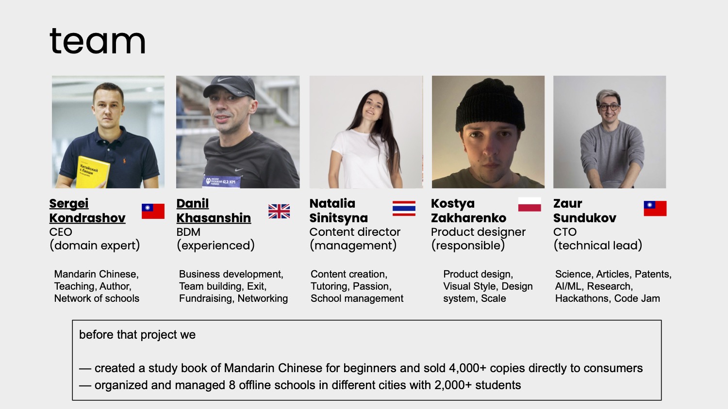
[Slide 7] A team slide should convince investors that you’re the right folks to build this company. Image Credits: Laoshi
I’m not sure if I’m 100% on board with the H3 ethos of founding team building — it’s far more important that you have the right, deep domain knowledge and drive (often expressed as “founder-market fit”), but you also need a breadth of skills to build a good startup. I do admit H3 often is a good template to check out a team’s skill set quickly and to determine whether there are major gaps in the team.
This team slide does two things: It shows that the team is international and distributed. It is diverse and experienced. And it manages — in the box at the bottom — to show that the team has market-relevant experience. Now, I would still need a voice-over to find out:
- How did the team meet?
- What are each team member’s strengths and weaknesses?
- What’s missing from the team?
- Why can this team deliver in a way that nobody else can?
- What is the hiring plan for the current fundraise?
But as a base-level team slide, this ticks a lot of boxes. What it doesn’t show, however, are past successes in startups, and I’d want to dig into that a bit more as well. It certainly is a much better slide than many of the previous ones we’ve covered in these teardowns — you know, the ones that basically stick a Stanford and Tesla logo underneath a picture and call it a day.
The thing you can learn from this slide as a startup is that your team slide is up there with the most important slides, and you’ve got to make it count. Use it to tell your story and to convince us your team is part of the reason to bet on you.
Good summary slide
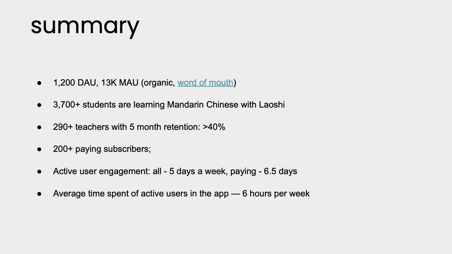
[Slide 10] A good summary slide can be a great way to remind investors why they should be excited. Image Credits: Laoshi
Almost as important as the numbers themselves are which numbers the company is measuring. It shows monthly and daily active users (MAU/DAU), which are crucial metrics to see how sticky an app is. It shows the number of teachers and how long they are staying on the platform, which again speaks to stickiness and the reach the company has. It talks about active user engagement, which shows that people are using the app actively.
For perfect marks, I’d love to have seen these numbers as graphs rather than just as collated numbers. I’d also have liked to see dollar figures here. It’s great that there are 200+ paying subscribers, and that’s impressive for a pre-funding company. But even though the revenue numbers probably are very small, seeing a graph of those, too, is important. If you don’t put it on the slide, the investor will be suspicious about why and ask for it anyway — you may as well skip that conversation and give ’em what they need right off the bat.
The thing you can learn from this slide as a startup is to be deeply aware of the metrics that are going to help you build and deliver your business.
Business model front and center
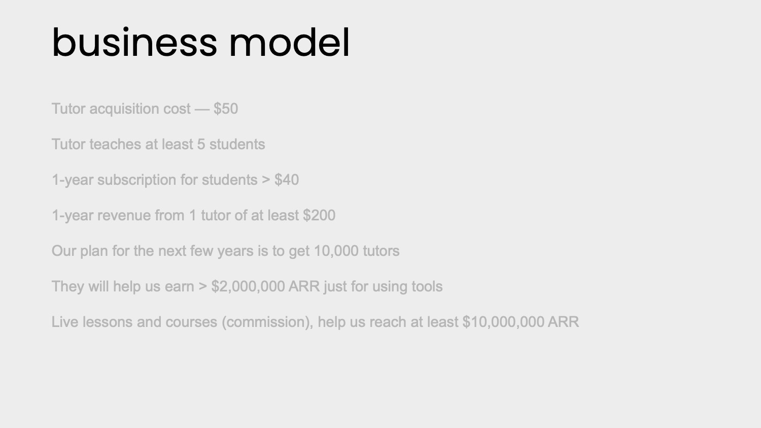
[Slide 14] It’s always a good idea to show that you understand the levers in your business. Image Credits: Laoshi
Having said that, these numbers are super important in your conversations with your investors; essentially, you’re showing how you are thinking about your business and your market and that you understand the levers in your business. In other words: What if every tutor had 10 students instead of five? What if every tutor cost $100 to acquire instead of $50? By plugging all of that into a model and running experiments to increase your trust in the model, you can get a long way toward building a great picture of your business in numbers.
In the rest of this teardown, we’ll take a look at three things Laoshi could have improved or done differently, along with the company’s full pitch deck!
Three things that could be improved
The deck is, overall, very good, but there are a few things that made me really wonder about the viability of the company and the experience of the founders. The rest of the story is rather good, so these stood out as topics I would want to explore more with the founders if I were cutting an angel check.
What are your metrics, and why do they matter?
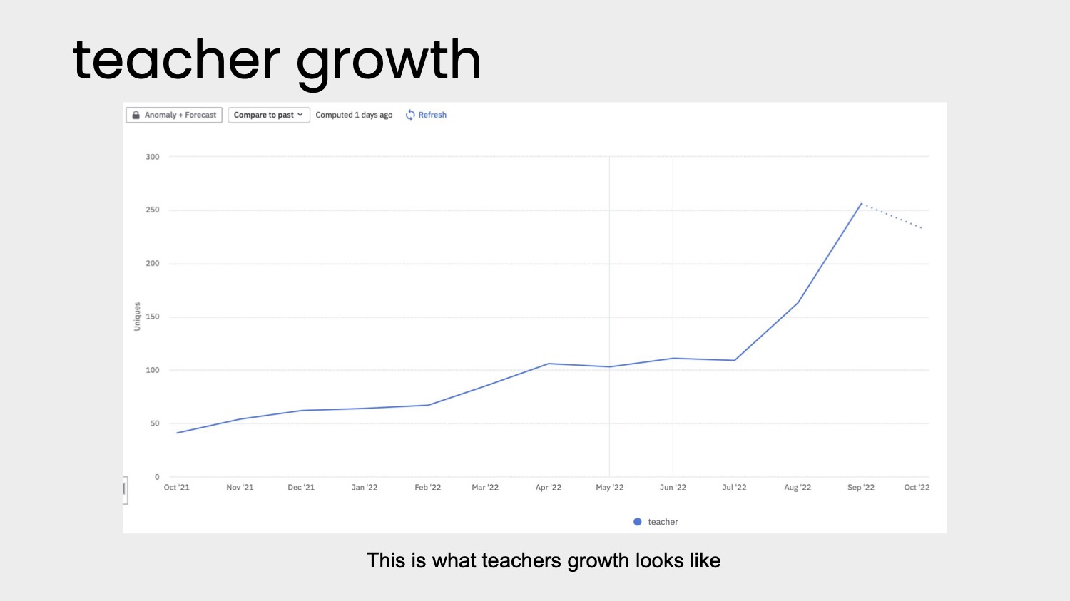
[Slide 8] Up and to the right is good. But. Image Credits: Laoshi
In one universe, this is a valuable graph. In another, this is a waste of time and space. I’m not sure which planet we are on here, and that’s just poor storytelling.
In its deck, Laoshi has two graphs — the above and one showing retention is above 40%. Both are impressive numbers, but the way the graphs are presented is really disappointing. For Slide 8, for example, the chart is just labeled “This is what teachers growth looks like.” That’s grammatically iffy (unfortunate for a language-learning app), but I’m also not sure what I am looking at here.
In the rest of the deck, the company typically refers to the “teachers” as “tutors,” but in this slide, they are referring to them as teachers. The chart’s vertical axis also shows “uniques,” which makes me think that this is traffic rather than sign-ups. If it’s traffic, then this is a vanity metric (we hate those); nobody cares if you get a bunch of people checking out your site or app unless they convert in a meaningful way. If they are sign-ups, then having the axis labeled as “uniques” is a little vague — of course your sign-ups are unique.
All in all, this chart looks good-ish (Exponential growth! Yay! But what is going on with the dashed line at the end? Why is it plummeting?). But it raises more questions than it answers. In one universe, this is a very valuable, meaningful graph. In another, this is a waste of time and space. I’m not sure which planet we are on here, and that’s just poor storytelling.
Better goals for the fundraise, please
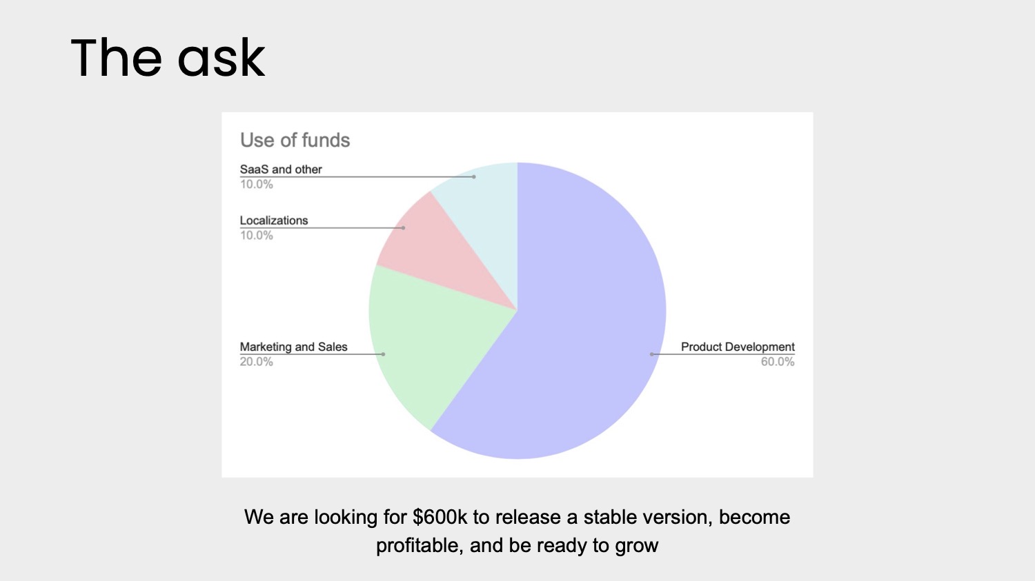
[Slide 15] Yay! There’s an “ask” slide. Unfortunately, it leaves a lot to be desired. Image Credits: Laoshi
Instead of this slide, I think a decent operating plan would answer a lot of the financial questions, and having some good goals for this funding round would be valuable, too.
The goals stated on this slide are worrying: “Release a stable version” implies that the current version is unstable. Even for an MVP, that shouldn’t ever be the case — simple versions, sure. Feature incomplete? Why not. Unstable is worrying; it makes me believe that the work done so far isn’t designed to scale or that there are other technical issues. For me, that little throwaway line would trigger a bit deeper due diligence on the technical side.
The two other goals stated are also worrying. “Become profitable” is a laudable goal, and there’s an argument that companies should be prepared to become profitable at the early stages in the current financial climate, but I’d have thought that aggressive growth is more important at this point.
Again, that makes me want to dig into the founders’ goals and ambitions much more. Profitability is cool and all, but it starts to look like a lifestyle business very quickly, which means that it isn’t VC-scale. Finally, “be ready to grow” doesn’t really mean anything. I think a more specific goal around the metrics would make more sense: “Grow to $50,000 ARR,” or perhaps, “Sign up 400 tutors.”
Is your solution purely theoretical?
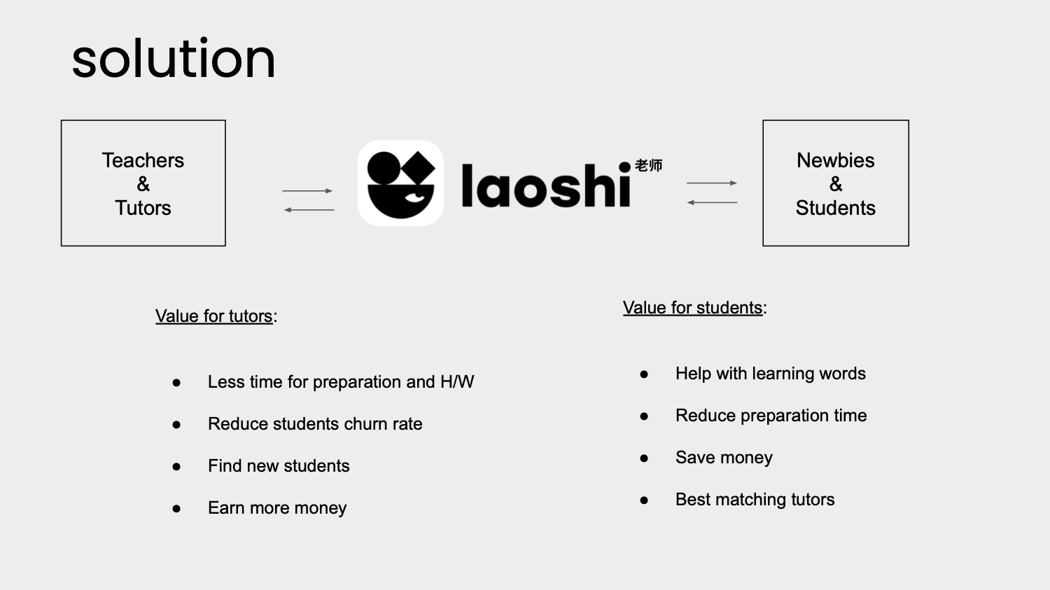
[Slide 4] Having a solution slide is great, but we also need to know what the actual product is. Image Credits: Laoshi
The company does have a confusing road map slide (see Slide 6), but it doesn’t actually show how much of the product is already built. Some screenshots or a user journey would have been helpful here to get a better picture of how much of the app is currently built and alive, as well as what’s in the pipeline.
Sure, investors can download the app and try it out — and they will, as part of the due diligence and pitch process — but for a quick skim through a deck, it’s helpful to show off what you’ve built so far. Giving an impression of the features that exist and the design language, etc., helps give an idea of how good the app is and how it compares with the competition.
Don’t worry too much about whether the app is under-designed or unfinished. In this case, the company claims to have paying customers. So what are they paying for? How does it work? Show that off to help tell the product-market fit story!
The full pitch deck
If you want your own pitch deck teardown featured on TC+, here’s more information. Also, check out all our Pitch Deck Teardowns and other pitching advice, all collected in one handy place for you!