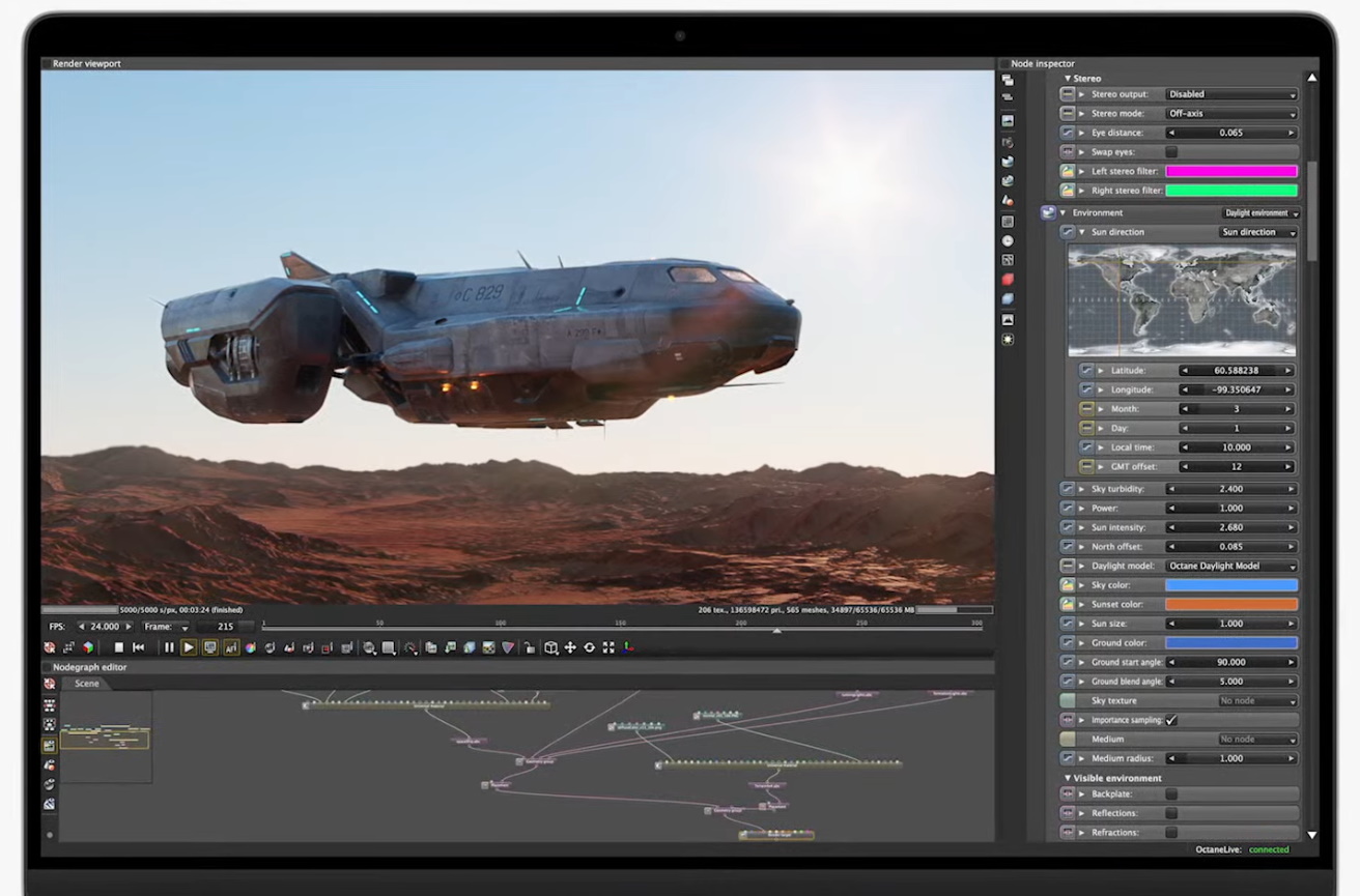
Apple has backpedaled on years of questionable design choices with its MacBook Pros, unceremoniously retiring the universally disliked Touch Bar and adding back the ports and MagSafe users have missed. But in a show of perverse solidarity with the iPhone, the company has added a big, ugly notch front and center on the “best notebook screen in the world.”
It must be something of a humbling moment of Apple, despite its seeming bravado, to be forced to acknowledge that it has been told so clearly for so long that so few of its design innovations were valued by its users. As you salivate over this MacBook Pro, don’t forget why you’re hungry in the first place: Apple’s misguided attempts to streamline in pursuit of a slick promo.
The Touch Bar was interesting in theory but ultimately hamstrung by a lack of compelling use cases and the fact that 90% of the time people just wanted the default keys — and the accessibility loss of mapping these crucial features onto an undifferentiated touchscreen was a misstep as well.
Going all USB-C was another aspirational step that had no basis in reality. All it ended up doing was juicing the dongle industry in a big way and making people carry around half a dozen two-inch cables so they could use the various devices and drives they’ve accumulated over the years.
The keyboard design has reverted to a thicker one with a “mechanical feel” (we’ll see) after the dismal failure of the butterfly switches. Turns out people don’t care about losing that last millimeter if it means typing sucks and your keys break on a regular basis.
So, after withdrawing or failing to improve on these and other aspects, Apple has turned around and added them back in as if they were novel ideas. The irony of seeing a commercial touting the power of the M1 Pro Max but there’s an SD card reader assembling itself in the cutaway view is thick and worth savoring.
But then Apple went and did a bad thing.
They notched it
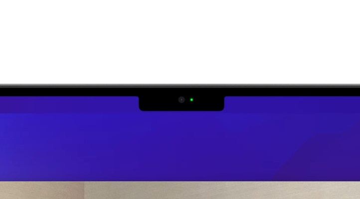
Now, I really don’t like notches. I know that not everyone feels that way. But I find them very distracting both in everyday use and on fullscreen media. A hole punch is even worse, but the notch isn’t great. The new iPhones aren’t as ugly as the old ones, but that notch means I’m sticking with my SE 2 for a while longer. (RIP, original SE … you’ll return some day.)
What appears to have happened is that Apple essentially extended the display upward and closer to the bezel, but couldn’t shrink its new webcam down enough to fit it in there (there’s no Face ID or anything). So in a sense you’re gaining space, or so my perennial Apple apologist colleagues have convinced themselves.
What do you need to do with that middle piece of the menu bar or whatever anyway, they say? It’ll probably be letterboxed out in media; the new screen aspect ratio is taller than 16:9, 2:1, 21:9 and other common ratios. And when you’re in a fullscreen app they’ll black out either side of the notch, so you won’t see it (though on the other hand, it wipes out the extra space you’ve supposedly gained). It’s a net gain, they say.
Yeah, but it’s ugly.

Look, you can’t even see it! Of course, you can’t see the whole top quarter inch. Image Credits: Apple
It’s really a super simple question. Which would you prefer, a screen with a notch or a screen without a notch? The answer is pretty much always “the one without a notch,” because the notch is disruptive to the basic mission of a display, which is to show things. Anything that obtrudes into the rectangle (the shape we now expect) of the display prevents it from using that shape fully and effectively. Fundamentally speaking, everything you show on the screen has a notch taken out of it or otherwise accommodates the notch in some fashion.
Some people truly won’t mind. Some people truly won’t notice. I’m happy for them. But some people also leave “TruMotion HD Smooth” on and make everything on their TV look like a soap opera. Some people have both cold LEDs and warm incandescent bulbs in the same room. Some people don’t organize their books by color. Okay, you get what I’m saying — and the objections of a neurotic aesthetic like mine can go too far.
Tech should be as invisible as is practically possible. The whole industry has been pursuing the reduction of wires and the increase of automation and “smartness” so that their products can be ubiquitous and practically invisible. A little sphere the size of a tennis ball (now in five fabulous new colors) but it’s a conduit to your entire digital world. A pair of little earbuds that “magically” charge themselves, connect automatically and adjust their levels based on the idiosyncrasies of your ear canal. And so on.
A display is meant to be a magic window: a “Retina” display sharp enough to be mistaken for real life; a 120 hz refresh rate to enhance the illusion and prevent lag and blur from noticing the difference between digital and physical; a minimal bezel to minimize the “frontier” between those two worlds. Every advance in displays has been in pursuit of the idea of a more magical window. The notch is a step backward instead of forward, simple as that. It’s less magical; it’s less real; it’s obtrusive and artificial: the digital compromised to admit the physical.
You know it’s true — even if it doesn’t bother you — because as soon as it is physically possible for Apple to remove this notch, they will. They know and we know that screens are better without notches. And when they do, they’ll act like they’ve reinvented the wheel on purpose, like they did today when they touted the return of decade-old features no one asked to be changed in the first place.
