Clubhouse, the social audio app that first took Silicon Valley by storm and is now gaining much wider appeal, is an interesting user experience case study.
Hockey-stick growth — 8 million global downloads as of last month, despite still being in a pre-launch, invite-only mode, according to App Annie — is something most startups would kill for. However, it also means that UX problems can only be addressed while in “full flight” — and that changes to the user experience will be felt at scale rather under the cover of a small, loyal and (usually) forgiving user base.
In our latest UX teardown, Built for Mars founder and UX expert Peter Ramsey and TechCrunch reporter Steve O’Hear discuss some of Clubhouse’s UX challenges as it continues to onboard new users at pace while striving to create enough stickiness to keep them active.
Homepage curation
Peter Ramsey: Content feeds are notoriously difficult to get right. Which posts should you see? How should you order them? How do you filter out the noise?
On Clubhouse, once you’ve scrolled past all the available rooms in your feed, you’re prompted to follow more people to see more rooms. In other words, Clubhouse is inadvertently describing how it decides what content you see, i.e., your homepage is a curated list of rooms based on people you follow.
Except there’s a problem: I don’t follow half the people who already appear in my feed.
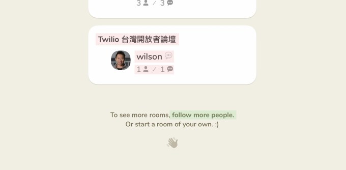
Image Credits: Clubhouse
Steve O’Hear: I get it. This could be confusing, but why does it actually matter? Won’t people just continue to use the homepage regardless?
Peter: In the short term, yes. People will use the homepage in the same way they’d use Instagram’s search page (which is to just browse occasionally). But in the long term, this content needs to be consistently relevant or people will lose interest.
Steve: But Twitter has a search page that shows random content that I don’t control.
Peter: Yeah, but they also have a home feed that you do control. It’s fine to also have the more random “slot machine style” content feed — but you need the base layer.
The truth about aha moments
Peter: In the early days of Twitter, the team noticed something in their data: When people follow at least 30 others, they’re far more likely to stick around. This is often described as an “aha moment” — the moment that the utility of a product really clicks for the user.
This story has become startup folklore, and I’ve worked with many companies who take this message too literally, forgetting the nuance of what they really found: It’s not enough to just follow 30 random people — you need to follow 30 people who you genuinely care about.
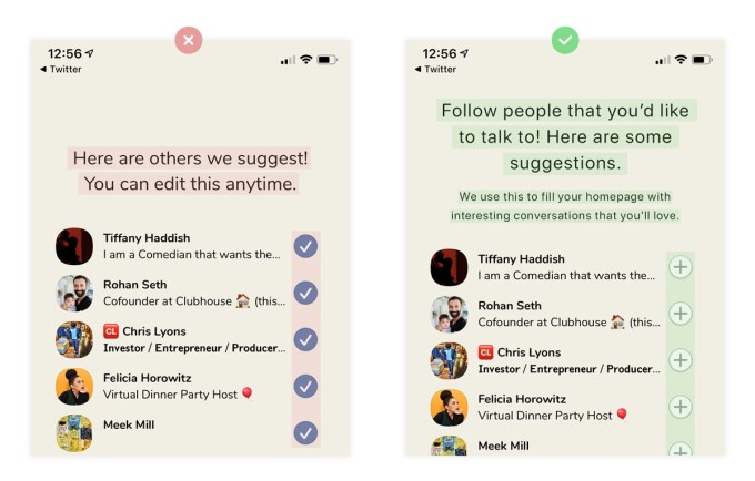
Clubhouse has clearly adopted a similar methodology, by pre-selecting 50 people for you to follow while signing up.
Have you noticed that some people have accumulated millions of followers really quickly? It’s because the same people are almost always recommended — I tried creating accounts with polar opposite interests, and the same people were pre-selected almost every time.
At no point does it explain that following those 50 people will directly impact the content that is available to you, or that if your homepage gets uninteresting, you’ll need to unfollow these people individually.
But they should, and it could look more like this:
Steve: Why do you think Clubhouse does this? Laziness?
Peter: I think in the early days of Clubhouse they just wanted to maximize connections, and by always recommending the same people (Clubhouse’s founders and investors), they could somewhat control the content that is shown to new users.
But as Clubhouse exploded, they never took the time to go back and do this screen properly. At least that’s what I’d speculate.
Steve: So what lesson can other founders take away from this?
Peter: As your platform grows in size, the requirements will change. Things that once seemed sensible may no longer be, so take time to look back at older flows and ask yourself if that’s still the best option.
Steve: Do people not do that?
Peter: In my experience, no. It’s just too easy to never touch the old flows again, as there’s always something new (or some fire burning somewhere).
A UX crutch for search
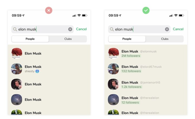
Pete: Following the right people on Clubhouse is necessary to find interesting conversations, so it’s important to know that you’re following real people — e.g., the real Elon Musk.
Over time it’ll be necessary to verify identities like the other social networks do, but it’s an unfeasible task for the small team that runs Clubhouse currently.
Yet, they’ve built an app that is as simple as their rivals.
But therein lies a problem: Established social networks can appear simple purely because they do so much behind the scenes.
Steve: So, if what you’re saying is that Twitter can have such a simple app because they pay process and back end costs, how is a startup supposed to build a good and simple UX?
Peter: That is the golden question. You know those business-school triangles that people love to draw, where there are three sides showing “cost,” “time,” “quality,” and they say, “You can only pick two”? That’s annoyingly true here.
Great UX takes time and effort, normally obsession, and it doesn’t come cheap. The key is to understand that you can’t just copy Facebook’s UI and expect to have just as good UX, because you don’t have the same product.
Steve: But would a startup actually benefit from that additional cost? Or is a more “basic” UX good enough?
Peter: It can be good enough. If you’re a bootstrapped company and growth isn’t a problem, then yeah, spending 100 hours painfully fixing minor UX issues may be a bad idea. But if you’ve just raised millions, and looking to go out there and build the best possible product, I’d argue that you need that desire.
A broken follow hook
Peter: It’s no secret that social media companies want you to be addicted to their apps. They’re designed to be infinity pools of content — always available to give you another quick shot of dopamine.
One of the most common tools used to create these habits can be described as a “hook” — essentially a pattern of action and reward that is addictive. And one of the key components of a hook is an investment: in this instance, the user investing time into following people, and expecting more great content in return.
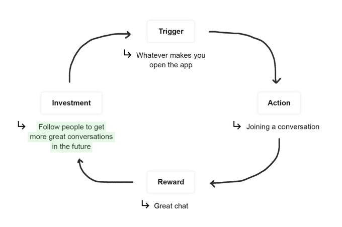
But there’s an issue: The reward for that investment is neither guaranteed nor instant. And I don’t just mean that the reward is variable — it can be entirely nonexistent.
Steve: I thought this the other day, as I was following people randomly, not knowing if they’ve ever been online. But isn’t this just a design flaw of the concept, rather than the UX of the app?
Peter: It is certainly a part of the concept and something that Clubhouse will have to battle uphill with. But that doesn’t mean they should do nothing (which I argue is their approach right now). The few changes I’ve suggested would make a huge difference. It wouldn’t remove the issue, but it’d dampen the effects.
Steve: More generally, what’s the lesson here for other founders?
Peter: Be aware of hooks, and a good place to start is by reading the book “Hooked” by Nir Eyal. By understanding how habits are formed within your app, you can maximize their effect.