
In July last year, Spotify extended its shared-queue feature, Group Session, to support remote usage. Essentially a “party mode,” the feature offers a way for participants to contribute to a collaborative playlist in real-time and control what’s playing across everyone’s devices.
As TechCrunch’s Sarah Perez explained, Premium users are able to tune into the same playlist or podcast together at the same time, even if they’re not in the same place. Prompted by the coronavirus pandemic, Spotify, like a spew of other tech companies, is trying to create more shared online experiences that are lockdown-proof, and as people are being forced to spend more time indoors and online.
In our latest UX teardown, with the help of Built for Mars founder and UX expert Peter Ramsey, we highlight some of Spotify Group Sessions user experience failings and offer ways to fix them, as well as a number of UX features that are done right. Many of these lessons can be applied to other existing digital products or ones you are currently building, including the need to remember the difference between usernames and display names, when it makes sense to combine common actions into one, and how to use “react and explain” on-boarding.
Usernames and display names
Always remember the difference between user names and displays.
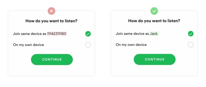
Image Credits: Built For Mars
The fail: If you created a Spotify account using Facebook, then you’re arbitrarily assigned an 11-digit display name. This is then shown to everyone you invite and is totally meaningless.
The fix: Prompt the user to set a real display name when they create their first session. It avoids confusion and creates a more real experience.
Steve O’Hear: This looks really sloppy and unprofessional, as well as being useless from a usability point of view. However, I’m guessing this is technical debt of some kind; any idea what’s going on here?
Peter Ramsey: Yes, it happens when usernames go from being irrelevant (i.e., Spotify) to suddenly relevant (i.e. when they add social features). But by that point, the database/infrastructure is already in motion.
Can you think of an example where this has been done right?
Twitter is the perfect example of this done right. There can only be one @jack, but loads of people with the display name Jack. Otherwise basically every tweet would be by some obscure name and the world would feel like Reddit (i.e., anonymous).
Combining common actions into one
It often makes sense to combine common actions into a single user action.
The win: Spotify noticed that most of their users will copy the share link, and then need to click to go back into the lobby. Instead of allowing these to be two actions, they combined them into one.
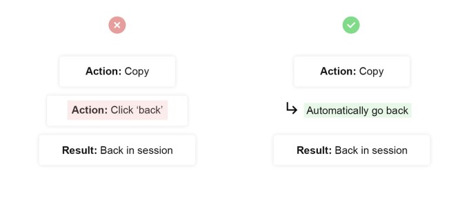
Image Credits: Built For Mars
Why is this important?
Well, it helps to reduce the amount of effort and thought behind a process.
When should you combine actions? Gut instinct?
No follow the data. You should probably know that >80% of your users always do action A and B in immediate succession, otherwise you may be making it worse by combining them.
What’s a good example of this?
When you click to open a link in a new tab, it doesn’t open the tab in the background, it opens the tab AND sets it as the active tab. That could be two actions: (open new tab, set window as active). But browsers have combined it into one action.
Add context
Consider communicating the context to important decisions.
The fail: When someone accepts an invitation to join a Group Session, they’re immediately faced with a decision. Except, Spotify doesn’t provide any context or rationale behind the two options — despite being totally different experiences.
The fix: Consider it like a UX law: If asking the user to make a decision, ensure that they actually have enough information to make that decision. Simple, right?
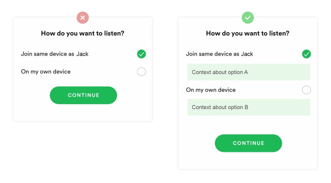
Image Credits: Built For Mars
This one feels rather obvious but I know it is quite a common mistake. Why do you think that is?
I think this can happen because the people building the product have been working on it for so long — and intimately understand every fine detail — that the decision appears clear to them. Instead, you need to find someone who doesn’t understand how your product works and learn if they’re confused.
This typically is difficult with user testing, as people hate admitting that they don’t understand stuff. Even if they say that they’re being honest, nobody likes to feel stupid.
React and explain
When normal on-boarding isn’t suitable, remember “react and explain.”
The fail: When multiple people are using this feature, all of the participants can control the music. That means pausing, playing, skipping and changing songs. Yet, at no point is it explained how this works or the implications of this feature.
The fix: For complicated apps, with lots of features, you can’t really be expected to explain every single action — nobody would listen. But in this instance, Spotify should have remembered the lesser-used type of on-boarding: “React and explain.” In this, you’d show a message explaining what just happened (i.e., someone pausing the music), and teach the group about how the control system works.
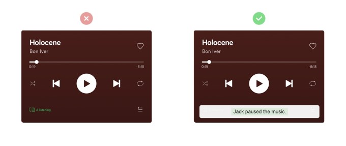
Image Credits: Built For Mars
I’m guessing you learned this one through a chaotic Group Session?
When I tested this with five real friends it quickly descended into chaos. It was horrific. Nobody knew who was pausing; everyone said they weren’t but people clearly were. And there’s a little bit of lag, so multiple people pressed play, and it re-paused. Genuine hell.