Google today announced a subtle but welcome refresh of its mobile search experience. The idea here is to provide easier to read search results and a more modern look with a simpler, edge-to-edge design.
From what we’ve seen so far, this is not a radically different look, but the rounded and slightly shaded boxes around individual search results have been replaced with straight lines, for example, while in other places, Google has specifically added more roundness. You’ll find changes to the circles around the search bar and some tweaks to the Google logo. “We believe it feels more approachable, friendly and human,” a Google spokesperson told me. There’s a bit more whitespace in places, too, as well as new splashes of color that are meant to help separate and emphasize certain parts of the page.
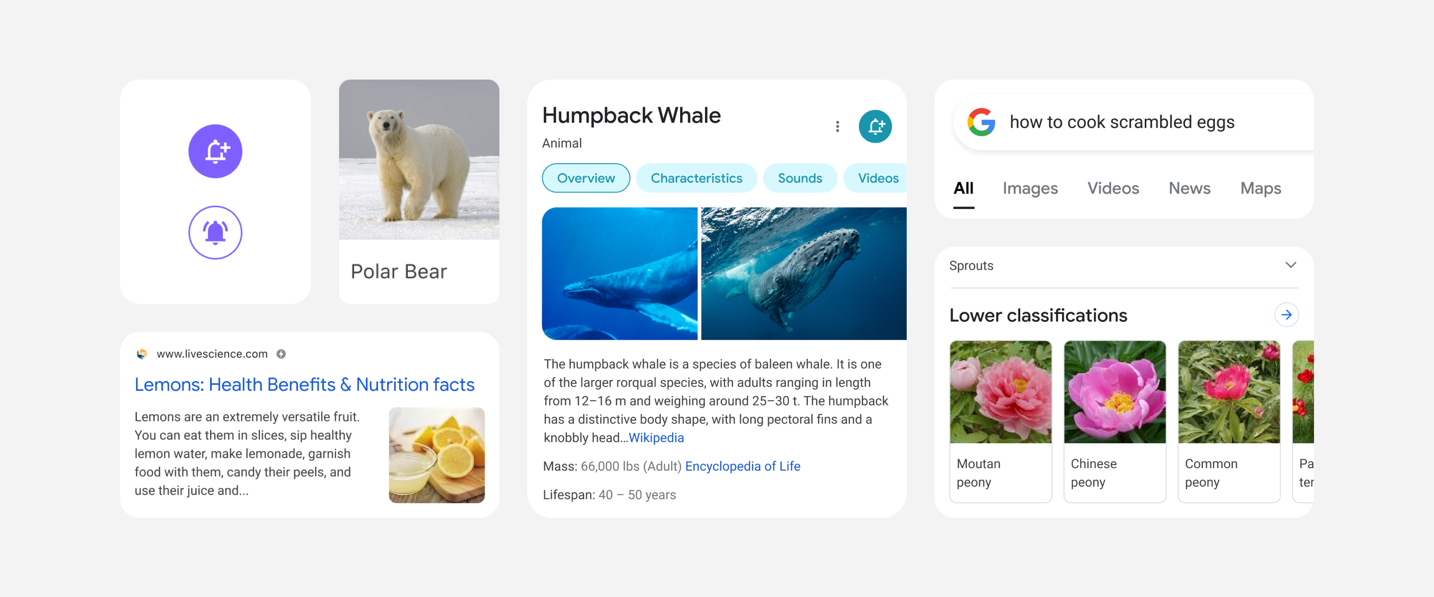
Image Credits: Google
“Rethinking the visual design for something like Search is really complex,” Google designer Aileen Cheng said in today’s announcement. “That’s especially true given how much Google Search has evolved. We’re not just organizing the web’s information, but all the world’s information. We started with organizing web pages, but now there’s so much diversity in the types of content and information we have to help make sense of.”
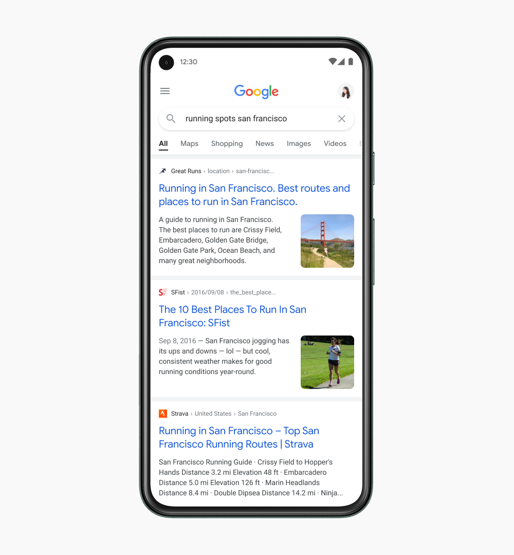
Image Credits: Google
Google is also extending its use of the Google Sans font, which you are probably already quite familiar with thanks to its use in Gmail and Android. “Bringing consistency to when and how we use fonts in Search was important, too, which also helps people parse information more efficiently,” Cheng writes.
In many ways, today’s refresh is a continuation of the work Google did with its mobile search refresh in 2019. At that time, the emphasis, too, was on making it easier for users to scan down the page by adding site icons and other new visual elements to the page. The work of making search results pages more readable is clearly never done.
For the most part, though, comparing the new and old design, the changes are small. This isn’t some major redesign — we’re talking about minor tweaks that the designers surely obsessed over but that the users may not even really notice. Now if Google had made it significantly easier to distinguish ads from the content you are actually looking for, that would’ve been something.
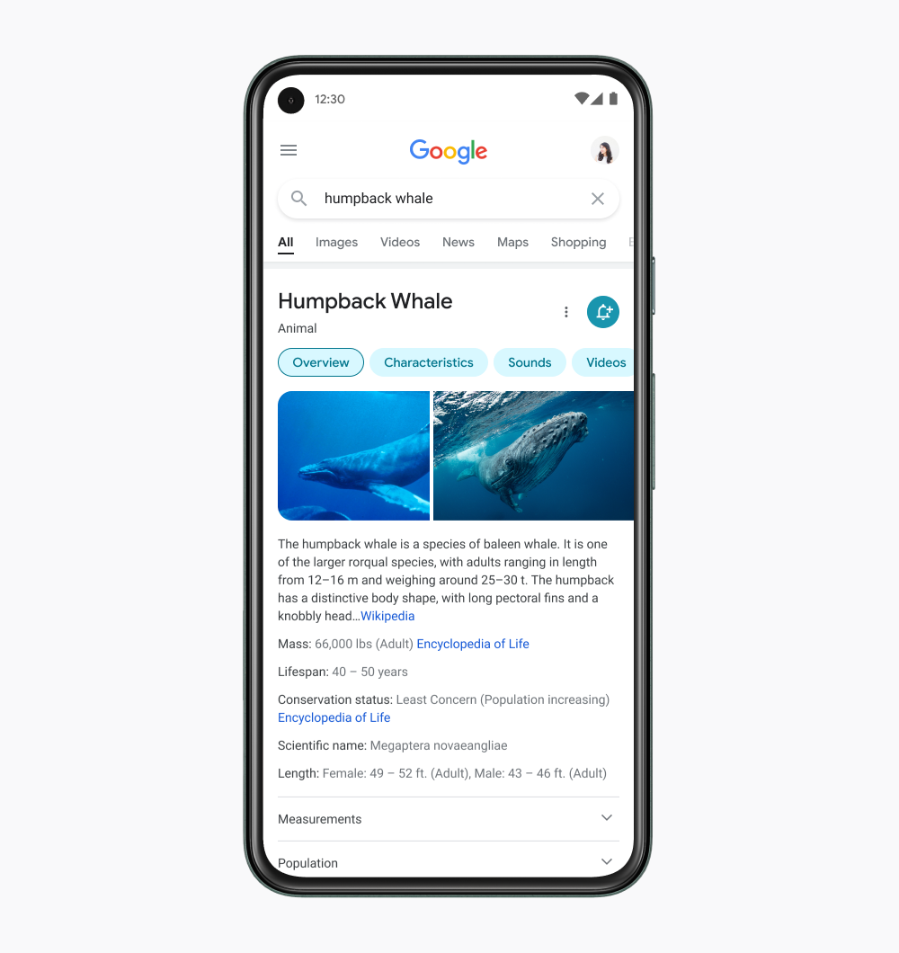
Image Credits: Google