Hulu is the first major streaming platform to offer a social watching experience. And with most major league sports now being allowed to resume behind closed doors, Hulu’s combined proposition with ESPN will likely help entertain the service’s 30+ million users over the winter months.
But users have a surplus in choice of streaming services right now, so how will Hulu stay competitive?
With the help of UX expert Peter Ramsey from Built for Mars, we’re going to give Hulu an Extra Crunch UX teardown, demonstrating five ways it could improve its overall user experience. These include easy product comparisons, consistent widths, proportionate progress bars and other suggestions.
Comparing features inside packages
If your product/service has different tiers/versions, ensure that the differences between these options are obvious and easy to compare.
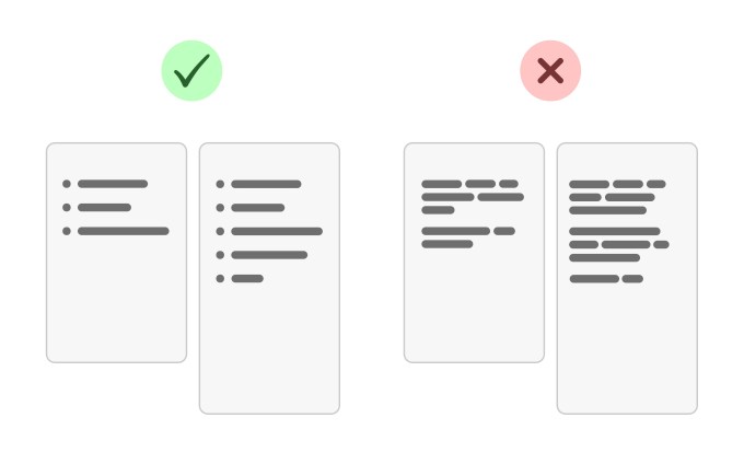
The fail: Hulu has four different packages, but the listed features are inconsistent between options, making it incredibly difficult to compare. Instead of using bullet points, they’ve buried the benefits within paragraphs.
The fix: Break the paragraphs down into bullet points. Then, make sure that the bullet points are worded consistently between options.

Steve O’Hear: I’m really surprised this one got past the marketing department. Not a lot to say except that I would argue that when UX, including layout and copywriting decisions, become decoupled from business goals and customer wants, a company is in trouble. Would you agree that’s what has happened here?
Peter Ramsey: Honestly, this happens all the time. I think it’s just a symptom of the designers building things that look nice, not things that work nicely. I probably raise this issue on about one-third of the private audits I do — it’s that common.
Keep a consistent width
Try to maintain a consistent page width throughout a single journey — unless there’s a major benefit to changing the width.

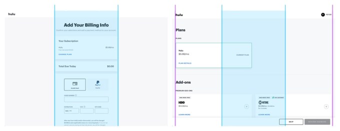
The fail: During the Hulu sign-up process, the page width doubles at a totally unnecessary point. This is disorienting for the user, with no obvious rationale.
The fix: Hulu has a pretty consistent first-half of their journey and then it drops the ball. I’d redesign these “extra-wide” pages to be the default width.
For clarity, I don’t think you’re saying that the problem here is that the page got wider — because later on the wider page is useful — but it’s that the page got wider before it was useful, right?
Exactly, it’s the unjustified change that’s frustrating and awkward.
More generally, why is changing page width an issue?
In short, it takes a small amount of effort for the user to work out what’s happened. It may only be a split second, but these tiny issues make things feel disjointed.
An analogy I like is of barnacles on the hull of a ship. One doesn’t slow anything down, at least not noticeably. But with distance (i.e., time) and volume (i.e., lots of tiny errors), then they become a problem.
Don’t ask your users to do math
Don’t expect your users to ever bother doing math — because most of the time they won’t.
The fail: While creating your Hulu package — by selecting add-ons — there’s no total price summary. You know the base price and the individual add-on price, but it doesn’t tell you what your total monthly price will be. Given that these prices aren’t rounded numbers, it’s awkward and frustrating.

Image Credits: Hulu
The fix: Don’t expect your users to add things up, because they won’t. Show a total price.
Obviously we don’t know the intention here but do you suspect a rudimentary error or is there something like dark patterns going on here to trick the user to not keep track of their total spending?
I’m not sure, possibly. I like to think that Hulu has more integrity than that, and this is just an oversight.
Lazy errors
If there is a known, or predictable, reason why a user can’t access your website, then be clear with your error messages.
The fail: You can only watch Hulu from an IP address inside the United States, which is fair enough. But, it never actually tells you that as you sign up. Instead, it lets you go through the entire account creation process, and then at the final stage, it shows a vague error. This error makes it look like you should try again, which is annoying because no amount of refreshing will make this work.
The fix: Ideally, they should warn the user right at the beginning. But if not, then at least make this error message actually explain what the error is.
Just to clarify, how do you know that this was the real issue and not some other error?
Because I used a VPN and then it worked immediately. Turn the VPN off, and it error-ed again. I’m absolutely sure.
Do you think this oversight is because if you’re not in the U.S., then you’re not a potential Hulu user? In other words, why should they care?
Exactly. They’ve built an experience for their users and probably don’t care about the rest. But what they’re ignoring is that a “real” U.S.-based user may be on holiday in the U.K., and then it wouldn’t work. The experience of being a traveling Hulu user basically makes a VPN a necessity.
Disproportionate progress bars
Progress bars — as opposed to steps — are a visual representation of progress. When the bar is 50% full, that means you’re 50% of the way through the process. When it’s 75% … you get the idea. So the rule is this: The progress bar needs to accurately represent the actual progress.
The fail: Hulu’s on-boarding has a two-step process, with a progress bar that makes no sense when viewed without the “step counter” below it. If you need a step counter for your progress bar to make any sense, then why have the progress bar at all!
The fix: Ensure that if someone was to look at the bar in isolation, then they can guess how far into the process they are as a percentage.
This feels like really good advice. However, what are the pros and cons of choosing only a step counter or only a progress bar? Which is ultimately best?
I think they work best in different scenarios and contexts. For example, if you had 100 steps, then having a progress bar move 1% each step might not even be noticeable and therefore would be a waste.
