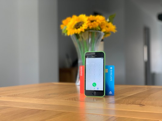
Customer support is a huge part of a user’s experience, and one that every bank likes to say they’re great at. But there is a lot we can learn from the mistakes that U.K. banks have made.
Based on his latest research report into the user experience of a dozen leading British banks — including Barclays, HSBC, Santander, Monzo, Starling and Revolut — Built for Mars founder Peter Ramsey shares his top five UX tips for customer support.
We dive deeper into each tip, including discussing the thorny topic of call decision trees (press 1 for … press 2 for … etc.), which Ramsey advises should be depreciated in the age of mobile apps, how push notifications might be employed to provide a more Disney-like queuing experience, why hold music is bad as a concept and why it’s time to ditch the live chat bait and switch.
Get rid of call decision trees
Call decision trees are annoying to use and unnecessary for users who have access to an app. Instead of asking customers to navigate via their telephone’s numeric keypad, use in-context questions inside the app, and then put the full number, including the correct extension, behind a button.
TechCrunch: Perhaps we should clarify what you mean by “call decision trees” and — considering they’ve been an industry standard for years — why is now the time to get rid of them?
Peter Ramsey: The decision tree is that automated “press 1 for … press 2 for … ” process you sometimes have to go through at the beginning of a call. I should clarify: It’s not time to eradicate them entirely, because it’s pretty useful for people who only use telephone banking. But for anyone who has access to an app, it’s totally unnecessary.
Related to this, I gather at least one UK bank has done this right. Which one was it and can you talk us through what they did?
So, a few of the banks have removed this: First Direct, Lloyds, Nationwide, Natwest and Starling. That being said, they didn’t seem to actually direct me to different extensions within the app, I’m fairly sure they just have one line.
Let users see where they are in the queue
It’s important that the user knows where they are in the queue, and how much longer is left. Not just being told once at the start, but being updated throughout. This is best done through the app — why not give them push notifications when they move forward in the queue?
I gather it’s not just a case of being given a queue number or an estimated queue time, but best practice is to provide both. That’s because the real value is in our subconscious ability to constantly reestimate the waiting time based on the queue progress and position. Can you explain the thinking here?
Yeah, exactly. The value is not knowing how long it will take me, but the ability to be able to constantly evaluate your current position, progress and time invested. I used an example of queueing in Disneyland, but not being able to see the queue — it’d be so frustrating. A better example I’ve thought of since is Argos, and how they have the screens to show you your position in the queue, and which number they’re currently serving. Whenever I’m in Argos I’m glued to that screen, and if they took it away you’d find the wait felt a lot longer.
For app users, you suggest employing push notifications to provide queue updates. Wouldn’t push notifications add to the annoyance while also being on hold in a phone queue?
It would yeah, and I wanted to go into detail on this but it’s a fairly comprehensive point. The push notifications would be annoying if they were pinging every 30 seconds, but let’s say you got one notification to say “Hey, you’re next,” that’d be awesome. But, then I’d expect to be able to see my live position in the queue, a bit like the Domino’s “your pizza is cooking” tracker.
Ditch the hold music
Hold music is nearly always bad. People don’t want to sit and listen to a jingle for 20 minutes — you’re just guaranteeing that they’ll be annoyed when you finally pick up the phone. Passive and gentle music is okay as long as it’s non-repeating.
Before we rip hold music apart — again, it’s a pretty legacy feature — what do you think its intended purpose is?
There are a few studies on this, including suggesting that it helps reduce anxiety and improve cognitive performance. But, remember it was designed in a world with fewer alternatives. Whatever its purpose was, it’s not needed any more.
If I’m understanding correctly, you’re not actually saying hold music is bad, you’re saying the choice of music is usually bad. That sounds awfully subjective, but I’m guessing there is more to it than that?
Oh no, I’m saying hold music is bad as a concept, not the songs — although these jingles are mostly terrible too. I wouldn’t want to listen to any song on repeat for 20 minutes, let alone without adding the variable of it being massively distorted.
Yet you say that passive and gentle music is okay as long as it’s non-repeating. So, it’s the type of music combined with its repetition that really sucks? If hold music is discarded entirely, what are you proposing replaces it?
I used “okay” as a verbal shrug. Metro, for example, played different songs, and it wasn’t nearly as bad. The repetition certainly makes it a lot worse. So, I’d replace this with a totally app-based queue. You click a button, it joins a queue — without you even being on the phone — and then you receive a push notification when you’re next, and then they call you.
If it takes 8 hours to respond, it’s not a live chat
We know the “live chat” functionality doubles up as a nice ticketing queue when nobody is immediately available, but it ruins the illusion of that chat being “live.” You need to let the user know that a response is likely to take considerably longer.
This one feels like dark patterns have crept into customer support — a kind of bait-and-switch where you think you’ve entered live chat but you’re out of hours and have actually been redirected to asynchronous ticketed support. Am I understanding the criticism correctly and can companies switch modes more transparently?
You’re spot-on here. I wish I’d thought of the phrase “bait-and-switch” when writing the article. It gives the illusion of being available 24/7, but that’s not true. It’d be like having a physical branch open 24/7, with people behind the desk smiling, but then when you walk in they’re cardboard cutouts and you need to leave a note.
Make sure pages are persistent after logon
When users re-authenticate into your app, make sure the page they were on is persistent. It’s annoying to be on a live chat, your phone to go to sleep, and then when you log in again get put on the homepage.
I’m not lying when I say that Barclays live chat did this to me several times the other day. If I recall correctly, the app even warns you that this can happen, but it still tripped me up. However, it’s not just Barclays that makes this mistake as banks appear to prioritise security over page persistence?
It’s not even a question of security, because I’m totally fine with reauthenticating after inactivity. It’s that once I’ve reauthenticated, I expect to be back in the chat right away. All the banks except Monzo and Revolut did this, and it was genuinely infuriating.