“I’ve got a really high attention to detail, which might sound great, but it’s possibly a curse because I can’t help but spot problems with everything around me,” says Peter Ramsey.
He’s the founder of Built for Mars, a U.K.-based UX advisory, and he has spent the last three months documenting and analyzing the user experience of a dozen leading British banks — both incumbents and challengers — including Barclays, HSBC, Santander, Monzo, Starling and Revolut.
“Quite literally, I opened 12 real bank accounts,” he explains. “You remember the stress of opening one account? I did that 12 times, [and] it was probably a terrible idea. But I really needed to control as many variables as possible, and this was the only way of doing that.”
Next, Ramsey says he “logged everything,” recording every click, screen and action. “I saved every letter, and made a note of when they arrived. I recorded pretty much everything I could,” he recalls. “At one point I even weighed all the debit cards to see if some were heavier. That was a total waste of time though, because they all weighed the same amount. But you see what I mean, I just thought about making it as scientific as possible. Also, UX is really quite subjective, so I wanted to back up my opinions with some more quantifiable metrics.”
The resulting analysis — covering opening an account, making a first payment and freezing your card — supported by individual bank case studies, is being published on the Built for Mars website over the month with a new interactive chapter released weekly.
After being given early access to the first three chapters and an initial series of case studies, I put several questions to Ramsey to understand his motivation, methodology and what he learned. And if you’re wondering which bank came out on top, keep reading.

TechCrunch: Why did you choose to do this on banks?
Peter Ramsey: My background is in fintech, and I think the banks are just in this weird place right now. When they first came out I think consumers were surprised at how much better the apps were. Banking was renowned for having old software, it was almost acceptable for an old bank to be buggy. But now that these challenger banks have been out for five years, I think that perception has changed. So I chose the banks because they represent this industry of “challenger” versus “legacy.” Plus, for billion-dollar companies, you’d expect them all to really care about experience.
Have you checked your credit score after signing up to 12 separate bank accounts!?
[Laughs] I don’t dare. It actually shouldn’t be too bad because I didn’t get any overdrafts.
Looking through the case studies, pretty much all the banks have made very obvious mistakes. Why do you think this is?
I think people will be really surprised how many obvious errors have been made — some real facepalm moments even from the challenger banks.
I think the answer of “why” is difficult; it’s probably a combination of lots of things. Do the banks actually understand the long-term value of UX? Or are they confusing UX with UI? Do they think UX is the role of the designer? Is there even anyone on the product team whose job it is to care about UX? Have they hired the right people who really obsess over design? I’ll mention Monzo here — they absolutely get it, it’s clear they fundamentally care.
It didn’t take long to mention Monzo! In the report, you give examples of where you think incumbent banks may have mistaken UX for UI. What do you mean by this, and how would you define the two?
Yeah, so UX quite literally stands for “user experience,” and UI is “user interface.” A good way to think about the differences are with the example of designing a car. The interface (UI) would cover how the dashboard was laid out, where the wheel was, and to a certain extent the fabrics and colors used. But the experience is far more broad; it covers how it feels to drive. So, is the seat comfortable after 100 miles? When it’s dark can I still fumble around and press the right buttons on the stereo. Are two of the buttons so close together you sometimes press the wrong one. That sort of thing.
As you said earlier, UX can be quite subjective, and so you wanted to back this up with things that are measurable and quantifiable. So things like:
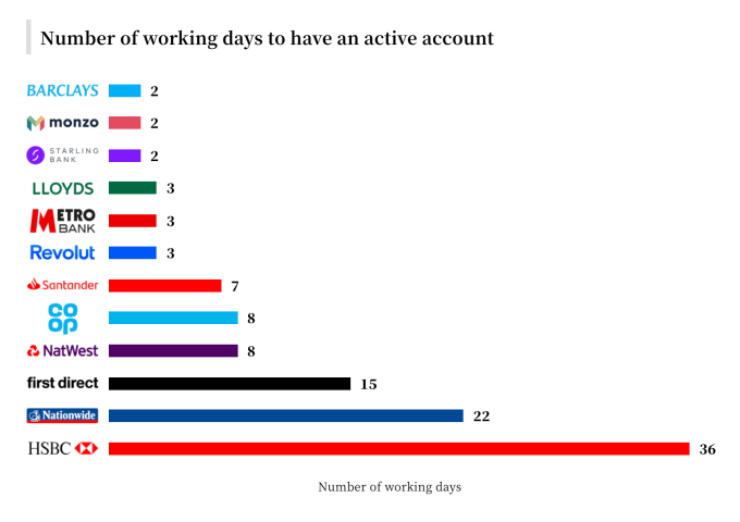
- It took 18x longer to open an account with HSBC than it did with Monzo;
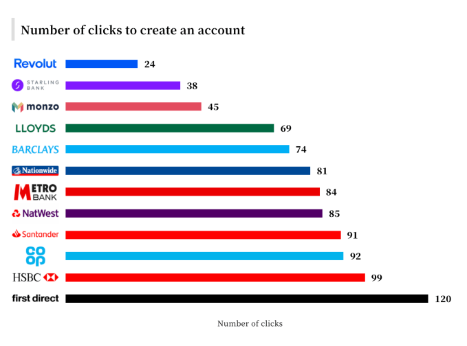
- It took 5x as many clicks to open an account with First Direct than it did with Revolut;
- Payment notifications were at least 2x faster with the challenger banks, and in some cases 100x faster.
What is the discovery that surprised you the most?
I think the biggest surprise to me was just how bad some of the legacy bank account opening processes were. Take Nationwide for example, I finally get all my account set up (which took seven physical letters), and then when I try to set up my online banking I had to “request” a card reader, which took another week. Who doesn’t want online banking? Why not send me that at the beginning with my card?
A number of the challenger banks provide instant access to Apple Pay, without the need for a physical debit card to arrive in the post first. You write that skeptics who argue that this feature is a gimmick, because it offers limited functionality compared to having a physical card, are mistakenly assuming that the value is utility rather than psychology.
Specifically, you write: “the value of getting some instant access is in the feeling of progress, achievement and ownership. By giving some access to the account, and proving that it is open, it subconsciously changes the way you think.”
Why is this important? And did you find other examples of psychology over utility?
It’s important because often the subconscious value you get from something is actually why you enjoy it so much. If the world was designed purely for utility, then you may end up with transparent doors on dishwashers, which would let you see when the wash is finished — but when you think about it, a lot of the value in a dishwasher is that it gives you somewhere hidden to temporarily store dirty dishes.
There is so much hidden psychology in the world of software, but it’s impossible to tell when it was designed with intent or a happy accident. Another example would be how some of the banks show you which bank you’re about to send money to. Your first reaction is that it was designed to stop people accidentally sending money to the wrong people and the utility is in reducing the number of payments made in error. But I believe there’s actually far more value in the psychological effect that it has on reducing anxiety when making a payment.
Let’s talk about “ID verification,” the laborious process of proving that you are who you say you are, required so that banks can combat fraud and meet their regulatory requirements with regards to anti-money laundering and know your customer (KYC) laws.
You note that five of the incumbent banks don’t utilize digital verification and argue that this leaves them very prone to the “peak-end rule.” What is this, and why does it matter?
In short, people often think that they judge an experience based on how good it was on average, but we don’t. For example, if you were asked to rate a film after watching it, then you may think you’re judging all two hours of the film, but studies have shown that we massively overvalue both the peaks and pits (highs and lows) and the end.
So a really boring five minutes in an otherwise amazing two-hour film would not just slightly dampen the experience, but would dramatically change how you remember that experience. In contrast, think about films you watched five years ago — you might just remember one amazing fight scene and be forgetting the hour-and a-half of below-average acting.
In this context — of the banks — having to manually verify your identity would be described as a pit. It’s probably the most boring, time-consuming and laborious part of the entire process. Therefore, by removing this, or at least making it considerably better, the effect will be greater than just that moment of reduced effort.
In one of the more fun parts of your report, you make quite a fuss about envelopes, noting that all of the incumbents used a standard white windowed envelope for their welcome pack. Does the envelope really matter?
[Laughs] Yes. This is actually one of my favorite comparisons in the whole publication because it’s so literal. Think about it this way: The challenger banks are trying to give the impression that they’re not like your typical bank. You can easily see this in their branding, use of emojis and their tone of voice, but it also includes the physical world too.

All three challenger banks not only didn’t use the non-boring white envelopes, but also all had different envelopes to each other. They’ve done this to create a moment that feels different. Monzo in particular used a blue envelope that feels more like a birthday card from a friend than a letter from my bank.
I don’t believe it’s all coincidence. Monzo didn’t settle on a coral-coloured card because it’d blend in, Starling didn’t decide on a vertical-oriented card because it’s any easier to hold and Revolut don’t send their card out in a pull-out holster because it’s more efficient.
They’re using the physical world to build the image that they’re different, and it works. Just check Twitter; people love receiving their cards from these banks.
In various places in the report, you rightly argue that the number of clicks alone is often too crude as a way of measuring UX.
Specifically, you write, “you cannot measure a form, or process, purely on the number of clicks. Great UX can actually make it quicker to complete a longer form, than a poorly-designed but shorter one.”
Perhaps you can elaborate on this with an example or two?
There’s a version of this phrase that everyone will be more familiar with: “time flies when you’re having fun.” But really, there should be a bunch of other similar phrases, like, “time flies when you’re not frustrated,” or, “time flies when you feel like you’re in control.”
Take the example of freezing your card. On Monzo, you can do this in one click — it’s right there on the homepage — but to make it so easily accessible, they had to squeeze into an area that’s approximately 120×240 pixels. To do this, they had to cut all the explanation, all the helpful info, all the reassurance and ultimately they’re wasting the opportunity to build a great experience around what is ultimately a pretty anxiety-inducing circumstance.
But Monzo aren’t the worst by a long shot. All the banks have built experiences that lack the correct context. If you think for a moment about how you’d be feeling if you’d just lost your card, it’d be a mixture of frustration, anxiety and probably anger at yourself.
So is one button (or two) enough to really satisfy the questions that the user has? Is the experience of freezing my card proactively reducing my anxiety? It is reassuring me that nobody can now use my card if they find it.
In the payments section of the report, you correctly spot that a number of banks force you to specify which account you want to send money from even if you only have a single account. Not pre-selecting my only account when making a payment seems like such a rookie UX mistake. What are some of the others you found?
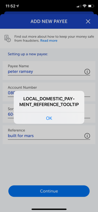 I think people will be surprised just how many “rookie” — as you say — UX mistakes some of these banks have made. I actually highlight far more in the case studies though. Some of them are just so basic. For example, Metro Bank has a tooltip on the “add new payee” screen that says “LOCAL_DOMESTIC_PAY-MENT_REFERENCE_TOOLTIP.” It’s been there at least a month.
I’ve got another super easy one to fix: Santander have a really obvious padding issue on their “make a payment” screen. When you type an amount to send, it all bunches up and overlaps. Sure, it’s minor, but this type of mistake is so damaging to the experience because they make you stop and think, “wait, that doesn’t look right.” It’s like when someone left a coffee cup in the background of a scene in Game of Thrones — it shouldn’t really matter, it’s just a coffee cup, but it shatters the illusion and reminds you that you’re sat at home covered in Dorito crumbs.
It’s not just the traditional banks either; even the challenger banks make pretty avoidable mistakes. Like not showing password rules on fields, or having inconsistent styling between pages. But yeah, there are quite literally hundreds of slides in the case studies showing these tiny mistakes.
Although anyone who’s read my other case studies shouldn’t be surprised, as I find similar mistakes in some of the biggest companies in the world, like Disney+ and GoDaddy.
Driven by the marketing narrative of challenger banks and post-financial crisis when the incumbents took a huge reputation hit, these days the banking industry likes to talk a lot about the idea of making money less stressful, and this is a theme you touch upon when looked through the lens of UX. Is this something banks are genuinely getting better at or is it just marketing fluff?
I’ve spent maybe 500 hours studying the UX of the 12 banks, and even I find that a hard question to answer. There are a lot of things to benchmark — which I guess is why I ended up writing a whole publication about it.
Whilst there is undoubtedly marketing fluff, I think Monzo, Revolut and Starling especially have made banking feel more accessible. And feeling more accessible, open and transparent has probably had a broader impact on making money less stressful.
There’s still a long way to go though, and I think some of the traditional banks could catch up within the next year or so. Barclays in particular have really upped their game and their experience is great.
A very macro question like that will be a lot easier to answer in five years, I think.
This challenger bank versus legacy bank battle; do you see it going on in any other industry?
Yeah, I think it’s happening in the investment app world with people like Robinhood, Freetrade and the legacy players like Fidelity. Have you ever used the Fidelity app? It’s literally dreadful. Just like in banking, these new players are showing consumers that they should expect more. It raises the bar.
Why do you think it took a challenger bank to raise the bar? Why didn’t one of the traditional banks rise to the challenge?
I’ve thought a lot about this and I think it comes down to transparency. About 10 years ago, nobody would just open a new account with a bank without serious consideration. Your bank was such a stable thing in your life, and because most people don’t have loads of banks, there’s very little room for comparison. Lloyds might release a new feature, but for those who don’t have Lloyds, they wouldn’t find out. You didn’t talk about banks to your friends and you certainly wouldn’t follow them on social media.
But then, for me at least, Monzo came along and it was pitched as a “holiday bank.” This changed my perception and kind of gave me the freedom to open one without worrying to much about it. Then, once I was in, I realized that their experience was amazing. If nothing else, the challenger banks have given consumers a benchmark to which they then compare their traditional bank to.
And finally, to the multi-unicorn question: Can you give a definitive answer to which bank has the best UX?
So, there’s a clear trend that the challenger banks are faster, easier and simpler than the traditional banks. Not in everything, but as a trend. But I think people will be shocked at just how far ahead they are. Though I’m not sure it’d be fair to crown one “‘winner,” because there are some things that Monzo, Revolut and Starling do better than each other. I guess I could add though that I think Barclays and Lloyds were both very impressive on the whole. In some tests they did better than some of the challenger banks. I’d probably say Monzo, Revolut, Starling, Barclays and Lloyds were the top five.
You can read the full report as it is published each week via the Built for Mars website.