
Every founder wants an eye-catching website or app, but it’s easy to overlook a basic fact: not all your potential visitors will experience your content with their eyes. If you haven’t considered whether a user with differing visual, motor or hearing abilities can easily navigate your software, it’s time to get serious about digital accessibility.
As tempting as it might be to prioritize a stunning visual and mobile experience over an accessible design, accessibility is a legal requirement—not an option—for many businesses.
Just ask high-profile founder Beyoncé Knowles. In January, Beyoncé’s Parkwood Entertainment was hit with a class-action lawsuit that includes “all legally blind individuals in the United States who have attempted to access Beyonce.com.” The lawsuit claims that the site’s lack of visual alternatives make the site inaccessible to blind users like the plaintiff and therefore illegal.
Failing to accommodate people with disabilities not only limits your market (blind people buy concert tickets and merchandise too), it can also bring legal and reputational consequences.
The Americans with Disabilities Act (ADA) requires US businesses that serve the public to provide equal access and accommodations to everyone, whether through a physical building or a digital experience. Just as stores provide ramps as well as stairs, websites need to accommodate people with varying abilities, from movement disorders to visual and auditory impairments. The number of website accessibility lawsuits raised against private companies more than doubled last year. A single plaintiff won $100K in a similar ADA lawsuit in 2017.
While ADA is the enforcing legislation in the United States for the private sector, the Web Content Accessibility Guidelines (WCAG) provide de facto global standards web designers should follow. The guidelines are based on four principles: content must be perceivable, operable, understandable and robust.
If you’re not sure whether your digital content (websites, apps, e-books, etc) is WCAG-compliant, have a certified accessibility consultant conduct an assessment immediately, and contact your legal team should you identify any risks.
However, simple compliance is only the first step. Understanding how accessibility is defined will broaden your understanding of the overall user experience, so you can create better content for all users.
This article is part of Extra Crunch’s exclusive “Startup Law A to Z” series, following previous articles on employment law, customer contracts, intellectual property (IP) and corporate matters. This series is designed to provide founders the information needed to assess legal risks in the areas common to most startups.
Should you identify legal risks facing your startup after reading this or other articles in the series, Extra Crunch resources can help. You can reach out to the Verified Experts of Extra Crunch, who focus on serving companies at your stage, for further guidance in the particular issues at hand.
The Web Content Accessibility Checklist:
- Perceivable
- Time-based media
- Text alternatives
- Adaptable
- Distinguishable (Use of color)
- Operable
- Keyboard accessible
- Navigable
- Input modalities
- Enough time
- Seizures and physical reactions
- Understandable
- Readable
- Predictable
- Input assistance
- Robust
- Compatible for various assistive technologies (Links can be programmatically determined)
Perceivable
A website must present content so that users of different abilities can perceive it. That means providing alternatives for any non-text content, like images or music.
For time-based media (audio and video), captions, content descriptions and sign language are acceptable options.
The Beyonce.com lawsuit cites the lack of alt-text a barrier to blind users. This refers to invisible text embedded in the website’s source code that describes images on the page. Screen readers used by the visually impaired pick up on alt-text and read it aloud—a simple way to make even aesthetically driven websites like Beyonce’s more accessible.
Writing alt-text is easy. Just describe what’s going on in the picture using a few keywords. Beyoncé’s alt-text on the photo below might read, “Jay and I arriving hand-in-hand to the 2019 ROC Nation Brunch.”

Screenshot of an image on the home page of Beyonce.com, featuring Beyoncé with husband Jay-Z at the ROC Nation Brunch 2019.
Perceivable content can be adapted into different, often simpler, presentation formats. A webpage’s structure and information should be “programmatically determinable,” meaning that its elements can be extracted by assistive technologies using markup language or data structures.
Color, contrast and text size play an important role in creating distinguishable content—content that’s easy to see and hear. Color alone has a huge impact on users: a reasonable portion of your audience (an estimated eight percent of men of European background, for example) are affected by color blindness.
Make sure color isn’t the only mechanism used to convey information, that content has a high enough contrast ratio to separate the foreground from background, and that text can be resized up to 200 percent.
Operable
In addition to being navigable, accessible websites needs to be understandable. At the most basic level, the text on the page needs to be readable, with simple language and jargon and abbreviations expanded. The language of the page should also be noted invisibly within the source code so a screen reader can pick it up.
Naturally you want your brand to be innovative, but it’s better to err on the side of convention when it comes to an accessible digital experience. Predictable interfaces meet your user’s expectations about how to interact with the page.
For example, every area of your site should provide a consistent and ideally familiar experience for input, identification and navigation. Input refers to user actions like swiping, tapping or clicking. Don’t surprise people! Accessibility guidelines and interface design principles alike recommend advising users how a component will behave before they have to use it. Input should not automatically initiate a change of context— say, opening a new window or changing the focus to a different element— without warning.
Similarly, consistent identification and consistent navigation give users a sense of familiarity when navigating content. Consistent identification means identifying components with the same functionality consistently across the page. For example, a check mark icon that means “approved” on one page shouldn’t mean “included” on another page. In the same vein, any repeated navigational scheme should always appear in the same relative order (consistent navigation). If “skip to content” links are used on multiple pages, they should appear in about the same place. This allows users interacting with content across pages to find what they need more quickly.
The final guideline for understandable content, input assistance, recommends cues to help users avoid and correct mistakes. This could be text that flags an error (“There has been a problem processing your request”), suggests a correction (“Passwords must be 8-20 characters”) or prevents an error from occurring (“Please review the information before submitting your request. This action cannot be undone”). Beyonce.com’s e-commerce page lets users enter phony shipping addresses and phone numbers. Input assistance would prevent the user from submitting invalid form information and suggest how to correct it in order to complete the transaction.
Understandable
Try conducting the “keyboard test” on your site right now. If you can’t navigate using only a keyboard, it doesn’t meet WCAG guidelines. That’s a common pitfall, especially for sites designed with a “mobile-first” approach.
Visually impaired users, as well as those with motor-control issues, often use keyboard commands to navigate webpages. Tab and arrow keys allow them to jump from link to link, or from headings or content areas, for example. The same principle applies not just to links and content sections, but forms and other user interface components (input modalities).
Keyboard navigators and screen readers offer shortcuts for quickly skipping to content on a webpage. But they only work if the content is properly organized. If not, they’ll either get trapped on the page, be forced to navigate through a long list of elements (missing the shortcut) or in some cases, be unable to reach the content at all.
Try to navigate Beyoncé’s music page using a keyboard. You can tab through it, but it’s a laborious process. All seven albums get their own div class, or content section, containing six links: the album’s lyrics, videos, track listing, image gallery, credits and iTunes page.
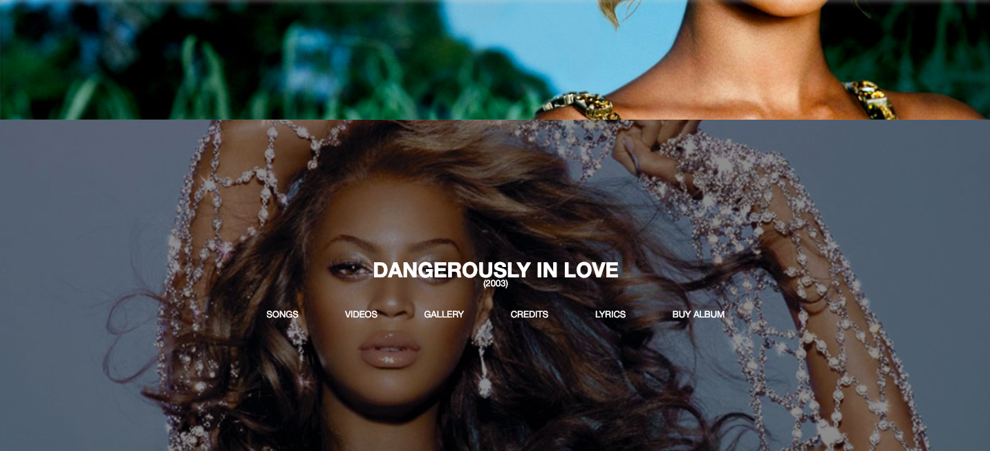
Screenshot from the music page of Beyonce.com showing the cover of “Dangerously in Love.”
Let’s say you want to listen to the song “Crazy in Love” off her first album Dangerously in Love, all the way at the bottom of the page. You would have to press Tab 53 times before reaching the right link. Adding “skip links,” a mechanism for bypassing blocks of content, helps keyboard navigators parse through repeatable content.
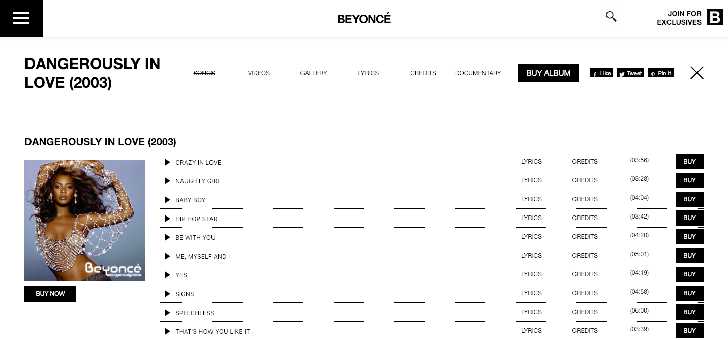
Screenshot from the track listing page of “Dangerously in Love” on Beyonce.com.
Making the album titles headers would allow keyboard users to jump from section to section. Screen readers also use headers to navigate the page. Written as headers, the screen reader would simply read aloud the album titles, not the six links following each. That gives users a logical outline of the page’s content so they can more easily explore what they’re interested in.
The last two guidelines under the operability principle are straightforward. Let users consume content at their own pace. They should be able to pause, stop and hide auto-play media. And don’t design content in a way that’s been known to cause seizures— avoid anything that flashes more than three times in one second.
Robust
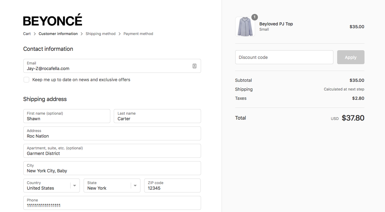
Screenshot from the “Shop” page of Beyonce.com demonstrating a user’s ability to enter invalid information.
A robust website is one that can be interpreted by a variety of assistive technologies, including screen readers, text readers, speech input software and head-mounted pointers and eye-tracking devices. To maximize compatibility with current and future assistive technologies, make sure all user interface components (forms, links and content generated by scripts) can be programmatically determined.
In a society that increasingly relies on mobile over desktop for everyday interactions like networking, entertainment and shopping, many startups design their website around highly visual mobile experiences. Beyonce.com fell into that same trap. The seemingly endless roll of photos on the home page tempts you to scroll forever. Considering how the photos are stretched below the fold on the desktop version—yet fit perfectly on the mobile version, it’s easy to see Beyonce.com was designed as a mobile-first experience, perhaps intending to replicate the seamless Instagram feed effect Beyonce’s 126M followers are used to.

Screenshot from the desktop view of the Beyonce.com homepage, demonstrating how its images have to be cropped horizontally.
Screenshot from the mobile view of the Beyonce.com homepage, demonstrating how the pictures readily fit the screen.
Mobile experiences (and desktop interfaces designed to emulate them) pose new problems for impaired users. JAWS, the world’s most popular screen reader, isn’t mobile compatible. And some websites will automatically scale down their features—including important accessibility components—when they detect use of a mobile device. While the number of mobile native accessibility features and compatible companion products is growing, mobile assistive technologies have yet to provide a consistent experience across all devices. Some visually impaired users may not be able to use a mouse or keyboard, much less control a touchscreen device. Individuals who are partially or completely paralyzed often use eye-tracking devices to place the cursor on a screen.
Since many users with disabilities still rely on desktop interfaces, designing an accessible desktop experience cannot be an afterthought.
Conclusion
Contact an accessibility consultant and your legal team immediately if you’re unsure your site follows WCAG guidelines. If you’ve committed any of these mistakes, you can and should correct them—whether that means a simple touch-up or a major redesign. This is more than just a question of reducing legal risk. You’ll reach a wider audience and ensure a better experience for visitors of all abilities.