Yesterday, Twitter rolled out its much-anticipated prototype application to the first group of testers. We’ve now gotten our hands on the app and can see how the current version differs from the build Twitter introduced to the world back in January. While the original version and today’s prototype share many of the same features, there have been some small tweaks as to how conversation threads are displayed, and the color-coded reply labeling system is now much more subtle.
“Twttr,” as the prototype build is called, was created to give Twitter a separate space outside its public network to experiment with new ideas about how Twitter should look, feel and operate. Initially, the prototype focuses on changes to replies, with the goal of making longer conversations easier to read.
However, the company said it will likely continue to test new ideas within the app in the future. And even the features seen today will continue to change as the company responds to user feedback.
In the early build of the twttr prototype, the color-coded reply system was intentionally designed to be overly saturated for visibility’s sake, but Twitter never intended to launch a garish color scheme like this to its testers.
The new system is more readable and no longer color codes the entire tweet.
Below are a few screenshots of what the public Twitter app looks like when compared with the new prototype, plus other features found in twttr alone.
Feedback

Above: regular Twitter on the left; twttr on the right
Before digging into twttr’s key features, it’s worth noting there’s an easy way for testers to submit feedback: a menu item in the left-side navigation.
Here, you can tap on a link labeled “twttr feedback” that takes you directly to a survey form where you can share your thoughts. The form asks for your handle, and what you liked and disliked, and offers a space for other comments.
Reply threads

Left: Original Twitter; Right: twttr prototype
This is the big change Twitter is testing in the prototype.
In the photo on the left, you can see how replies are handled today — a thin, gray line connects a person replying to another user within the larger conversation taking place beneath the original tweet. In the photo, TechCrunch editor Jonathan Shieber is replying both to the TechCrunch tweet and the person who tagged him in a question in their own reply to the TC tweet.
In twttr, Shieber’s reply is nested beneath that question in a different way. It’s indented to offer a better visual cue that he’s answering Steven. And instead of a straight line, it’s curved. (It’s also blue because I follow him on Twitter.)
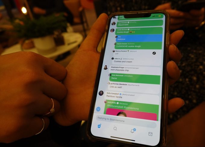
You’ll notice that everyone’s individual responses are more rounded — similar to chat bubbles. This allows them to pop out on the contrasting background, and gives an appearance of an online discussion board.
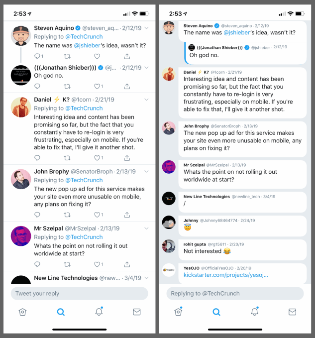
Left: Original Twitter; Right: twttr prototype
This is even more apparent when the background is set to the white day theme instead of the darker night theme.
Color-coded replies
Here’s a closer look at nested replies.
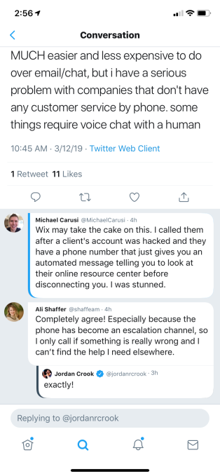
People you follow will be prominently highlighted at the top of longer threads with a bright blue line next to their name, on the left side of their chat bubble-shaped reply. Twitter says the way people are ranked is personalized to you, and something it’s continuing to iterate.
Left: Original Twitter; Right: twttr prototype
In the public version of the Twitter app, the original poster is also highlighted in the Reply thread with a prominent “Original Tweeter” label. In the prototype, however, they’re designated only by a colored line next to their name, on the left side of the chat bubble. (See Jordan’s tweet above.)
This is definitely a more subtle way to highlight the tweet’s importance to the conversation. It’s also one that could be overlooked — especially in the darker themed Night Mode where the gray line doesn’t offer as much contrast with the dark background.
In the day theme, it’s much easier to see the difference (see below).
Engagements are hidden
Another thing you’ll notice when scrolling through conversations on twttr is that engagements are hidden on people’s individual tweets. That is, there’s no heart (favorite) icon, no retweet icon, no reply bubble icon and no sharing icon, like you’re used to seeing on tweets today.
Instead, if you want to interact with any tweet using one of those options, you have to tap on the tweet itself.
The tweet will then pop up and become the focus, and all the interaction buttons — including the option to start typing your reply — will then become available.
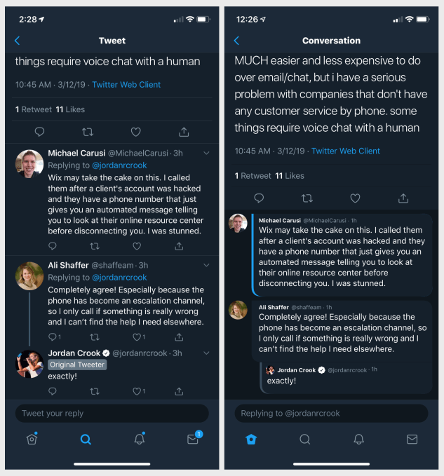
“Show more”
Another change to conversations is that some replies are hidden by default when you’re reading through a series of replies on Twitter.
Often, in long conversation threads, people will respond to someone else in a thread besides the original Tweeter. Both are tagged in the response when that occurs, but the reply may not be about the original tweet at all. This can make it difficult to follow conversations.
Above: “Show more,” before being expanded
In twttr, these sorts of “side conversations” are hidden.
In their place, a “Show more” button appears. When tapped, those hidden replies come into view again. They’re also indented to show they are a part of a different thread.
This change highlights only those replies that are in response to the original tweet. That means people trolling other individuals in the thread could see their replies hidden. But it also means that those responding to a troll comment to the original poster — like one offering a fact check, for example — will also be hidden.
There are other reasons to hide some replies, notes Twitter — like if the original response was too large or the thread has too many replies. It’s not always about the quality of the responses.
Above: after being expanded
The icon!
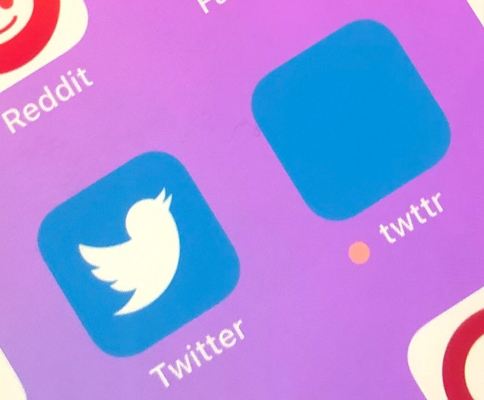
Twttr is very much a prototype. That means everything seen here now could dramatically change at any point in the future. Even the twttr icon itself has gone through different iterations.
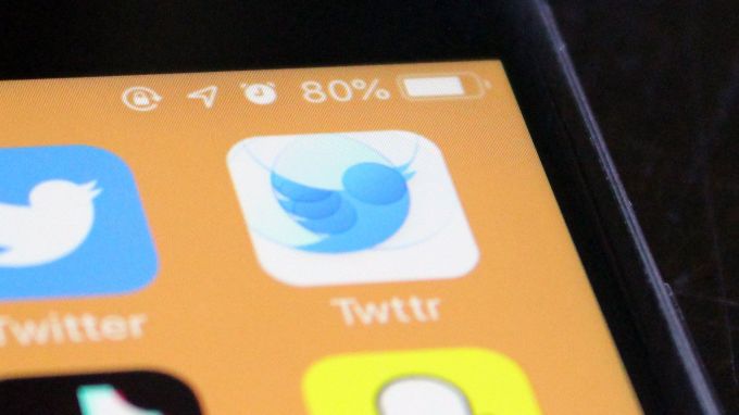
The first version of the icon was a very lovely bird logo that looked notably different from original Twitter. The new version (which we’ll dub twttr’s Yo icon), is a plain blue box.
Twitter has its reasons for that one… and clearly, it didn’t ask for feedback on this particular change.
Where’s that feedback form again?