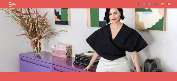
Girlboss, the juggernaut business and lifestyle brand launched by serial entrepreneur Sophia Amoruso (the founder of Nasty Gal), has launched a fresh redesign of its website as the company looks to evolve beyond publishing.
While publishing will remain a central component of the business that Girlboss is building, Amoruso says that the brand encompasses much more than a content play.
“We’re beginning with editorial content and our conferences and what looks like a publishing business, but the future will look like us incorporating our users in a much different capacity,” Amoruso says.
[gallery ids="1624715,1624716,1624717,1624718"]
In a blog post about the site redesign, the company’s new chief operating officer and editor in chief walks through the functional changes that the company wanted for its web and mobile face:
It’s fast.
First and foremost, this experience should be fast. We only used system fonts. We don’t have any weird pop-ups or doodads to slow down the load time or to distract you from the reason why you’re actually here: the content.
It’s intuitive (sort of).
We built this thing to be mobile first. That means you swipe from category to category and scroll endlessly—even on desktop. It might feel a little weird at first, but only 10% of you are on desktop to begin with, so let’s call a spade a spade.
It’s fun.
There’s a lot of color here. Each category is noted with a different color (work is green, money is a coral-ish pink, wellness is yellow, etc), and you see those colors play in different ways on category pages, in related content, on article pages, and more. Those are visual cues that tell you where you are—and they’re also supposed to feel fun and immersive. We’re trying not to take ourselves too seriously here at Girlboss. We talk about serious things, but we hope to inject a bit of wit and humor into everything we do. And all of this color-soaked goodness should reflect that.
It’s useful.
This is a big one. We know that some people may never wander over to our website (although, you’re obviously not one of them), and we’re totally fine with that. We strive to inspire and delight and inform people where they are—whether that’s on email, on social, through podcasts, or IRL at our Rallies. But if you are visiting our website, we want you to walk away feeling like you got something meaningful out of the experience of spending time with us. We want to make things that open your eyes to new ways of thinking, and that offer you life and work and money advice that legitimately helps you advance and grow and save and evolve. That’s what this site is built to do—to make it easy to find the tools and tips and insights we’re offering up, while being transparent about how much time you might need to spend with a story or podcast or video to get what you need out of it.
Beyond the purely functional and aesthetic aspects of the redesign, Gandhi hints that there’s a larger sense of purpose and mission to the company’s choices as well… and an indication of how Girlboss will evolve.
“At Girlboss, when we think about the big picture, we want to help make change. We want to create opportunity and knock down the obstacles that stand in your way. We want to call out tokenism and create spaces where many women can thrive—and help each other make progress and advance,” Gandhi writes.
Girlboss in this new incarnation seems to be as much of a networking and social engagement site as it is a publisher. This new model fits squarely within the new notion of what brands can mean and the role they can play.
“It’s important for us to keep evolving and casting a line to build a social-first environment,” says Amoruso. With the new site, and an executive team built out on the back of $3.1 million in financing from Lightspeed Venture Partners, Gary Vaynerchuk, Atom Factory and Slow Ventures, it looks like they’ve succeeded.