Cover Apple for a while and you start to notice a general cadence to the company’s behavior and strategy.
To name one example, consider the last several macOS releases. In 2009, Apple announced Snow Leopard, which famously eschewed new features for what the company described as “hundreds of refinements [and] new core technologies.”
Snow Leopard subsequently set off a trend in which every other version of macOS (née Mac OS X) to date aspired to reach similar goals. Lion begot Mountain Lion. Yosemite begot El Capitan. Now Apple’s doing it yet again: Sierra has begotten High Sierra.
Talking to Apple people at WWDC, I got a profound sense that the company’s approach to accessibility across all of its platforms runs through a very similar vein to that of High Sierra. There are new features, as always, but like the Mac, Apple’s accessibility feature set is mostly fully mature. Hence the emphasis on refinements, such as the work Apple put in on iOS to reduce truncation of Dynamic Type at the largest settings. Text flows differently so users see more content.
There is an interesting dichotomy here, because for all the focus on refinement, there also is a cavalcade of new stuff to be excited about. As it pertains to accessibility, some obvious highlights for me are the 10.5” iPad Pro and the corresponding iPad-centric enhancements in iOS 11. I’m also psyched for smaller niceties too, such as the ability to automatically enter Reader View in Safari on iOS and macOS. I use this mode all the time; it makes reading on the web a much more pleasant—and accessible!—experience. Reader View is one of my favorite and most-used tools on both iOS and the Mac.
Apple announced a boatload of stuff at WWDC, and it’s quite a task to process it all and ruminate on what it means. With this sentiment in mind, here are my three biggest takeaways around accessibility and the conference that matter most.
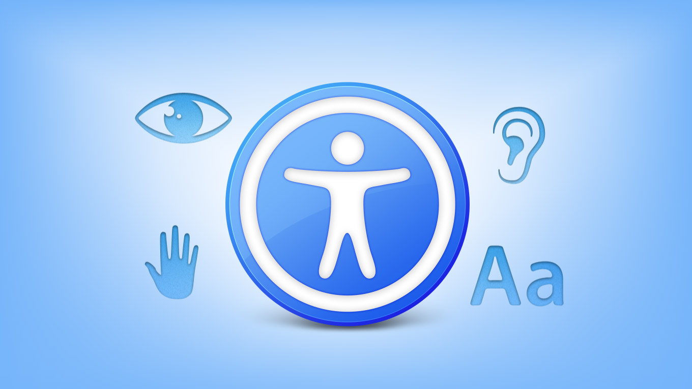
New Accessibility Features
As usual, there are a handful of standout accessibility features across Apple’s operating systems worth mentioning.
Enhanced Dynamic Type. As mentioned at the outset, Apple has put in a lot of work to optimize how Dynamic Type handles itself at its largest sizes. New this year are options for even larger sizes that smartly adapt to various user interfaces. The Dynamic Type API, available for third-party developers to hook up to their apps, has been updated to take advantage of this new capability.
Type to Siri. Available on iOS and the Mac, Type to Siri is a feature whereby a user can interact with Siri via an iMessage-like UI. Apple says the interaction is one-way; presently it’s not possible to simultaneously switch between text and voice. There are two caveats, however. The first is, it’s possible to use the system-wide Siri Dictation feature (the mic button on the keyboard) in conjunction with typing. Therefore, instead of typing everything, you can dictate text and send commands thusly. The other caveat pertains to “Hey Siri.” According to a macOS Siri engineer on Twitter, who responded to this tweet I wrote about the feature, it seems Type to Siri is initiated only by a press of the Home button. The verbal “Hey Siri” trigger will cause Siri to await voice input as normal.
Technicalities aside, Type to Siri is a feature many have clamored for, and should prove useful across a variety of situations. In an accessibility context, this feature should be a boon for deaf and hard-of-hearing people, who previously may have felt excluded from using Siri due to its voice-first nature. It levels the playing field by democratizing the technology, opening up Siri to an even wider group of people.
Smart Invert Colors. Apple doesn’t think of it in this way, but to me, the new Smart Invert Colors feature in iOS effectively is a de-facto “dark mode.” Whereas before Invert Colors would invert everything — which made photos look really weird — this “smart” incarnation inverts everything except photos. It also recognizes other apps, like Clock, that are already dark, and leaves them be. In a demo I saw, turning on Smart Invert Colors and opening News, for example, presents you with a white-on-black interface while leaving photos alone. No longer will you see Quantum Leap-looking holograms of people in photos; all you see is a normal picture.
VoiceOver Image Descriptions. A three-finger tap on a photo with VoiceOver turned on will elicit more detailed descriptions (aka “alt-text”) of what’s in the shot. This includes lighting, facial expressions (e.g., smiles), and objects. This works even without manual annotation of photos—a feature Twitter, for instance, supports in its iOS app.
Accessibility Shortcut in Control Center. Apple has redesigned Control Center in iOS 11 so that everything fits on a single page. What you see can be configured in Settings, and one of the included options is the Accessibility Shortcut. Instead of a triple-press of the Home button to launch Magnifier, for example, it’ll be quickly accessible right from Control Center.

iOS 11’s Refreshed User Interface Design
As I wrote in my blog post on the keynote, Apple has downplayed the visual refresh it has given iOS 11. I first noticed the changes on an iPad in the hands-on area after Monday’s event. The new design is fairly substantial, and I believe a significant step forward for usability and accessibility.
There are two reasons for this. First and foremost, the system-wide adoption of the visual style pioneered by Music and News — big, bold headers everywhere paired with thick, high contrast iconography — is a huge improvement for visual accessibility. As someone with low vision, I find the prominent headers in Music to be extremely helpful in “anchoring” my place in the app. I’m not looking for where I am (or where I should go) because the big headers are obvious, concrete indicators of place. This matters for accessibility because it helps focus my eyes on a fixed element; what’s more, it lessens eye strain and fatigue, which is a big win.
Secondly, the higher contrast iconography makes it easier to discern buttons. This is beneficial for the same reasons the new headers work: it helps someone with low vision orient she/he navigate an interface, also lessening strain and fatigue.
The other dramatic change, design-wise, concerns the App Store. It adopts the same bold headers and iconography as the rest of the system, while also integrating the card-like UI that the Music app received in last year’s revamp. I have yet to see the App Store firsthand, but generally speaking, these visual changes will make browsing apps more accessible than ever.
Alas, the one thing the App Store still lacks is pervasive Dynamic Type support. After lamenting this with some members of the App Store team, however, I was told Apple will try to prioritize it for a future update. Such an addition would instantly make reading app descriptions, reviews, et al, accessible without the need for an extra tool like Zoom.
Overall, I am so stoked for these improvements. I’m a huge fan of the design of Maps, News, and Music, and am beyond pleased Apple decided to expand the look across the entire system.
Gaming Gets More Accessible
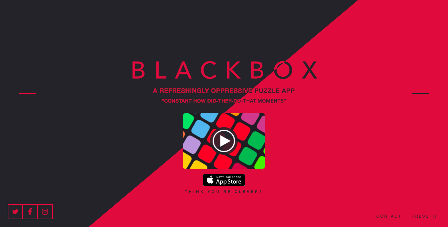
This year’s Apple Design Award winner for Innovation in Accessibility is Blackbox, by Ryan McLeod. It’s a puzzle game that was chosen for the honor, according to Apple, for being “fully accessible, taking a highly visual interface designed to be navigated by touch and and other sensory inputs, and adding a brilliant sonic interface that enables a new world of gameplay for everyone.” (Full disclosure: I’ve never played the game, but McLeod did give me a demo.)
What makes Blackbox notable isn’t so much that it’s accessible — Apple awarded Workflow and djay Pro in this category in 2015 and 2016, respectively — but that it’s an accessible game. Finding accessible games is something that’s long been a problem for many in the accessibility community, although developers such as McLeod and For All to Play are working to fix that. For its part, Apple has long been keen to promote games on the App Store — in fact, games are (rightly) getting their own dedicated tab in the App Store once iOS 11 ships.
In Blackbox’s case, it’s a good game, period. That it’s an accessible game to boot is the proverbial icing on the cake.
“Apple’s always had a huge focus on accessibility that’s become apparent to developers,” McLeod said. “It’s something I had in mind from the moment I started working on the app. It’s something like localization and internationalization—something that I didn’t want to bite me later if I started implementing it but couldn’t do.”
The inclusion of VoiceOver was a big moment for Blackbox.
“I finally got asked by a player on Twitter about VoiceOver support,” McLeod said. “I realized I definitely needed to figure that out.”
McLeod also explained that implementing VoiceOver into Blackbox was easy because he mostly uses UIKit for the design of his app. (By utilizing standard UIKit controls, developers get VoiceOver labels “for free” out of the box.) Other elements, he said, were tougher to label as they were custom-built for the app.
The Bottom Line
2017 marks the third straight year I attended WWDC. Sessions and labs of course are a constant, as are the lunchtime speakers. Also continued was the mid-week accessibility mixer, where attendees and Apple engineers come together to mingle and celebrate diversity and inclusion, of which accessibility is a part.
As someone who’s covered the conference from the inside the last two years, I see how the messaging around accessibility has been refined. There remains a push to educate and raise awareness, for sure, but this year it felt as though accessibility firmly cemented itself as a cornerstone of the event. Attendees expect it to have a sizable presence now. That was evident by sitting in on sessions and labs, and speaking with developers.
In this sense, then, refinement applies not only to product direction, it applies even to the aura of the conference itself.