Twitter is testing a new interface for its mobile applications on iOS and Android, which involves rounded profile images, buttons and other features. It’s unclear what advantage going “round” would bring, as the style’s adoption among app makers and designers tends to be more of a trend that ebbs and flows over time, rather than a format that’s proven to have a significant advantage over the classic and familiar square/rectangular style.
One argument for introducing rounded icons could be that it makes it easier to differentiate an app’s users from the content — like the photos or albums being posted to the service, for example. (You can see an example of this here on Quora where a Facebook designer showed how this worked in Instagram’s activity feed to differentiate the people from the photos they had liked.)
However, for a service like Twitter that’s constantly tweaking its user interface and even how its core feature set functions — like what counts toward the 140 characters or how replies work — messing around with rounded thumbnails and buttons seems like a bit of a time-waster.
After all, Twitter’s product issues over the years have stemmed from trying to take a service that ultimately appealed to the more tech-savvy individuals and trying to make it something that also works for the everyday, mainstream user.
Twitter’s earliest adopters and power users have reveled in its more obtuse features, like the app’s once purely reverse-chronological feed, its built-in constraints on character count that force brevity and its “secret club” nature where users hacked their own way of communicating on top of Twitter’s platform — whether that was by writing “RT” to kick of retweets, putting a period (“.”) before replies to make them more visible, or numbering tweets to share longer thoughts as “tweetstorms,” for example.
By now, one would think Twitter would know that its app won’t ultimately be more or less usable because of how its profile icons look, or whether the tweet button is round or rectangular.
It will be usable if it respects its user base by addressing spam and harassment head-on. It will be adopted if it offers an easy way to both watch and participate in the kind of online conversations you can’t have on other social platforms, like Facebook. And it can attract more users if it serves as the exclusive home to content you can’t get elsewhere. (Twitter hopes this will be its live-streamed videos, but, in reality, it’s Trump’s tweets that drove its user numbers up in recent days.)
But nevertheless, Twitter likes to test things, so bring on all the rounded stuff, I guess?
Android Police first spotted Twitter’s new look last week, when it was then available in the Android alpha application. We’ve also heard from iOS beta testers that they have the new look, as well.
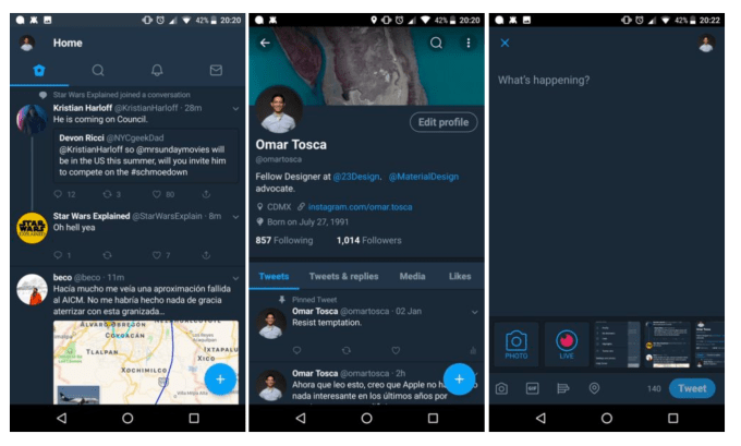
Image credit: above, Android Police
Specifically, the thumbnail images are rounded both on user profiles and next to tweets, and other buttons are rounded, too, like the “Edit Profile” button and the “Tweet” button in the compose screen. The search boxes and buttons also have a rounded theme.
Other changes may also be in the works, too, like the use of new fonts.
Whether or not any of these changes make their way to the wider public remains to be seen.
Twitter declined to officially comment on the test, but we understand from those familiar with the experiment that it’s now running on both iOS and Android with the intention of determining whether the update makes Twitter easier to use.
¯_(ツ)_/¯