People love a Greek tragedy. Icarus has flown too close to the sun and tumbled to Earth. Apple has forgotten its core users and been eclipsed by Microsoft. The Touch Bar is a compromise between adding a touch screen on a MacBook and ignoring touch entirely.
These narratives are easy to sketch because they sell better to readers than moderated, honest inspection of sentiment and behavior. If you have heroes and villains, then everything is a zero-sum game and nothing that competitors do can exist on their own merits.
The MacBook Pro’s Touch Bar is the right thing to do because people don’t use touch screen laptops like they do tablets.
I’ve got a Surface Pro at home which I enjoy. The pen is cool, the hardware is neat and the touch interactions are super useful in some cases. (It totally falls down as a tablet but that’s another discussion.) My time with the Surface, along with plenty of conversations that I have had with people who use touch-enabled laptops or laptop analogues, has taught me this simple truth:
Most people use touch screens for light interactions a half dozen to a dozen times a day.
These machines are not tablets; there is a work surface area and a view area. Any interaction you take on the screen has to be worth you moving your hands from your work area to the view area, obscuring a portion of the content that you’re viewing, and taking an action. The wrist rest and keyboard position also mean that you sit far back from the screen — and whether you touch a screen is almost always a function of how close your hands are to it. Most of those actions are also taken on large touch targets like the Start button and other tappable things.
Having a discrete bar that can update with context, allowing you to take those dozen daily actions makes total sense. Far more sense than bolting a touch screen onto a non-touch-optimized OS and forcing you to poke at tiny buttons meant for a mouse.
One thing that the Touch Bar does not solve for is scrolling, but I think that’s why the MacBook’s trackpad was made oversize.
In keeping with my theme, I am not here to vilify Microsoft or its approach. As a reformed artist and photographer, I’m fascinated by the approach that the Surface Studio is taking and I hope to get the chance to experience one for myself. But Microsoft is tackling a vanishingly small part of a historically slow growing and small market. MacBooks are not.
The DJ demo that Apple ran during the event, by the way, was probably not a great way to show off the Touch Bar. This is not how 98 percent of people will use it and no matter how cool Djay is, I don’t think DJs will either, unless it’s your uncle spinning at your 8th grade graduation party.
What professional users would like — what I know I would like if I were still editing thousands of photos a week as a photographer — is a way to surface buried commands and make them ready for you. (As a side note, I think Apple is doing future generations a great service in sublimating the importance of keyboard shortcuts, which are arcane and difficult to discover and use.)
A candidate for a Touch Bar shortcut (with some exceptions) should meet the following tests:
- It saves some sort of Dr. Strange-style physical finger contortion to hit a shortcut combo.
- It saves you more than two clicks of a trackpad.
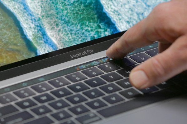
Even the way it works speaks to a lot of thought about how, exactly, people use their MacBooks. The screen, for instance, is pitched to be best viewed at a 40 degree angle — from where you’re sitting at the keyboard. Normal OLED screens are best viewed from dead on, but that would put your head over the keyboard, which no one does. And the surface of the bar is textured to reduce glare but also to feel as similar as possible to the top of the keys on the keyboard. 
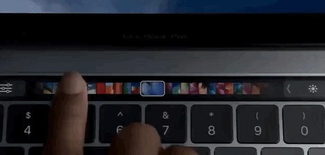
The interaction models are also different than they are on an iOS device. On an iPad, every touch interaction is 1:1 — your finger directly manipulates stuff like volume sliders. On the MacBook, you can touch the volume button and begin sliding right away, providing you with an off-axis slider in plain view. In other words, you should be able to single tap and slide many interactions on the toolbar, while not obscuring your view of the control or content (in the case of photo thumbnails). This does not work on a touch screen.
I think the Touch Bar is going to be a very widely used tool for consumers and pros. I also think that the long term will prove out that it’s the right thing to do for the form factor. I also acknowledge that people will disagree with these viewpoints and that is okay, because we’re not honoring Dionysus — we’re analyzing consumer behavior, and different people want different things.