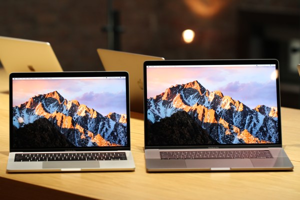
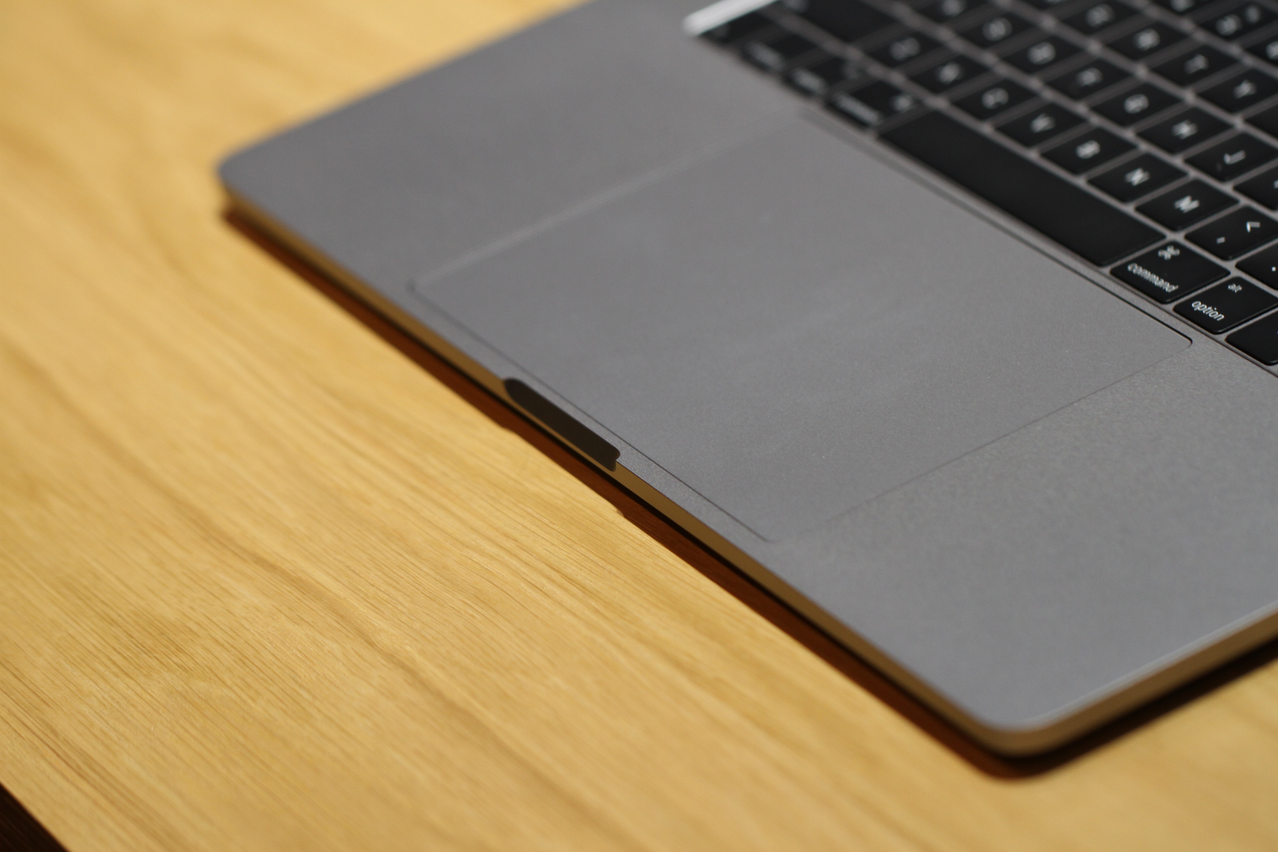
At first glance, it looks an awful lot like the same MacBook Pro we’ve become accustomed to seeing over the last several years. The TrackPad is the first indication that something’s different here. It’s huge — twice as big as the last version, and thankfully now carrying the Force Touch technology the company perfected with the last version of the standard MacBook, perfectly mimicking the analog click to the point where it’s virtually indistinguishable.
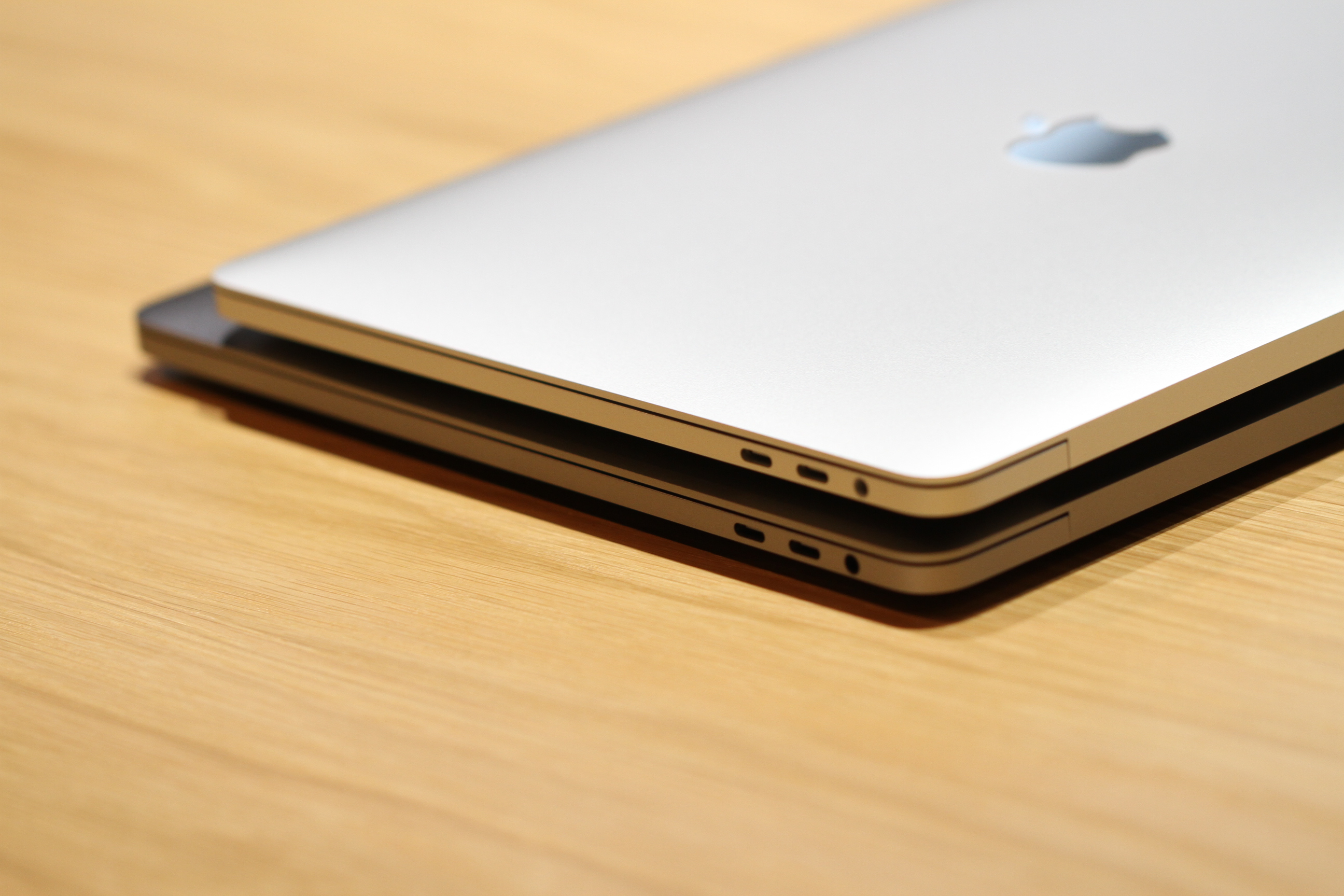
If you’re standing off to the side, you’ll spot the ports. Two Thunderbolts on each side, clean and uniform, and the balance is once again restored for the Apple aesthetic universe. Save of, course, for the headphone jack still located on the right side (for now, at least).
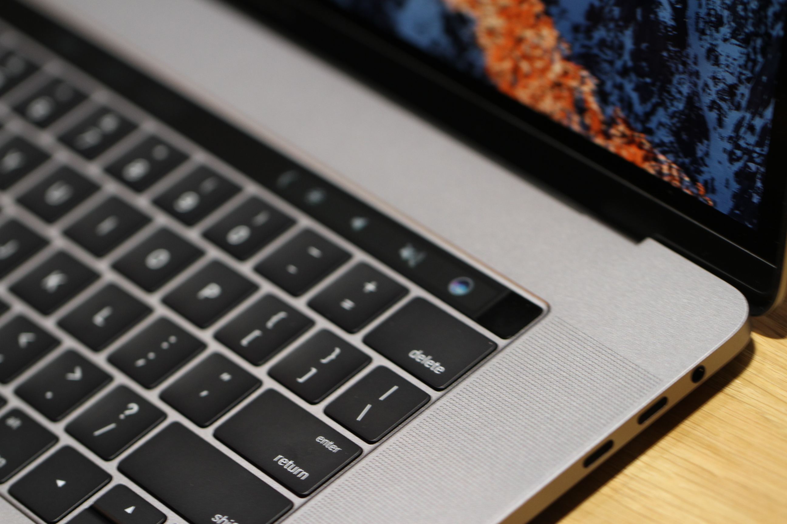
The eagle-eyed might pick up the fact that the system is thinner — or that the screen is brighter, though it probably helps to have an older version right by it for sake of comparison. From there, however, you’ll pick out the key new feature, the row of function keys now lost to obsolescence, in favor of a thin, black, glossy strip.
The Touch Bar (a much catchier name than the rumored Magic Toolbar, mind) is, in a word, neat. Sure the company put the new feature through its paces onstage, but press conference demos and in-person usage are two different things entirely. The strip itself is glossy. Not quite slick, but frictionless enough so as to run a finger across with little effort.
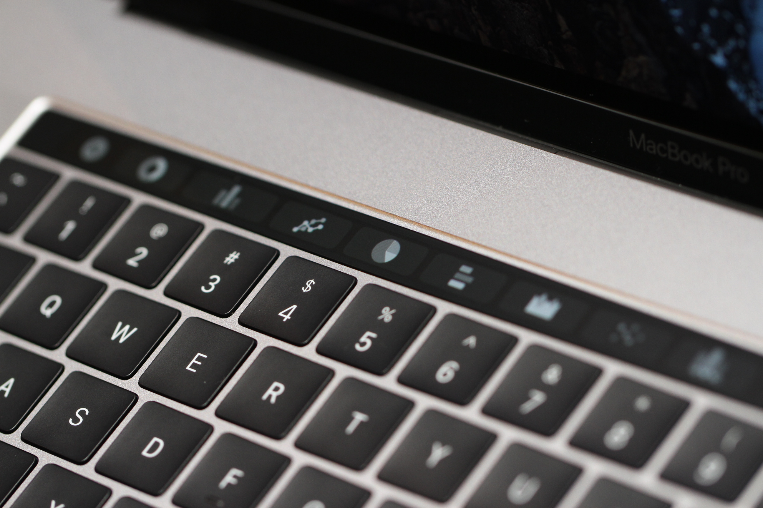
It’s a secondary Retina display, which mean it’s capable of displaying some fairly high-res graphics, in spite of the fact that most of what you’ll be interacting with will be big and button-like functionality. Click into Photos, however, and you’ll get little thumbnails that you can scroll through. Click into Safari and you get small images of the tabs you have open.
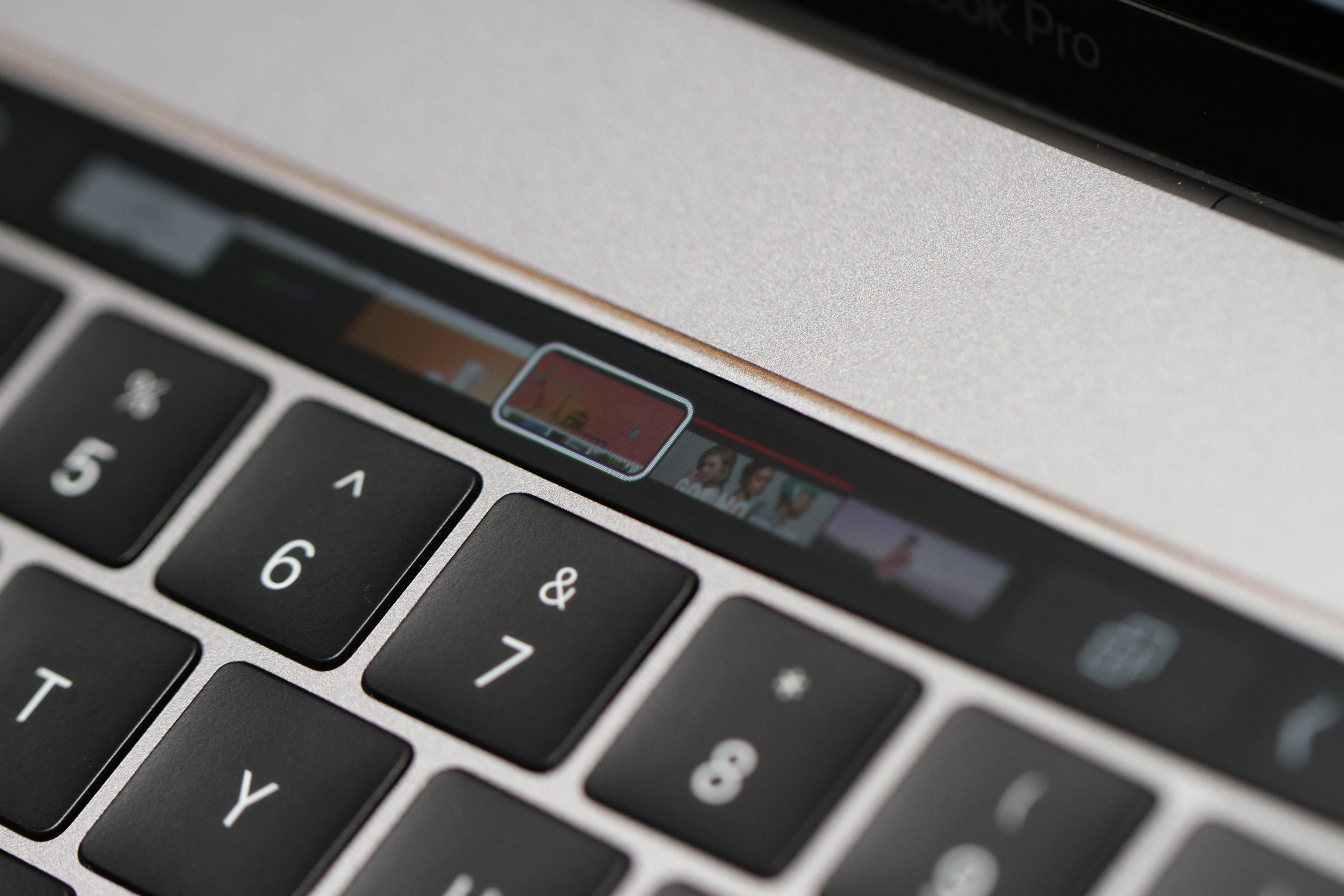
It’s quick and responsive, reacting to multi-touch and the amount of pressure the user applies. It also adapts quite quickly as you toggle between different apps. It’s a really cool and really versatile new addition — like having a small mobile display embedded directly into the notebook.
As with the onstage demo, most of what the Touch Bar functionality Apple was showing off post-event involved its own proprietary applications — though I did see a brief demo of Excel, which was, as with Excel itself, a bit complicated to grok during a quick walk-through. With its software, on the other hand, the functionality was largely intuitive.
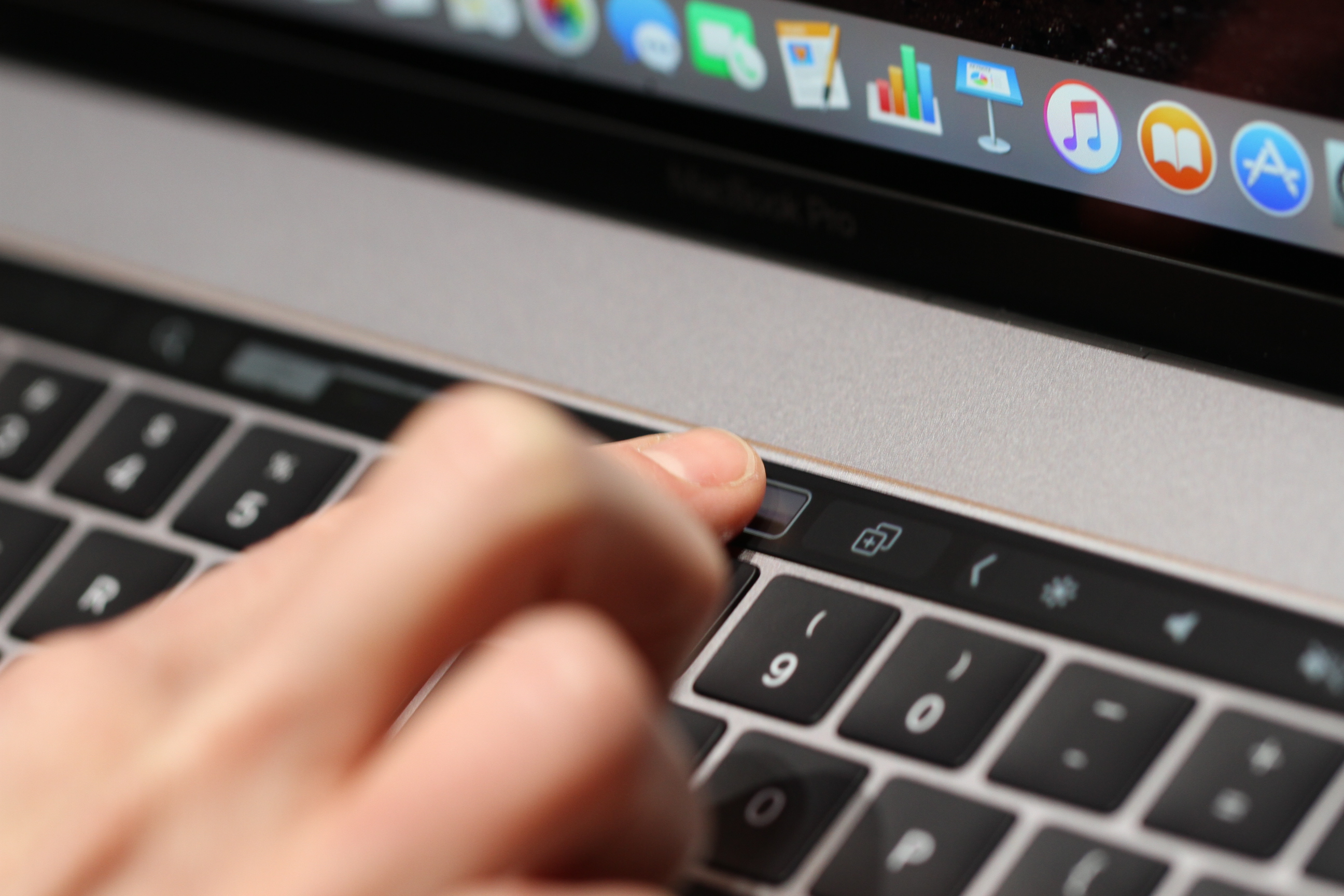
I could see myself getting the most use out of music playback, which includes a lot of the functionality currently built into the function keys, along with track scrubbing — something else that will likely appeal to video editors. It’s not quite the Surface Studio, but it’s easy to see how the company is essentially using the second display as a surrogate for touchscreens — something it has long refused to include in its line of computers.
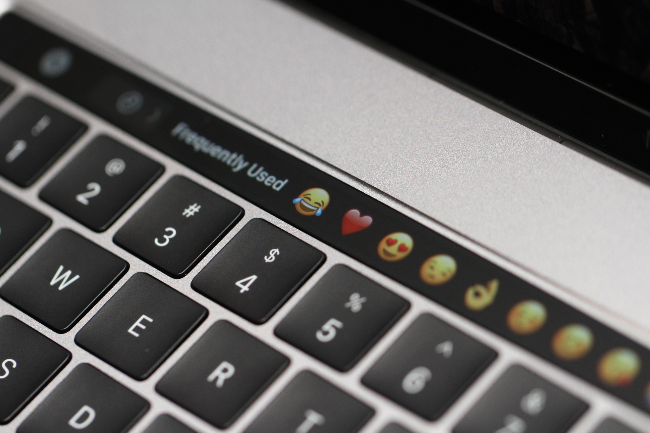
On a whole, color is used sparingly with the buttons, in-line with the keyboard itself, though some is used here and there to highlight some functionality — the flag in email is red, for example. Emojis, on the other hand, are a regular explosion of color. And they’ve invaded the MacBook in a big way.
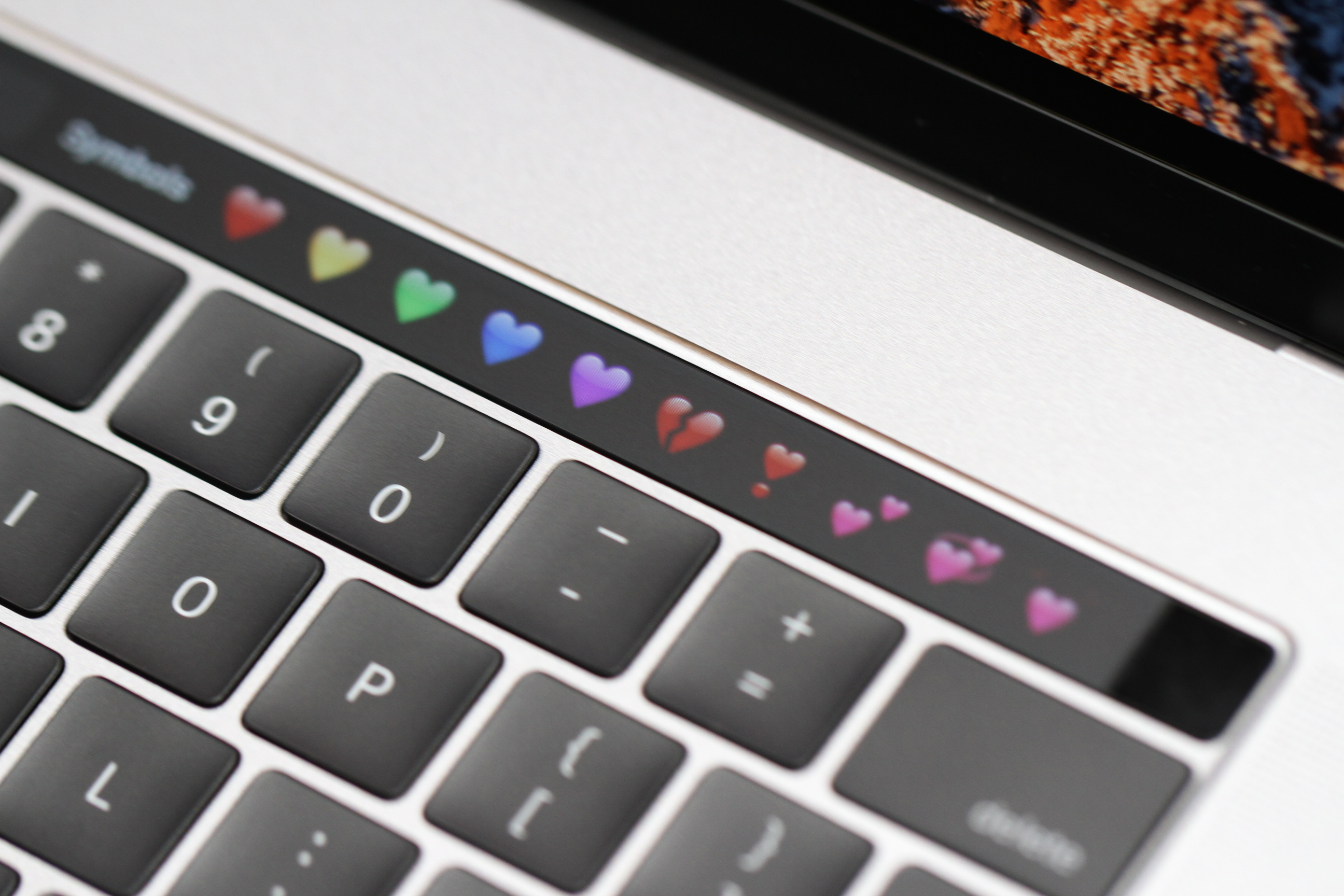
We’ve long been monitoring the continuously blurred line between MacOS and iOS, through features like Control Panel on the desktop. It’s continued here, but it’s happening on a front most didn’t predict: that tiny swath of real estate between the screen and keyboard. Like iOS, the Touch Bar pops up your most frequently used emojis by default. You can also scroll through them. The scrolling is quick and responsive, but I could certainly imagine it getting tedious when the time comes to pull up something more obscure.
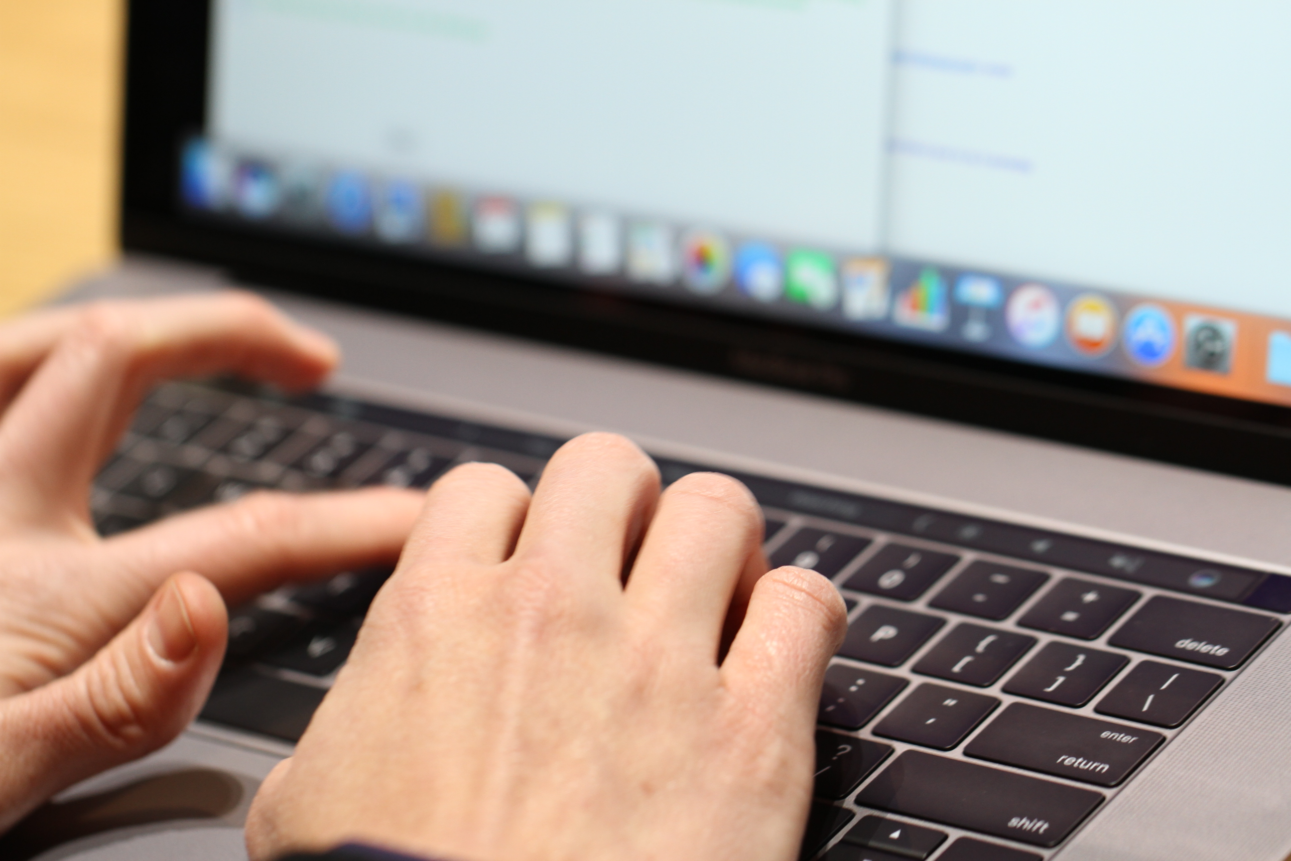
The keyboard, meanwhile, is similar to the version on the latest MacBook, featuring an improved version of the Butterfly Switch technology. It felt a little less soft, but unlike the trackpad, the company hasn’t quite mimicked the old-school keyboard. Granted, it’s hard to draw too firm a conclusion having only spent a small amount of time with it, thus far.
Also worth a mention are the speakers, which have been noticeably improved over the last version. They’re both louder and richer. Apple calls them “room-filling,” though I listened to them in a pretty large room. So, more on that, along with everything else when review time rolls around.
