Google’s bid to connect the world with its services is a multi-faceted effort that spans mobile services, search, maps, connectivity, devices and more. But today, it’s the company’s efforts in the world of fonts — perhaps one of the less celebrated, but still central, parts of that ambition — that is having its day in the spotlight.
Google, in partnership with font specialist Monotype, has taken the wraps off the Noto Project, a five-year collaboration between the two to create a typeface that applies to any language that now offers a single font style covering more than 800 languages and 100 writing scripts. The mammoth effort is now being shipped. The fonts are available under an open source OFL (Open Font License), both to use and to be modified with more design tweaks.
The aim here is a big one: regardless of which language you create or consume digital content in, there should be no “unknown” characters that come across as white boxes, which are described as “tofu.” (Noto is a portmanteau of “No to(fu)”.) And all of it, Google and Monotype believe, would look better if it were visually unified.
To be sure, there was a degree of skepticism when Google and Monotype embarked on this project, in my opinion well summed up in the words of Pakistani-American writer Ali Eteraz (quoted by NPR in 2014, when the project was already well underway):
“I tend to go back and forth,” he said. “Is it sort of a benign — possibly even helpful — universalism that Google is bringing to the table? Or is it something like technological imperialism?”
Fonts can be an extremely fun and liberating thing to play around with if you have a wide selection at your disposal, and the right one can make just the right statement at times.
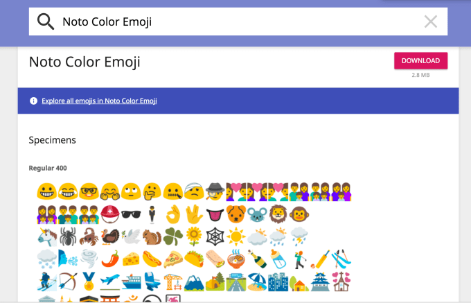
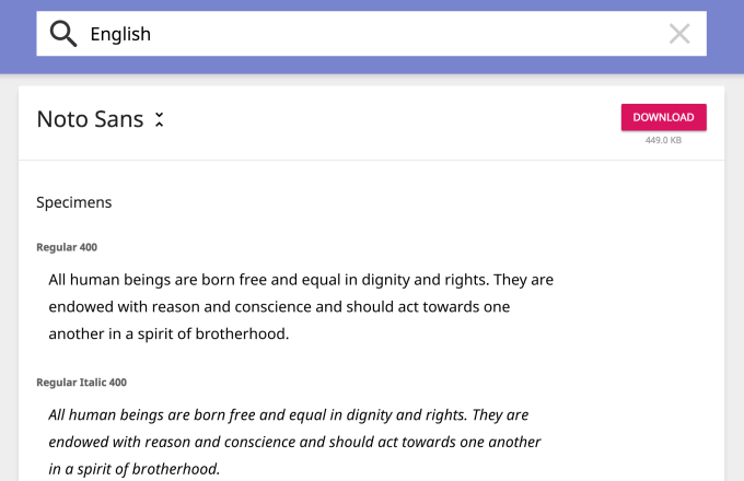
In that context, I’d say that what Noto has produced is more functional than inspiring. The resulting fonts are as unoffensive and neutral as you might imagine an everyfont might be (the basic English sans-serif font is down below), and with styles including different weights, serif and sans serif versions, numbers, emoji (which are basically Google’s emoji), symbols and music notations.

But as far as functional goes, it’s a notable and worthy effort of how to create a truly global font language, and come out with something clean at the end of it.
“Google Noto is a daunting project in size and scope, and I’m proud of how we’ve worked hard over the past five years to develop a really good product that solves a problem no one else has taken on before,” said Bob Jung, director of internationalization, Google, in a statement.
“Our goal for Noto has been to create fonts for our devices, but we’re also very interested in keeping information alive. When it comes to some of these lesser used languages, or even the purely academic or dead languages, we think it’s really important to preserve them. Without the digital capability of Noto, it’s much more difficult to preserve that cultural resource.”
What’s interesting to me is the division of labor between Google and Monotype when embarking on this project.
Monotype was in charge of a lot of the actual design work. This included, it said, “researching and digitally designing the characters, writing systems and alphabets, and applying the rules and traditions for those individual languages to the fonts and managing the project, including organizing outside designers and linguists around the world who specialize in specific scripts.”
Google, for all its engineering and other prowess, appears to have occupied the client role, setting out the parameters of what it is that Monotype needed to do, and paying for it: It “defined the requirements and scope of the project, shared significant input into design direction for major languages, contributed design review and technical testing resources and expertise for a broad range of languages, and provided the funding that made this project possible.”
The two said also that “hundreds of researchers, designers, linguists, cultural experts and project managers around the world have been involved with Google Noto” as well.
For Google, this fits with the fact that the company is launching services and wants to grow its footprint wherever Internet connectivity can go. It also dovetails nicely with the company’s other efforts around languages, specifically providing translation frameworks for a wide range of languages that are both active and in decline (an effort that broke the 100-language barrier earlier this year).
In response to the claims that there may be some kind of commercial imperialism here, Monotype — which has been working with Google since 2011 and the release of Unicode 6.0 (we’re now on 9.0) — seems to have gone about its effort with a degree of sensitivity.
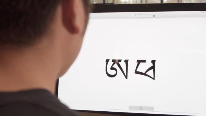
Describing the company’s approach to Tibetan, for example, Monotype did “deep research into a vast library of writings and source material, and then enlisted the help of a Buddhist monastery to critique the font and make adjustments. The monks’ constant study of Tibetan manuscripts made them the ideal experts to evaluate Noto Tibetan, and were instrumental in the final design of the font.”
While the Noto fonts are being released today, Monotype and Google said that this continues to be a work in progress, with more scripts and weights getting added with subsequent Unicode standards.
“We are passionately dedicated to type and helping to advance the use and adoption of type across many cultures, languages and geographies,” said Scott Landers, president and CEO of Monotype. “We are thrilled to have played such an important role in what has become one of the most significant type projects of all time. The combination of Monotype’s type expertise and Google’s innovation has proven to be a productive relationship and we look forward to continued collaboration that helps advance the use of type to new places.”
More on the Noto font effort in Google and Monotype’s video, here:
Creating Noto for Google from Monotype on Vimeo.

