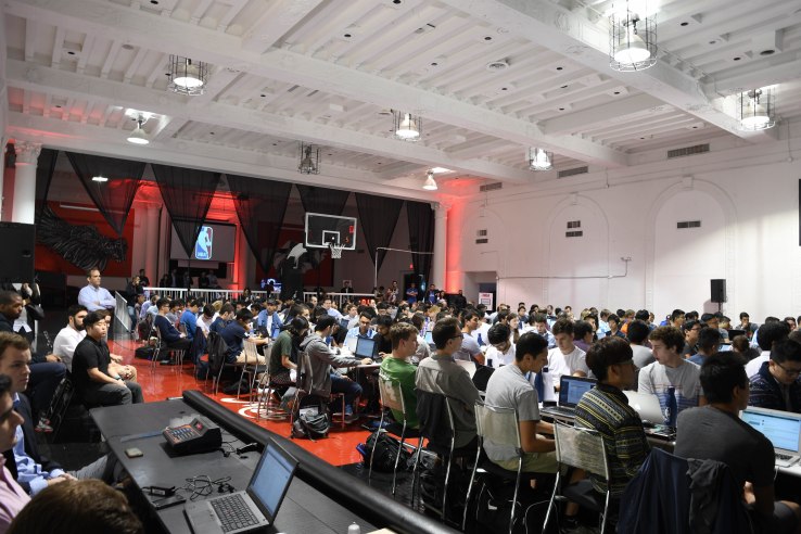
The NBA recently held an invite-only event in Midtown Manhattan: Its first hackathon. Their goal: establishing a new way of looking at game stats. But that goal entails far more than just a new software hack.
America has many favorite sports, it seems. Baseball is one of them; MLB (Major Baseball League) stands as a good example of having stats analysis and predictions for everything: hitting, fielding, pitching, errors, etc. — there really is no end to it all.
Meanwhile, the NBA has been increasing its stats know-how for commentators, coaches and players in recent years; this hackathon is an example of wanting the edge. This is a foray by the league to be more aware, but also more analytical. But where this matters most is through public perception: the viewers.
Future viewers will be exposed to far more data than ever before if the NBA keeps its eyes and ears open to producing more statistics. Knowing this adds context as to the NBA’s sudden desire for new players — not on the court, but behind the laptops.
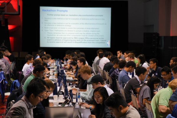
If you ask the programmers at the event, the NBA was more or less sampling: 200 programmers within three skill brackets, each containing teams that the league hoped would approach the challenge differently.
The micro-management of the event had a presence; it could be felt, not just seen. The NBA’s audience development team explained this one: the separation was one of skill, and consisted of undergrads, graduates and PhD laureates.
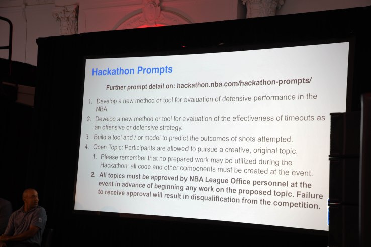
The rules of the hack were simple: Data used for the analysis that each team would provide was preset by the NBA and wasn’t to be tampered with — or risk disqualification. Oh, and there’s a time limit: Coding started at 9AM and ended at 5:15PM — eight hours and 15 minutes.
Seems fair enough.
The event begins
My first question about the event wasn’t just what the end-product might be (it would have to be good, after all), but what was going through the heads of these 200 people. Indeed, this intrigued me; as a sophomore computer science major in college, I was watching some diligent minds at work, doing what interests me.
So, I had to ask questions. Post-hackathon, I had email conversations with the teams, and asked them a few clarifying questions. After all, there was over 5GB of data for the teams to analyze, so you had to be more than up for it.
After all was said and done, I had to question the team with the No. 1 spot: To The Case Against Hero Ball. The team consisted of Columbia University graduates Alex Wainger and Zac Robertson, with undergrads Ella Kuzmenko and William Robbins from NYU and Pace University, respectively.
Speaking with Zac Robertson, Columbia University:
Q: Firstly, how did you approach the data?
A: We spent the first hour or two of the hackathon looking through all the different datasets. There were some suggested prompts, like creating a defensive efficiency formula or analyzing factors that make a shot more likely to go in, but we wanted to take a different approach.
Q: What were some problems you faced? Any data challenges?
A: Just the sheer volume of data was probably the biggest challenge. With over 5 gigabytes of data ranging from shot stats to possession stats to player tracking data down to the 1/25th of a second, choosing a topic that was both interesting and feasible to complete in a day was difficult.
It sounds like an impressive job and a fun day, coming from the winners, but it wasn’t all that seamless: Robertson dropped me a line after I asked how long it took the team to finish. “I think we submitted with around 2 minutes left on the clock,” he said.
The analysis that bought them a smile from the NBA? Looking at a tactic any coach worth his salt would know is a terrible idea: hero ball.
Q: So, what was the end result?
A: We analyzed player tendencies in the regular season as opposed to the playoffs for behavior that fit in with what people call “Hero Ball”— things like excessive dribbling by one player, less passing, and more standing around.
Our hypothesis was that in the regular season, there is a more team-oriented style of play, whereas in the playoffs there is a more selfish style of play.
We built a d3 application showing regular season stats on one axis, playoff stats on the other, and a 45 degree line that represented behaving the same way in both scenarios. You can choose a stat and interactively see the team data move around on the chart.
We found that among eventual playoff teams, their playoff stats involved 15% more dribbling, 10% more standing around, 4% less passing, and 4% fewer points per possession.
What more could you want?
Take away all the data-crunching and target analysis and try to boil it down to one reason for you to take on a programming challenge. For me, it might be curiosity. After all, 200 people wouldn’t travel from all over the United States (or maybe take the dreadful 1 train) and sit down for more than eight hours without some innate desire to be there.
Curiosity may be just one of those reasons.
Speaking with Will Robbins, Pace University:
Q: What drew you to coming to the NBA hackathon?
A: For me, the one thing that drew me to the Hackathon was the learning potential. I’ve always been a stat geek in terms of the NBA, I’m much more interested in the behind the scenes portion of the sport (coaching and data analysis), compared to actually playing.
I saw the Hackathon as an opportunity to make new connections, meet some of the brightest minds in analytics, and further my own knowledge.
So the desire to learn and network, basically.
If you asked, “what takes the most time?” when wondering about the building of a basic analytics program, the answer might be visualization. When speaking to Alex Wainger from Columbia University, his answer was similar, but with great detail.
Responses from Alex Wainger, Columbia University:
Q: Elaborate. What took the most time? Why the NBA hackathon, specifically?
A: We spent at least half an hour brainstorming what we wanted to do after seeing the prompts. We floated a lot of ideas on the provided prompts, but ultimately settled on a prompt of our own — analyzing the differences between regular season and playoff basketball to see if the concept of “hero ball” really exists.
We did some quick exploratory data analysis to see if there was actually anything significant in the data that could drive our project, and when we found some interesting differences between the playoffs and regular season, I went to work on an interactive visualization.
The visualization took the majority of my time — I built it using d3.js, a JavaScript library, and hosted it online with Github Pages. The rest of my teammates focused on diving deeper into some data I generated with a Python script, and ultimately found that teams moved the ball a lot less in the playoffs, and also scored fewer points per possession. They threw together a PowerPoint to present our findings and we handed everything in with literally a minute to spare.
As you hinted at with one of your questions, I think time was probably our biggest challenge.
Once we settled on our topic, the longer we spent working, the more ideas we had about different avenues we could have taken the project down (incorporating differing levels of defense, controlling for close games versus blowouts, analyzing individual players’ tendencies, etc.) and if we had an extra few hours, or even another day, we would have tried to incorporate some additional complexity into our project.
Some afterthought…
Now, as the writer, let me be honest, with you, dear reader: I don’t ever watch basketball games; I grew up playing in tennis tournaments and studying martial arts. More often than not, I was characterized as being interested in basketball based solely on appearance; that’s a different discussion, for another time.
But just think on it: A sport like basketball, with its immense requirement for physicality, might soon be grabbing a cloak that grants it more technical, critical analysis of professional games. But that reality is still some time away, so if you’re interested in seeing what the team’s winning visualization looked like, look no further than this GitHub link.