Many things have sought to capture your undivided attention, but that might be the ghost of a goal in today’s reality. We’re less attentive than goldfish; even our best and brightest can’t focus; and we’re more likely than ever to be paying less than full attention in even circumstances where distraction can be deadly.
And that genie isn’t going back in the bottle, so responsible product design now has to assume a high and growing average level of user distraction. Already, the products that perform well and generate high engagement from users are designed to cater to the idea that what people are interested in is constant distraction.
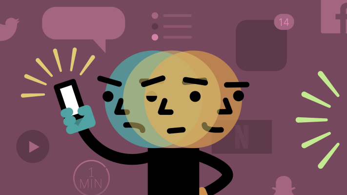
Twitter is an example that’s almost onomatopoeic in its exemplification of our shortened spans of attention. Facebook is little better in terms of sustaining interest, but for many it operates as kind of a default distraction, something to which people reach in order to avoid at all costs the cardinal sin of boredom.
You can debate whether they actually caused our ever-higher tendency of distraction, but modern tech products are increasingly designed to satisfy users who are quicker to get bored. UX designer David Teodorescu sums it up in an article detailing design best practices:
We expect speed. We demand no more than a few minutes for Uber car arrivals, same-day deliveries from Amazon, instant upload time of huge images on Facebook and not a single millisecond of buffering when watching a Youtube video.
Speed is a competitive advantage when it comes to apps and hardware, and cutting-edge advances turn into also-ran table stakes quickly – which means today’s mercury is tomorrow’s molasses. But speed, while a virtue in some instances, is a significant pitfall in others.
More multi-channel
One of the results of the trend to design user experiences that appeal to a more distracted user base is a tendency to assume that any kind of media consumption will span multiple channels at once.
The easiest example to point to might be the two-screen TV trend that became very popular shortly after the advent of smartphones, wherein broadcasters, TV content creators and others have tried to use devices that potentially distract viewers to amplify their own production.
Network shows almost universally have hashtags now, for instance, and almost every major player has experimented with creating some kind of companion app, often employing audio fingerprint tech to sync up stuff from the small screen with what’s on TV.
For publications like ours, this also means having a strategy for presenting content differently to audiences across platforms and devices. The earliest identity crisis around this occurred with formatting content for consumption on mobile, and whether it was better to go with a native app strategy or make use of webpages specially formatted for smaller screens.
Now, it’s more sophisticated; content is recreated for Facebook, for Snapchat, for Twitter for the web, for desktop video and for mobile audio. Every touchpoint is a renewed opportunity to catch someone’s attention, and on the consumer’s side, attention is configured differently depending on where a user is currently focused.
The new normal
Situational expectations can only vary so much, though. At this point, it’s probably fair to assume that there’s been a baseline shift in how much attention we can expect users to give any activity at any given time. And that includes attention-intensive tasks like driving a car. Or riding a bike. Or just walking down the street.
Tesla’s Autopilot-involved crashes are a recent, stark example of what happens when our attention maybe isn’t fully devoted to the task at hand. And while it’s still mostly fodder for hoaxes posted to Reddit and other obscure corners of the internet, there’s some precedent for the expectation that new augmented reality game Pokémon Go will eventually result in a distracted death.
Driver deaths have been steadily decreasing since a peak in the 70s, but distracted deaths are earning an increasing share of the overall number. Governments are trying to regulate away the problem of distracted driving, at the federal and state level, but the question of how well laws can mitigate the risk remain. A report from the Centers for Disease Control and Prevention (CDC) from earlier this week notes that, in fact, traffic deaths are up an estimated 8 percent between 2015 and 2014, which is the larger increase in 50 years.
When warnings won’t work
Included in the National Safety Council press release regarding the CDC’s findings is the following guidance about how Americans can reverse the troubling trend of increased driver deaths:
We must disconnect from any device or system that could take our minds, eyes and hands off the task of driving.
It’s hard to fault the logic of that advice. But it’s also increasingly hard to see any reasonable return on efforts to shame people into being less distracted. It’s obviously true that people bear responsibility for their actions – but it’s also true that sticking to a strategy that relies mostly on just telling people to be more mindful when that’s failing to have the desired effect is not only stupid, but also dangerous.
General research on the overall effectiveness of warning labels is fairly split. Often, where labels have proven effective, there are other concurrent factors at work that might also be contributing, including multi-part educational programs. It’s possible that dire warnings, repeated often enough and with significant emphasis, will change behavior – but it’s also possible that UX design which caters to decreased attention spans minimizes the benefits of any advice insisting we pay attention.
Drop better or worse and move on
Debating the relative merits of a more distracted versus a more focused society is about as worthwhile as kicking rocks. We’re better off accepting that, regardless of its merits in terms of actual productivity and even brain health, responsible product design should accept it as a new reality for the average user.
What does that mean in practice? Expecting that any opportunity your UX presents for distraction will result in divided attention, for one. Here’s a list of what that means:
- If your product allows a user to feel at all that they can do something else simultaneously, expect them to do that.
- Assume that partial participation by a user is roughly equivalent to no participation at all.
- If a task requires significant user attention, make it challenging – this might mean actually downplaying so-called “smart” features.
Taking advantage of the growing inclination to avoid even a second of boredom works well enough in the case of most consumer-facing products, but well enough doesn’t cut it across the board. There’s no need to babysit users, but there’s also no reason to deny significant changes in the marketplace. The increased tendency towards distraction has impact virtually everywhere.