The Apple Watch needs an action button. Something to allow you to confirm, acknowledge, activate and navigate using a physical press. There’s even a button right there, on the side, waiting for the task.
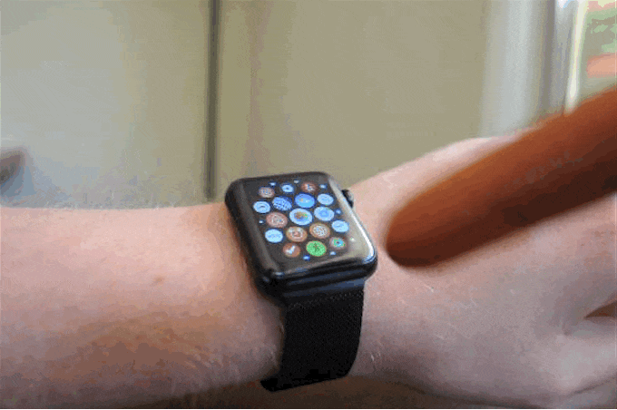
The button, located right below the scroll wheel, was originally used by Apple for the People function. So few folks used this feature that Apple is canning it in watchOS 3 and replacing it with the “dock,” a series of apps that you swipe through like you previously did with the “glances” that popped up from the bottom.
So now, you tap on the button and you get a swipeable dock of apps. Still not ideal. I’d venture to guess that so few people will use the dock that it could be up for replacement again with watchOS 4.
When that time comes, I want Apple to replace it with a general OK or Action button. Something you can physically press when you need to confirm, stop a timer with sweaty hands, mute a notification, move “forward” in a stack — anything.
I’ve been talking about this concept for a year with Chris Harris, founder of Tapjet. But the importance of having a button seemed to pale in comparison to the issues loading and transferring data and keeping interaction times down to just a few seconds. We started the discussion up again after Apple announced such solid progress on fixing the slows this week at WWDC.
It feels like trying to operate fine clockworks with a wet hot dog.
Note that what we’ve come up with is not a blueprint for exactly how it should be. Instead, it’s a way to start a discussion about the concepts of navigating a smartwatch. The smartwatch “era” is so young that Apple and (everyone else) is still gathering data about how, why and when they’re being used. Nothing is set in stone, so it’s a good time to think hard about how these things should work.
The new Apple Watch software shows that Apple is still a company that looks at the data and makes intelligent, humane decisions about their products. It is not afraid to change its mind, which is important. And to its credit, the new dock, activated by the side button on the watch, employs intelligence in how it surfaces apps that you use regularly. And it’s a huge improvement over the People screen.
Simply put, the People button misjudged how people would converse and communicate with the watch. Instead of being a place to initiate conversations, it is generally used to continue them, which makes a directory much less important. The new dock will start, by default, on the People screen, which minimizes the feeling of change for upgraders. But it will quickly fade down the list as people use other apps much more often.
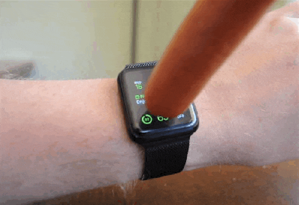
But the nexus of the problem is really about how the watch feels to use. Tapping the screen is regularly too sloppy or finicky a gesture for the situations and states in which humans use the app.
All too often, when you force smoosh your sweaty fingers on the Watch after a long run or you attempt to precisely trigger a complication while holding onto a handle in a swaying train car it feels like trying to operate fine clockworks with a wet hot dog.
When you want non-linear, immediate access to a function and you have the time and stability to do so, touch is great. When you want to pound the “pause” button on some music, end your workout or answer a call, there’s no substitute for a button.
While we’re at it, apps need to stop being treated differently from faces. Faces and apps are both faces. You’re just getting different sets of information and actions from each of these. The Apple Watch is not a watch that runs apps, it’s a watch with a bunch of really powerful faces. That follows the watch paradigm closer than anything that we’ve got now. The loosey goosey honeycomb app switcher is, I’d bet, incredibly rarely used. It’s finicky and doesn’t offer the finite snap or scroll interface that would make so much more sense on a device that is practically allergic to fussiness.
These two concepts go hand in hand.
If we were to begin thinking of the Apple Watch as a viewing screen for faces, and to boil down the navigation concepts a bit to their core strengths, you end up with something like this:
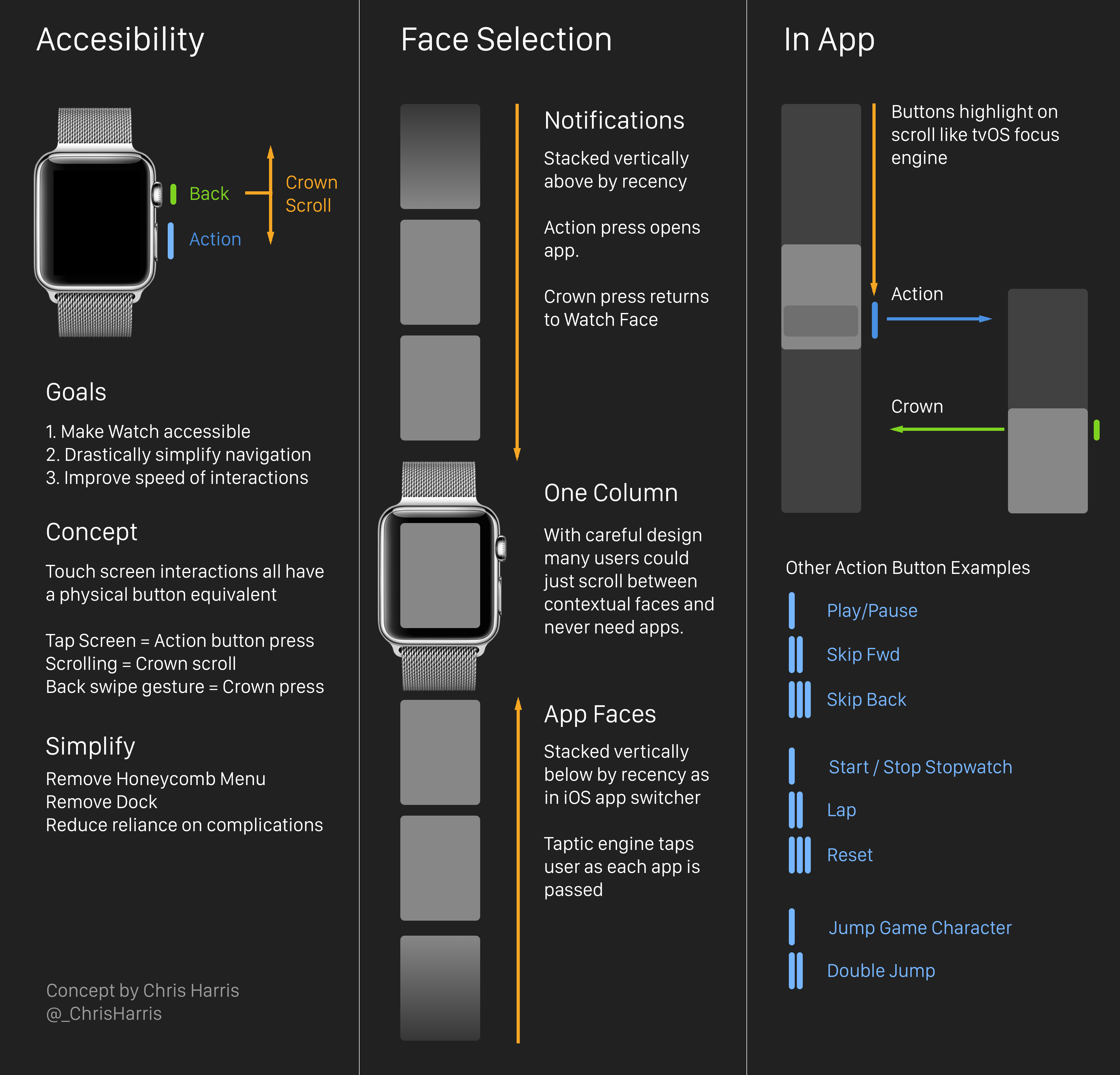
Vertically, you have your list of common apps. These are the ones you use every day. At the center is your default face. To scroll between these you use the wheel to move upwards and downwards — this would require giving up Time Travel, but once again I think the usage data would probably be cough light on this feature too. Add a bit of a snap to the first move beyond your face — a tiny bit of tension that prevents an accidental scroll — and you’re in business.
On any of these screens you can scroll or tap to select and then confirm with your new fancy ‘OK’ button. You could even use it without looking at the screen or knowing anything beyond a bit of haptic feedback. At the very end of the list of face apps you could add a group of icons that would allow you to pin new ones to your list.
Feel free to discuss and poke at this. It’s far from the world’s greatest design precis. I’m a voracious Apple Watch user, and, after over a year of allowing it to rub up against the real world with all of its indignities, I think that a healthy dose of simplification and physicality could help it move from something for gadget lovers and fiddlers to a truly indispensable device that acts as an interface between the physical and digital worlds.
Something I’ve written about before if you’re interested.