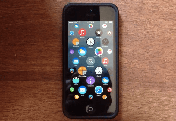
Ever since Apple announced the Apple Watch, it’s been easy to let the imagination wander a bit. It’s the first product out of Apple in a long time, perhaps since the iPhone, that feels truly exciting and new. Much of that is thanks to the user interface, which has a very distinct look from the UIs of the iPhone, iPad or even Macs.
YouTuber Lucas Menge has also been inspired to exercise his imagination, building a prototype of the Apple Watch UI as it would appear on an iPhone. Rather than having horizontal pages of static, equally spaced icons, the prototype shows an infinite, multidimensional scroll throughout apps, with automatic centering and the ability to zoom in and out.
Whether or not it’s more practical than static drawers and pages is yet to be determined. However, Lucas Menge says that an article on 9to5mac, written by Michael Steeber, arguing why the Apple Watch interface actually makes more sense for the multi-sized displays of the iPhone and iPad, was the inspiration for the prototype.
As we move to a predominantly touch world, it’s not hard to imagine more and more interfaces looking like this. In fact, Famo.us has been working on technology for this for quite some time.
You can check out the full video below or click here. (Skip to the :44 mark to get to the actual prototype.)
