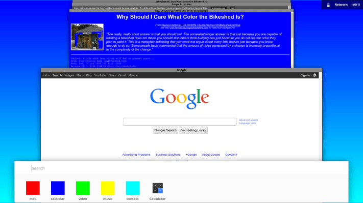
All of Google’s properties will eventually bear a look inspired by ‘Material Design‘ and Android L, and Chrome OS is part of that sweeping visual overhaul, too. A new preview posted by Google “Happiness Evangelist” François Beaufort today (via 9to5Google) shows a very early design inspired by the card-style multitasking view that made an appearance in Android L, the new Material Design-based update for Google’s mobile OS.
The new look, which clearly lacks polish and yet bears some hallmark resemblance to Google’s other Material Design reimaginings, is actually available already on the prerelease Chromium OS builds, and those keen on getting an early look and not afraid to get their hands a little dirty can follow along with fresh updates to the new look as they happen.
What’s interesting about this new look is that it resembles not only Google’s other efforts around Material Design, but also Apple’s use of Time Machine and Microsoft’s stacked multitasking view introduced in Windows 7. The Cards metaphor is not new by any means, of course, but its use across Google properties looks to be a certainty, although this is a test only and things can definitely change before we see any major alterations committed to the final release of Chrome OS.
