Today at an event for its users, Airbnb announced a massive redesign to its website and mobile apps that is designed to make it easier for users to find the information that they need while also making listings on its platform more appealing. The company also introduced a new, modern logo that will replace the lower-case cursive “a” that has defined it over the last several years.
The functional elements of the website and mobile apps will largely stay the same, following a massive overhaul Airbnb did last year. But it’s updated the look and feel of both with this update.
With the launch of the new site, Airbnb has largely gone “flat,” swapping out its previous design filled with shadows and gradients and instead filling it with more white space and a common font throughout. It stripped text that used to be overlaid on top of photos and placed it below the images and added host photos alongside listings, so guests know whose place they’ll be staying at.
That starts with Airbnb’s Discover feed, which has been updated to take into account more information about a user’s location to show nearby listings and destinations. For folks in San Francisco, that could mean listings at nearby “getaway” spots such as Tahoe, or popular destinations like Los Angeles or Portland.
That feed largely replaces city and neighborhoods information that had been highlighted in previous versions of its design. But have no fear, that info isn’t going to disappear — it’s merely being better integrated into other parts of the platform. (More on that below.)
A Brand New Listings Page
Overall, the new design highlights the things that really matter when users are trying to decide if they want to book a listing or not. It starts with giant images that fill up the top half of the screen in users’ browsers in listing pages, and follows with ratings, a photo of the host, and relevant info about what kind of listing it is, how many guests it can accommodate, etc.
From there it provides information at a glance about the listing — what kind of amenities are provided, what the cancellation policy is and the like — and then provides the host’s description below. According to Airbnb head of user experience Katie Dill, that decision was made to highlight the hierarchy of information that guests look for when deciding whether or not to book.
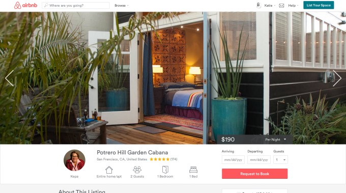
To make it easier for guests to do so, Airbnb has made its booking widget on listings pages “sticky,” so that it remains visible on the page as users scroll.
Over the past few years, Airbnb has worked hard to create neighborhood guides for many of the major cities around the world that its guests hope to stay in. By doing so, the company can show guests what they can expect when they arrive and what kinds of activities, shops and restaurants are available nearby. With the new design, Airbnb brings that information directly into the listings page.
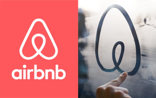
A New Brand Identity
While Airbnb users will recognize the big changes in how the site looks, another major element of the Airbnb brand is being updated. The cursive lower-case “a,” which has come to represent the company on its website and in its mobile apps, is being replaced with a new logo image.
The “Bélo,” as it’s called internally, looks like an upper-case “A” that has the familiar symbol for location on a map inside. The icon was created in partnership with a U.K.-based design studio, and Airbnb hopes that it will better represent its ambitions as a global hospitality brand.
For Airbnb, the new symbol is supposed to represent belonging — hence the name, get it? — which is kind of a hippy-dippy concept, but that’s something the company is betting its community buys into. After all, you gotta believe in something if you’re going to go stay in a stranger’s house or apartment, right?