Adobe and Google today announced the launch of a new open-source font for Chinese, Japanese and Korean (CJK) languages that covers 65,535 glyphs, making it one — if not the — largest font to cover these languages. The font, which was optimized for both print and screen, is now available for free through Google Fonts and through Adobe’s Typekit, where it is included in the free tier.
For reasons surely only the respective companies’ marketing departments understand, Adobe will call the font Source Han Sans while Google will release its own version of the font under the name Noto Sans CJK. It will also be available through Adobe’s SourceForge and GitHub repositories and the company will make subsets of the font available to those who only need support for a specific language.
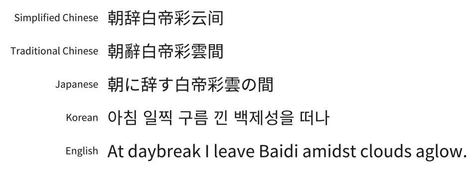
By default, the font supports Japanese, Traditional Chinese (including Taiwan and Hong Kong SAR), Simplified Chinese and Korean (with hangul syllables), as well as Greek, Latin and Cyrillic alphabets.
 Having Adobe and Google work together on an open-source font may seem somewhat unusual. Adobe’s principal product manager for type Caleb Belohlavek told me last week that the two companies actually started talking about this project about four years ago. Building a pan-CJK font was something Adobe had been wanting to do for a while and something Google thought would be useful for its own products and its developer community. For Google, this had to be an open-source project, and while that wasn’t always in the nature of Adobe, the company had already started working on its open source font at the time. Eventually, the two companies decided to pool their resources to get this project off the ground.
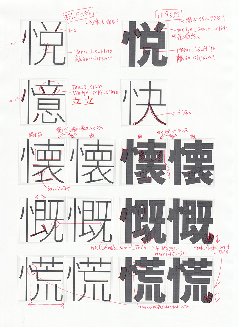
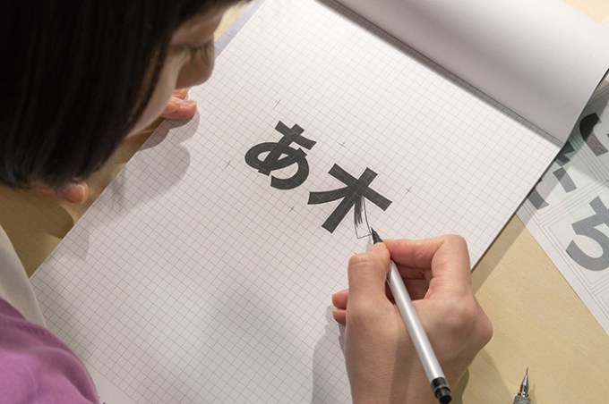
Belohlavek tells me that once the project got off the ground, Adobe’s Tokyo-based Senior Designer Ryoko Nishizuka started working on the overall design of the font, which Belohlavek described to me as “simple in style will retain the elegance of a traditional sans design for Asian characters.” This, apparently, was quite a daunting task, given that many of these glyphs may have up to four different regional variations. Adobe tells me that the other issues the designers faced was to ensure that the font will harmonize well with Google’s existing Roboto and Noto Sans families and Adobe’s own Source Sans Latin glyphs.
Adobe handled most of the initial design, and Google contributed to the project’s direction and provided the funding for much of the second part of the project, which involved shipping the initial design to partners in Japan, China and Korea to finalize the fonts. While each of these languages is based on historical Chinese forms, they have all morphed into different systems over time, with additional (often subtle) regional variants, all of which have to be accounted for in a font like this.
In total, about 100 people worked on this project according to Adobe. The full font weighs in at 19 megabytes and offers seven weights.