The new Time.com is here.
Well, it should be here for some of you, anyway. A spokesperson said that the first few users should see the new layout now, and it will continue rolling out tonight and tomorrow.
Time has been talking about the relaunch for months now, matching the talk with new hires (it has has made 35 of them since April) and by bringing on design studio Big Human.
Nancy Gibbs, who was named managing editor in September, said that the redesign is phase four or five of a longer-term process — the magazine has already been placing a bigger emphasis on things like mobile and video, we can expect to see additional changes in the months to come.
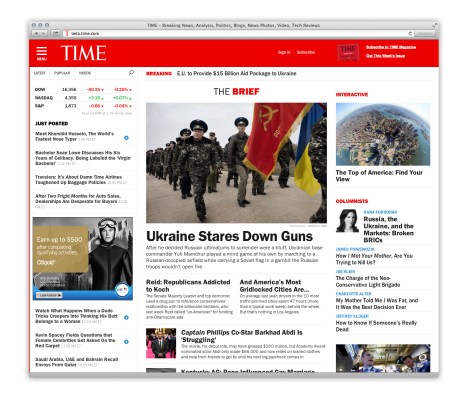
You can see the new homepage in the screenshot above. As news homepages go, it’s not all that radical. Gibbs described it as a “higher protein version” of the current one, a homepage that’s able to accommodate more content in general, and more breaking news in particular. The latest stories are featured on the left rail, the most important current news is highlighted in the central area called The Brief, and columnists and other features show up on the right.
Along with the redesign come relaunch sponsors (Citi, Siemens, and Advil), as well as new ad units. Any banner ad can now be “magnetized,” said Publisher Jed Hartman, meaning that when a reader clicks on them, it opens larger ad in the center of the screen, and different sections of the ad can be activated by clicking on different parts of the original unit.
And like other publishers, Time is offering native ads that are presented in the style of editorial content (while being marked as sponsored). These aren’t the first native ads on Time.com, but Hartman said they had to be “retrofitted” for the site before — this time, they were incorporated into the “ground floor” of the redesign.
Oh, the ads have been moved to the left rail, which might sound like a minor change, but it makes them more prominent, Hartman said.
The site uses responsive design, so elements will shift to accommodate the smaller screens of tablets and smartphones. When I asked if some elements might be applied to Time’s mobile and tablet apps as well, Gibbs replied that it’s “the philosophy” that carries over: “We want the experience to be customized for the platform.”
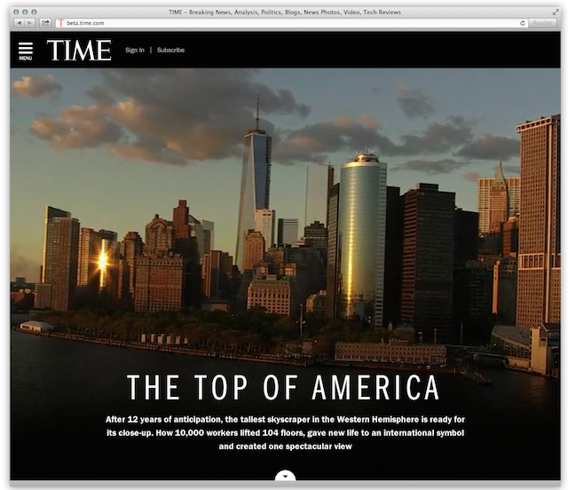
The redesign, by the way, was originally supposed to happen last fall. Gibbs said the delay was less technical and more editorial — Time was working on big feature about 1 World Trade Center that would highlight both its technical and editorial capabilities. The feature is supposed to go live on the website tomorrow morning, with a panoramic, interactive image taken from the top of the building. (Time photo editor Jonathan Woods and his team had exclusive access to the spire at the top of the wire, and they worked with startup GigaPan to create a “13- foot long aluminum jib” that was used to create the image.)
The feature will also be the cover story in the print magazine, with a three-fold cover, and there are plans to release book in April, too.
With all the changes, I asked Gibbs if the editorial vision has changed as well.
“I think the editorial opportunity has expanded,” she said. “To tell great stories, help people understand what’s happening, why it matters — to the extent that that’s our editorial vision, we have the opportunity to do that for much bigger audience.”
Time says the website saw 23 million unique visitors in January, an increase of 118 percent year-over-year. And mobile now accounts for 45 percent of its traffic.
Update: The 1 World Trade Center feature is now live here.