Peek is a new (paid) calendar app for iOS that’s aiming to appeal to the social middle ground of people whose lives don’t consist of non-stop meetings from 9 ’til 9. So not a calendar app for professional calendar nerds, then. The app rethinks the calendar as a gesture-based playground, rather than a spreadsheet-esque chore.
It’s an attempt at designed interaction, with a minimalist interface that incorporates a playful, gesture-based UI — itself flagged up by the cheeky name Peek.
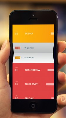
The look and feel of this calendar combines flat design — via rich blocks of colour — with a mischievous sense of dimensionality that allows subtly sign-posted calendar entries to fold open like origami when tapped on and hinge-closed again, simultaneously mocking the lie of flat design while embracing its seamless perfection.
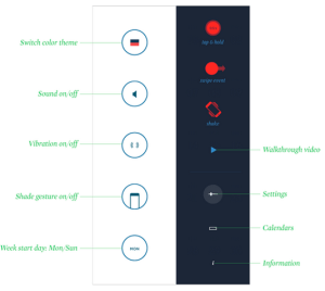
To the uninitiated user, Peek’s interface can appear enigmatic or even inscrutable at first glance — with a rack of icons swiping into view that look alien rather than immediately obvious, and a series of interface gestures required to navigate the app’s functions, which don’t immediately leap out as intuitive and absolutely do require a little poking and prodding around to get into the swing of.
 Yet, spend some time getting to know Peek, unlocking its finger signs and flat symbols, and the interface transforms — or rather unfolds, revealing hidden depths of fun and functionality beneath an intentionally minimalist exterior.
“Instead of using the conventional navigational elements, we decided to build Peek from the ground up,” says Peek designer Amid Moradganjeh.
“We believe interfaces can be more about the content. Focusing on the content makes the conventional navigational elements less visible, and using gestural control allows the design to be cleaner, quieter and more ambient. This can actually speed up the process of using calendar.
“There is also an element of play in Peek,” he adds. “We wanted to introduce new behaviors that are more fun to use. We believe that fun does not necessarily have to be less functional.”
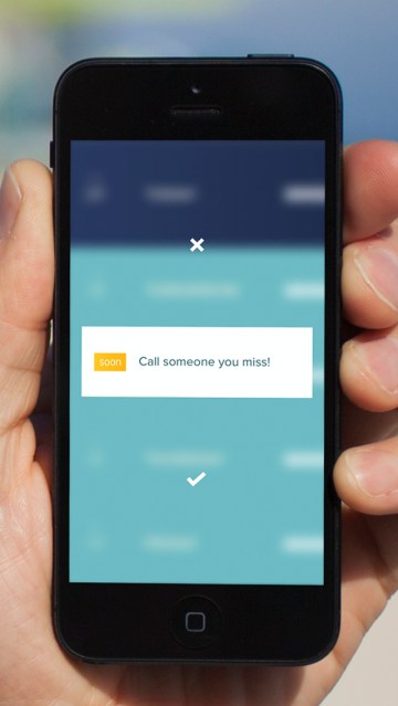 Peek’s sense of fun can be summed up by a shake gesture feature that allows the user to ask the app to come up with an idea for something new to do in future — such as ‘read something inspirational’ or ‘call someone you miss’ — which they can then choose to add to their calendar at a random time ‘soon’ (or not at all).
So, yep: Peek’s got serendipity diarized.
If you’re the sort of person whose heart sinks every time you have to call up and fill out a form to create a new event in Google Calendar (or its utilitarian ilk), exactly because it’s all check boxes and text input fields, then Peek’s purity of design is probably going to feel like a balm. Or a calendar panacea.
But, on the other hand, if you’re the type of professional time segmenter who relishes absolute granular specificity in slicing and dicing each and every one of your half hours on this earth, well, Peek will probably bring you out in half-day hives.
Here’s how the startup describes the design ethos it’s taking with Peek:
Peek is about cutting away the overwhelming features of mobile calendars. It redefines an on the go experience for people to use when they need it, so that they are not consumed by its entirety and benefit from its existence.
Peek is not just a minimalist and simple app, it is designed to be the right resolution for the context it is being used in. It is made to provide the necessary information in an easy to understand manner, without overwhelming you with data you might not need.
The app is the first product from Square Mountains, a new startup co-founded by Moradganjeh last July, and Patryk Zoltowski (who has a background in enterprise web app development). Designer Moradganjeh previously worked at vaunted design firm IDEO, and also at Microsoft (the latter may explain Peek’s distinct whiff of Windows Phone — an early and ongoing champion of flat design).
Square Mountains, which is based in San Francisco and Tallinn, Estonia, has a self-professed design focus clearly evident in this, its first product. A design ethos that’s hardly surprising given the IDEO connection.
“We believe that there is an opportunity to apply design thinking to the existing products and make them more useful for bigger groups of people,” says Moradganjeh when asked what problem the startup is aiming to solve generally. “We do not want to just come up with a new idea and introduce another gadget that only a small group of people might find useful.
“We have an approach which is very simple: understanding what people really value, coming up with new ideas, and then pushing technology to bring those ideas to life. Our goal is to apply the same approach and principles to other experiences and create more innovative products for people by using design.”
On Peek specifically, Moradganjeh reiterates that the aim is not to compete with calendar apps designed for power users, such as Sunrise, Tempo and Mynd. He argues that those are apps that “try to give too much to the users,” whereas Peek is designed for far less-focused folk.
“We think the smart calendars like Sunrise, Tempo and Mynd are great for the type of users they are designed for. But with Peek, we are addressing the needs of a different group, a bigger group, people that are not necessarily that busy. They simply need to manage time on the go without being overloaded by unnecessary information and features,” he says.
“For this group, if using a calendar app is not easier than remembering things or writing them on a piece of paper, then they would not use it. Our goal was to make Peek a more relevant tool for them so they can also benefit from managing time on their smartphones.”
Another goal for the app is evidently to act as a design showcase for what Square Mountains can do — to help it when it goes out seeking funds for what Moradganjeh refers to as “bigger projects.”
“We are currently experimenting with some new ideas that we hope will turn into products soon,” he adds, without being more specific about Square Mountains’ plans.
While Peek looks very nice on the surface, Moradganjeh concedes it is something of a “creative risk,” being as it’s so unconventional in its navigation — and thus requires users to put in the effort to learn it. Certainly I found my patience for figuring out the folds and foibles of certain sub-menus and deeper functions being tested. Portions of the design definitely felt as if they over-indulged at the expense of utility.
That effort may ultimately be at odds with the more idle audience Peek’s creators are apparently aiming for, although the app’s gestural dare and flare — and purist good looks — will undoubtedly push the buttons of tech aesthetes and attract a style-conscious app-using niche. So Peek may well get cachet, even if it doesn’t manage huge reach.
And if the app’s underlying aim is to plant a flag that puts Square Mountains on the map, and illustrates the calibre of design work this startup is capable of turning out, then Peek will probably have done more than enough work for one day.
Peek Calendar from Square Mountains on Vimeo.