Today, Tumblr is releasing its redesigned client for iPhone and iPad, bringing along a completely refreshed look and feel for iOS 7. The redesign, unlike some others to come out of Apple’s big shakeup, manages to maintain the core of what makes Tumblr so attractive to its millions of users.
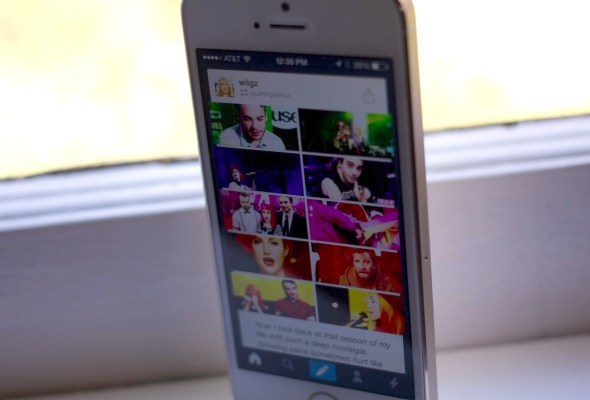
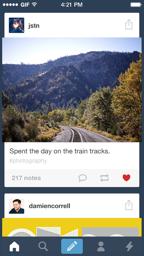
The new Tumblr app will look fairly familiar to users, as the trademark blue remains, as does the post format that puts the focus on the content being shared, with a slim bar of interface hovering behind, helpful but not intrusive. What’s gained this time is a big focus on the Activity stream, which was previously buried underneath the account tab.
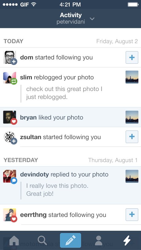
Moving the Activity stream out to the tabs, says Tumblr’s Creative Director Peter Vidani, was a decision that was made simply because it was so popular. Users, especially heavy users, were checking it a lot to see the latest likes, replies, reblogs and follows incessantly. Moving that out to the tab bar is a statement about how important this stream is. It’s the feedback loop, the thing that keeps you coming back to the app obsessively, just to see if you’ve got some new interactions to check out. The same concept drives feeds in other apps like Twitter’s Connect tab. If you’re getting feedback, you’re going to keep producing content (or re-blogging it) to get more. Call it Pavlovian, but it makes a lot of sense.
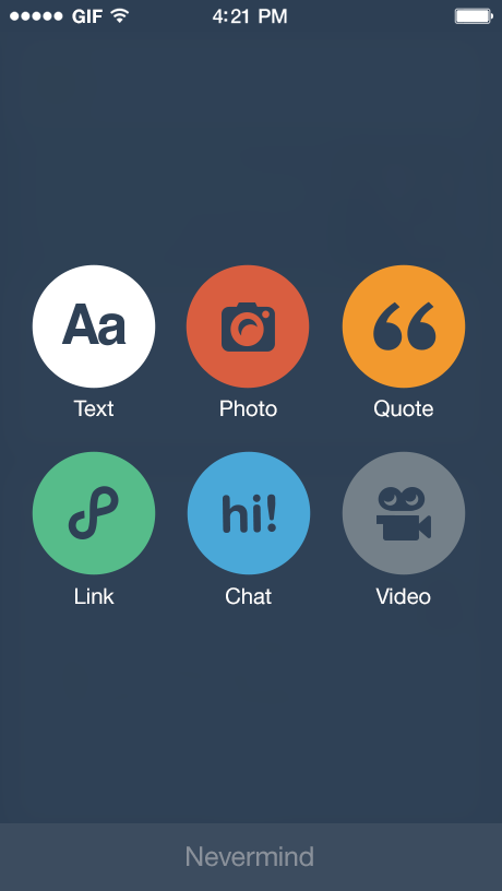
In addition to the Activity stream’s promotion, posting has also gotten a complete revamp. Tapping the new post icon gives you access to six large and easier to tap icons for all of the content types. Each of the composition screens has also gotten a revamp, but the photo sharing option is probably the most different.
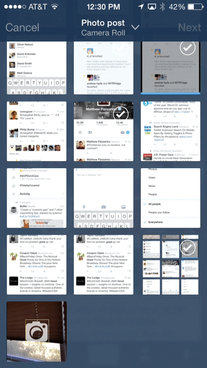
The photo capture screen is really cleverly done, and now dumps you onto a grid of images from your camera roll, rather than allowing you to choose immediately between the roll and the camera. This, Vidani says, was done after the data suggested that people dipped into their albums for images to post far more than they went to the camera. But the camera experience isn’t neglected — there’s a square near the bottom with a camera icon that displays a live view of your phone’s camera, inviting you to shoot an image if you choose. It’s neatly done.
Nicely detailed touches are scattered throughout. There are now ‘toast’ notifications that pop up while you’re using the app to tell you if you’ve gotten a reblog or like. This behavior was more difficult to implement on previous versions of iOS, Vidani says, because it was tough to get the metaphors to make sense. iOS 7 allows for much more freedom to ‘play with shapes’, letting the tab bar expand outwards to display the notification naturally.
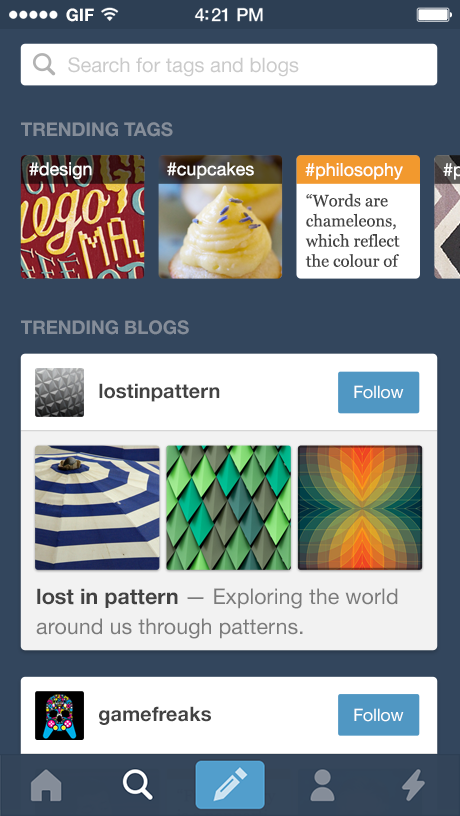
The Explore screen has also gotten a nice refresh, with a line of hashtag topics near the top that use iOS 7’s dynamics engine to stretch and scroll quirkily. They’re also animated, displaying video or gif content to catch the eye.
Vidani says that Tumblr has been making an effort to make posting more of a ‘casual’ function. This, he says, is in keeping with Tumblr’s design directives to ‘keep it small’. Even the number of things that a user is being asked to assimilate on the screen at once is given careful consideration.
This fits in thematically with other interesting experiments in the online publishing world. Medium, for instance, leverages the lowered barriers that come from making the act of creating a post the same as publishing a post. It’s a one-for-one equation. When you make a post in Tumblr, the post screen looks exactly like it will once you hit go. There’s no ‘rendering’ process here like there is with some platforms like WordPress. Yes, there are limitations to this approach, but it also keeps the threshold for self-publishing to the bare minimum.
Services like Tumblr (or Twitter, for that matter) have taught a generation of content creators that publishing things to the web can be something we do from anywhere, at any time, without a major production. This redesign keeps to that tenet well.
The overall feel of the Tumblr app for iOS 7 remains close to its previous editions at heart. Everything has been touched, massaged or redesigned, but it doesn’t feel foreign. “We thought hard about how to apply the feel [of iOS 7] without compromising what we know to be Tumblr, what users know to be Tumblr,” says Vidani. From our brief time with the app, that appears to be true. It’s a solid, clever and beautiful update that has found a home on iOS 7 without selling all of its belongings to buy it.