Flat. With one word Apple didn’t just change its look on mobile, but mandated an industry-wide face-lift. For iOS 7’s launch later today, chrome, navigation buttons, and textured title bars are getting replaced with more content, gesture-controlled navigation, and single-colored panels. Here’s a before and after look at the redesigns rolled out to some of the top third-party iOS apps, along with our analysis and thoughts from developers.
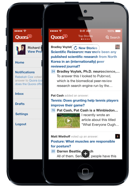
“We redesigned to focus on the content over the chrome — what the writer intends to convey and not the UI” says Quora‘s Marc Bodnick about the question-and-answer app’s makeover. The startup rebuilt Quora 3.0 for iPhone from the ground up in three months, and says it will be available for iPad and iPad mini by the end of the year.
 It’s not just the look that’s changing for many apps, but the feel. In iOS 6 and before, you’d often find yourself diving deeper and deeper through layers of navigation to get to a specific piece of content. To escape and access another part of the app, you’d have to click the back button over and over.
Now many apps are moving towards a swipe-based interface, where different app features exist on parallel screens you can horizontally flip through with a flick of the thumb. For example, on Quora you can now swipe between different feeds like Top Stories and Questions & Answers.
You can tell which pane you’re on and that there are others available thanks to a little title and set of dots at the top of the screen where the search box used to be. Instead, you’ll access that and everything that was previously housed in a row of navigation buttons at the bottom in a slide-out navigation drawer reminiscent of Facebook’s iOS app. Removing those buttons frees up more space for reading about whether it’s feasible to be Batman and other Q&A content. Other apps are taking the same navigation approach.
Quora 3.0 feels like thumbdancing — graceful rather than bumping into things in the dark. Definitely a more pleasurable browsing experience. I think we’ll find a lot of iOS 7 apps give off that vibe.
It won’t be all good, though. In the rush to update in time for the new operating system’s launch, some developers have gotten a bit heavy-handed with the flatness. With so little chrome, pieces of content can accidentally blend into each other. Less experienced mobile users like senior citizens might feel a bit lost without the skeumorphic cues to guide them towards what to tap or touch. If developers don’t put in clues, some people might miss buttons or those parallel hidden planes of apps because they didn’t know they were there.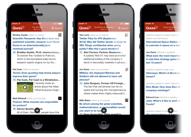
But many developers felt they had to be ready for the iOS 7 launch. Quora’s Bodnick tells me Quora didn’t have the benefit of being around in the early days of the App Store and has been playing catching up ever since. With iOS 7, though, he says “We’re going on the offense. We’re going to be among the first apps on iOS 7.”
Apparently a lot of developers had the same idea, which might negate any serious advantage being available day 1 will have. And that really underlines the next problem Apple needs to solve. Now it’s got a modernly-designed OS that supports beautiful apps, but how do you find those apps when there’s nearly a million of them in the store?
Well, here’s a look at some of the top apps that got an overhaul today, with before iOS 7 shots on the left and after iOS 7 shots on the right courtesy of developer portfolio site Tapfame:
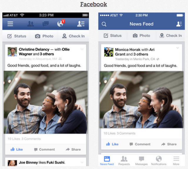
Facebook made its top navigation bar translucent to give more feed browsing context, redesigned some icons, and moved from a slide-out navigation drawer to quicker-to-access “tab bar”.
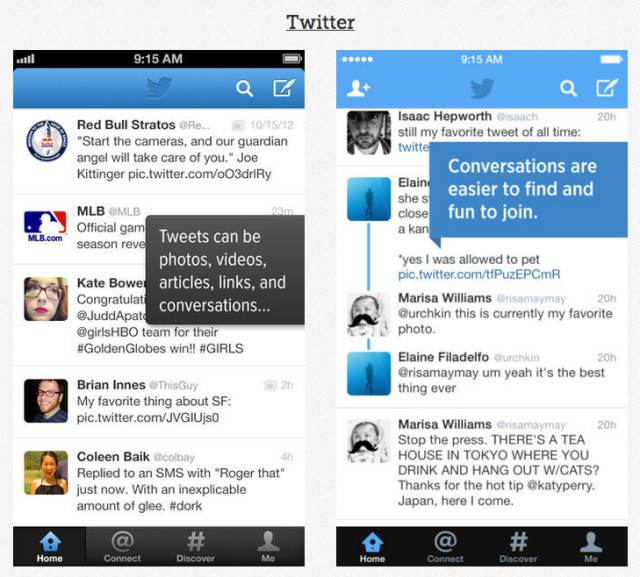
Twitter has brought its styling in-line with iOS 7’s, and made its buttons more like symbols drawn flat on its backgrounds instead of etched into the chrome.
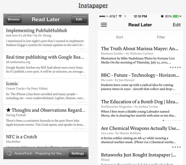
Instapaper, the read-it-later app, has scrubbed its title bar clear of texture, and eliminated much of the chrome so it just feels like a floating list of stories.
Venmo, the peer-to-peer payments app, has dropped its side bars and stripped down its buttons.

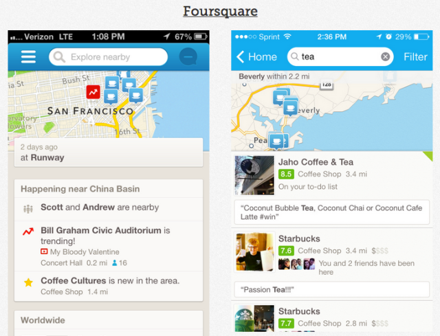
Foursquare has ditched its tan background to make room for larger content entries, a clear example of the content > chrome trend
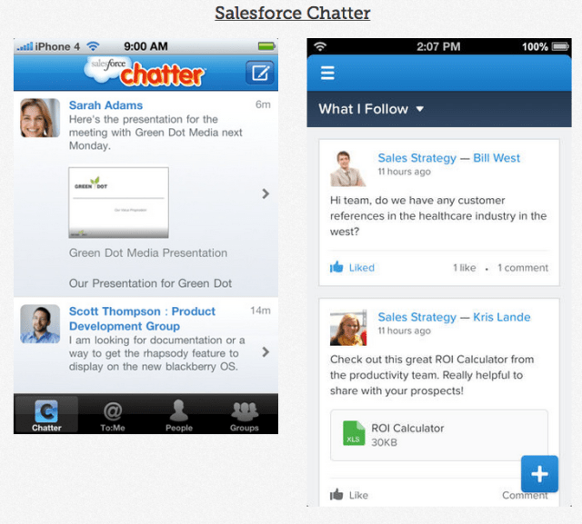
Salesforce Chatter, the enterprise communication app, has made space for its feed by switching from navigation buttons to a drawer, similar to Quora.
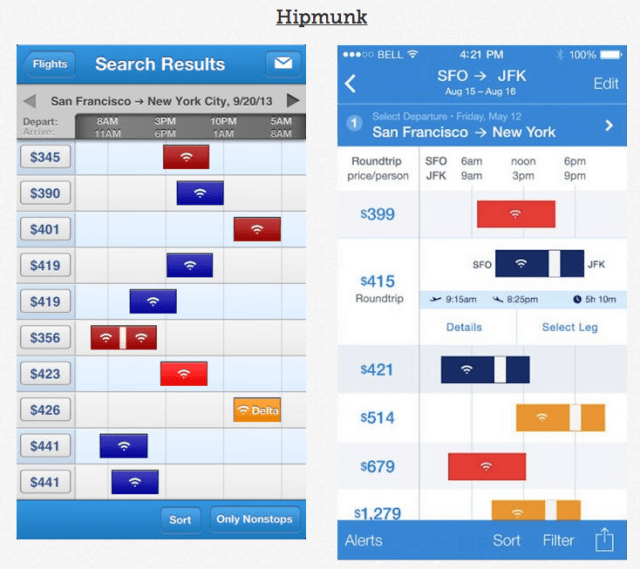
Hipmunk‘s flight search app has been completely flattened, removing the shading and depth from its navigation chrome to match iOS 7.
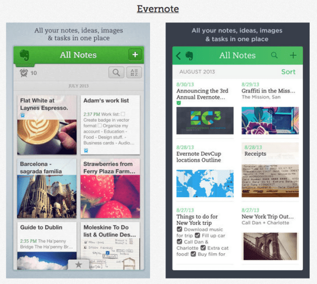
Evernote, the note-taking suite, has banished its background and moleskine-textured title bar for a very flat aesthetic.
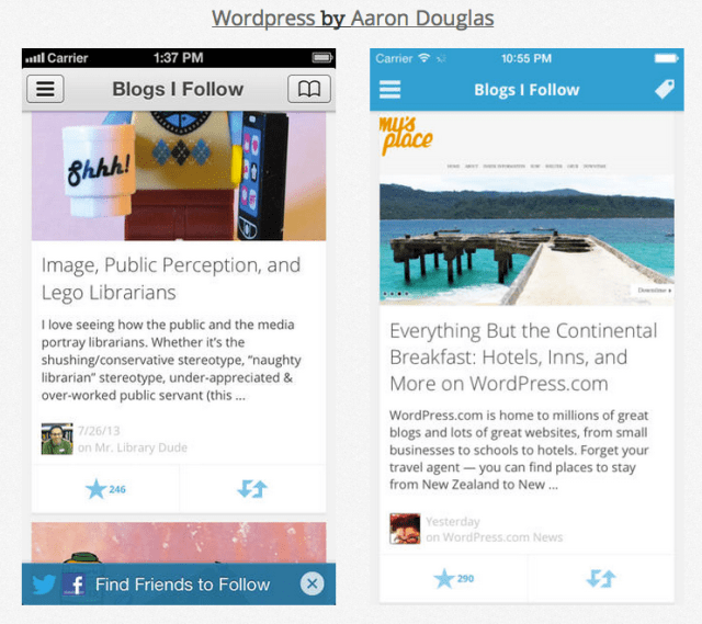
WordPress, the blogging platform, has squashed its layers together in contrast to its old elements that looked visibly stacked on top of each other.
We’ll be adding more examples of how iOS 7 has changed apps as the day goes on, and add your favorites (that you didn’t build) in the comments.