Given the challenges faced by Facebook Home, an Android homescreen replacement app which makes interacting with the social network easier for mobile users, it’s wise to be cautious about the chances for success of other, alternative “intelligent homescreen” apps. Apps like Andreessen Horowitz-backed Aviate, for example, which though still in alpha format was recently thrust into the limelight following a recommendation on Reddit.
Supposedly, a user happened upon the app’s alpha version which had been live on Google Play in the hopes of picking up a couple hundred early testers, and then shared that link in Reddit’s /r/Android section. Whether clever viral marketing or legitimate word-of-mouth (one can never be too sure), the company soon had to make the app invite-only, unable to scale the capacity the Reddit posting demanded.
For those unfamiliar, Aviate was created by an ex-Googler team at ThumbsUp Labs in Palo Alto, and closed on $1.8 million in seed funding last December. Its efforts involve a smart Android homescreen replacement, where apps are automatically categorized and shown to you based on your current context like home, going out, night, etc.
 At the time of the funding announcement, the company spoke only vaguely of the app’s capabilities, explaining that the overall goal was building a mobile interface that adapted to users, rather than offering a grid of apps.
It’s an idea whose time has surely come.
The Problem With An App Grid
Today’s app stores are operating at full capacity, even as the app store gold rush shows no signs of slowing down. At this year’s WWDC, for example, Apple announced there are now 900,000 iOS applications available for download, and Google’s Android marketplace, Google Play, isn’t too far behind with over 800,000 apps, according to analyst estimates in May.
No user would ever download every mobile application, of course – and, yes, a lot of them are spam. But even if a user downloaded a tiny fraction of the available offerings, under half a percent for example, you’re still talking about filling a phone with hundreds or thousands of applications. Today, there’s just no way to grow your app collection without dumping some of your lesser-used apps off your device.
This problem is a byproduct of the way our mobile interfaces have been designed. Smartphones today are inspired by Apple’s iOS, which presents row after row of app icons which you can stuff into folders to save space. Android, though having popularized the concept of homescreens and app trays, doesn’t deviate far from that original format, especially since users’ homescreens tend to still house a bunch of app icons.
Aviate, refreshingly, is quite different. The app does away with the app grid, which is a welcome change, but it also overtakes your entire phone’s interface in the process – like the way Facebook Home does. This is not as welcome.
Since the app is still in early testing, it’s unfair to do a formal review. But so far at least, color me intrigued.
Aviate Rethinks The Interface
After installation, Aviate basically works like any Android launcher – you have to set it as the default (hit “Always” when prompted), in order to have it respond when you tap your phone’s “Home” button. The launcher is more limited than typical homescreen replacements in terms of being able to add and resize widgets and move them around between various screens. Instead, widgets are placed above a row of favorite apps (Gmail, Phone, SMS, e.g.) and below a built-in date/time/weather drop-down.
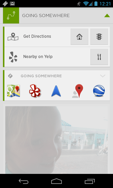
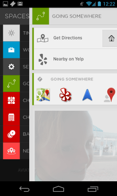
 What’s more interesting however, is the concept of “Spaces” which Aviate introduces. Swiping to the side reveals a list that lets you move between contexts like “Work,” “Nearby Places,” “Going Somewhere” and “Settings,” as well as the default space which is based on the time of day. As you move between these spaces, your screen updates to display a different collection of applications and other built-in widgets, like a Calendar in work or Directions widget for “Going Somewhere.”
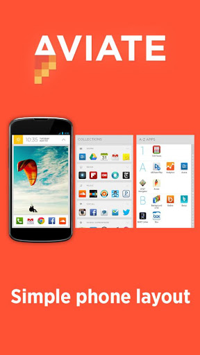
You can also swipe to the left from any customized homescreen to find more app collections – automatically organized groupings based on apps’ functions and features, like “Social,” “News,” “Music,” “Games,” “Morning Routine,” “Grocery Shopping,” “Home” and more. And if you don’t have enough apps for one of these categories, you just tap the “new” button for an app recommendation.
Another swipe takes you to an A-Z list of applications, which you can scroll through like an address book.
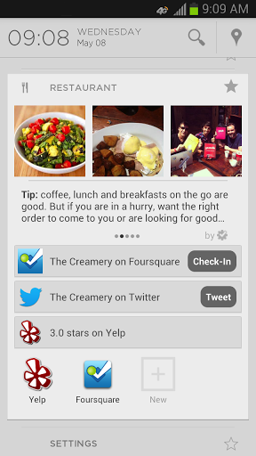
 What’s interesting about Aviate is that it doesn’t just redecorate your homescreen, it actually updates as you change what you’re doing. For example, when you wake up, you’ll have one display with meetings and weather info, but when you’re out driving, you’ll have another with traffic and directions.
The problem it has, though, like Facebook Home does, is that it takes over your smartphone’s interface entirely. I’d prefer being able to access Aviate as an add-on to Google Now, perhaps, or through a special gesture from my “normal” homescreen. It’s disconcerting to have to give up the personalization efforts I’ve already made in order to have the benefits of its contextual intelligence.
That being said, there’s a grain of an idea here that’s truly radical, if deceptively simple in its execution: that our mobile devices need to organize themselves around us and our lives, instead of the other way around. After spending more than a few hours with a phone that seems to have an intelligence of its own, it’s obvious just how dumb our smartphones today really are, and how much further they can still go.
Aviate co-founder Mark Daiss says the team is now working on improving the performance, refining the UI and UX, and squashing bugs, as well as building out more Spaces while improving the content in those that already exist.
The invite system is live in the app now, but the company does not plan on releasing more for at least a week or two, if then. Stay tuned.
