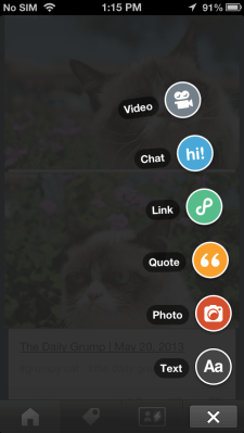
Tumblr is still shipping. Despite all the noise surrounding the Yahoo-Tumblr acquisition, the company has just pushed out an update to its iOS application introducing a new user interface that now includes the almost Path-like post chooser, previously introduced in the Android version.
This interface design is becoming more common today, but it’s most reminiscent of things like Mac’s Fan Stack feature, for example, or social network Path, which popularized the concept on mobile devices. For those unfamiliar, the post chooser is the button you tap to add content to your Tumblr blog, including text, photos, video, quotes, links and more.
Now, instead of having a compose button at the bottom right of the screen that launches a page of these options as a starting point for your post, in the updated version of Tumblr’s iOS app, the compose button will fan out the choices overlaid on your current window as small, round tappable buttons.
The revamped interface is the most notable change in today’s update, though Tumblr for iOS now also allows for app attribution in posts, according to its description in iTunes.
The iOS version of Tumblr’s application was updated just last month, at that time forgoing the then Android-only interface, in favor of a feature that actually made Tumblr’s infamous animated GIFs animate when you scrolled down. (At last!). That release also introduced more social sharing options to sites like Twitter, Facebook, Instapaper and Pocket, and more, as well as additional gestures.
The updated version of Tumblr for iOS is now live here in iTunes.
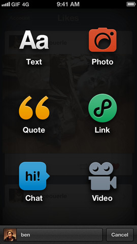
In case you don’t remember how the iOS app looked before, here’s an earlier version showing the old post screen:
(h/t parislemon)