Google took the lid off of its new version of Maps at I/O 2013 today, which is a dramatic redesign of the long-standing navigation and place-finding software across all platforms. We got a chance to go hands-on with the new Maps, which is still a beta product, with access only given out to a few select users so far. In the video above, you check it out in action as a Google rep gives us a walkthrough.
The new Google Maps takes a bunch of stuff that Google has been working on from Knowledge Graph to make, as it put it during the keynote, billions of apps for billions of people. That means you get a lot more personalization pulled into the experience, surfacing local landamrks that are likely important to you, as well as one-click directions from stored locations like your home address. Places frequented by your friends and acquaintances will also be pulled in to complete the picture.
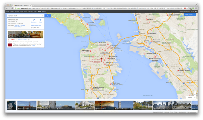
The whole experience on a Chromebook Pixel was fast, responsive and remarkably intuitive. All the new touch controls seem perfectly designed for use with the Pixel’s touchscreen display, and reduce dramatically the number of steps required to do things like call up directions. The in-building panoramas and 360-degree images are very impressive, and truly do give you a sense of both the inside and outside of a location, but don’t expect the images to be all that comprehensive for most locations at launch.
Overall this looks like an awesome improvement to the Maps experience, and it’s hard to see any spots where the progress isn’t a good thing. But it’s very different, so expect some pushback when Google does eventually push this live to a wider audience.