Do you enjoy checking email? Probably not, since the word “checking” is something that sounds like work. Whenever you have to continually go back to a place to see if anything new is there, it starts taking a toll on you. Checking things is boring.
I spent some time at Facebook last week to learn more about the changes that the company is rolling out for News Feed across all platforms. Some of the things that the social network made clear during its announcement was that all of its changes would now be taking cues from the experience users are having on mobile devices. That very specific design, with so little real-estate, makes designers focus on specific aspects that will cause people to engage more, rather than scroll through the feed endlessly out of sheer boredom.
I sat down with Facebook’s mobile News Feed project manager, Michael Reckhow, who has only been with the company for the past six months. I remarked to him that he joined the company at the right time, to which he agreed. His previous experience came from working at Amazon on the Kindle apps team, so he knows exactly where mobile is headed and how much it is taking over everyone’s time as their main computing experience.
Reckhow tells me that desktop users complained heavily about the News Feed experience being “cluttered,” and this probably has something to do with the fact that most of these people are using Facebook’s mobile apps most of the time. When you headed to Facebook on the desktop, it was a huge contrast in experience and turned quite a few people away.
One of the phenomenons I’ve been tracking over the past few years is that there seems to be a certain point where social networking apps and communities become a chore to participate in. I”ve found that many people mention having to “check” Facebook, much in the way that they’d “check” email. That change in mindset shows that Facebook has gotten away from highlighting content to simply aggregating it in one place, much like an inbox.
When you have over a billion users it’s very difficult to make sweeping changes without irking a huge chunk of core users, but this is what Facebook is faced with every time it wants to better its nearly ten year old product. Why is mobile leading the way when it comes to making these changes? Reckhow explained it in a way that I hadn’t heard it explained before:
The best design is happening in mobile phones. On mobile phones you’re constrained and constraints make good design. It makes you think about what’s good to put on the screen and what needs to be left off.
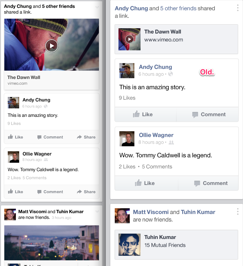
Addition by subtraction is clearly where Facebook is going. In previous versions of its mobile app, the company wanted to jam as much as it could onto your News Feed and make everything load as quickly as possible. Speed is still important, but it seems that showing as much content as possible, in a way that’s not engaging, was causing a bit of exhaustion in its user base. Take a look at this before and after, the before being on the right hand side:
By throwing in visual queues to grab your attention, Facebook appears to be slowing down the mindless scrolling that most users are doing right now. Instead of “checking” your News Feed, Facebook wants you to stop and participate. When I watch people use Facebook now, it appears that they’d see a small image and take note of where it was taken and who took it and then move on. Sure, maybe they’ll “Like” it as a way of letting the person know that they saw it, but rarely do they open the image or drop a comment in. These recent design changes should help change that.
To make sure that Facebook is headed in the right direction, Reckhow tells me that that the company is taking its slow rollout seriously, doing quite a bit of user testing along the way. It is possible that the designs that were announced a few weeks ago might not be the end result that the entire community gets to use, and Facebook is OK with that.
One example of a feature that clearly wasn’t having the impact that the company had hoped was the Ticker. This is the little box that infinitely scrolls all of the activity happening in your circle of friends. Since this isn’t a feature that could be fit into a mobile experience, it never really picked up on the desktop. With this new design, the Ticker is nearly impossible to find when you’re sitting at your computer. It’s just another example of how much of a mobile company Facebook has become, not because it wanted to, but because it had to.
As we discussed the need for personalization on Facebook, Reckhow told me why mobile is the perfect place to take design queues from:
The personal nature of your phone is obvious, it’s with you at all times. Because of this, the things your friends are sharing are with you at all times. We see that people on mobile are so active, they use it every day and that means they’re going to build a deep relationship with the product and identify Facebook with mobile. It’s available everywhere, and it’s a great thing to play with when you’re in a line at a store. Now you can spend more time on mobile with multiple choices of feeds. You can go deeper.
Going “deeper” means slowing your roll when it comes to scrolling and “checking” and taking a few moments to actually see what your friends are up to. It’s a mindset that Facebook sorely needs its users to change. If Facebook users are in a mode of endless scroll and passive interaction, how will a Facebook ad ever perform in a way that will cause brands to buy again?
By making News Feed items more robust, letting you see a full video preview or joining an event from a story, Facebook is trying to get its users to spend quality time on the site, not just time. Reckhow explained:
One of the interesting parts of doing this project is that we have so many stories and links and friend stories, and News Feed is a very complex thing and we tried to design it in a way that honors each type of content. We went through all of the different stories and Chris Cox would say “how would we handle this type of story”. We didn’t know. This let us go back to the drawing board and look at things differently.
Additionally, by being able to take a look at different cuts of information, like photos, all friends and music, you’ll be able to drill down to the information that interests you at any given time, rather than having to scroll to find a photo hidden amongst a bunch of random status updates.
The company says that it wants its users to rely on the service to not miss anything, which their current product isn’t conducive to. By showing you everything, in an algorithmic-only way, you are pretty much set up to miss everything. The fact that Facebook recognized this, and went ahead to fix it, is a good thing. It’s interesting that mobile is teaching designers and engineers how to capture people’s attention on any device.
If you ever find yourself “checking” a social service again, it’s probably a sign that the company is doing something wrong. You should be engaging, learning, enjoying and connecting. When you get your hands on the updated Facebook News Feed, take note of whether you’re actually getting something out of it, or if you feel like it’s taking something out of you.
Consume less, engage more.
[Photo credit: Flickr]