A new report from German researchers reveals the five main ways people are organizing the applications on their smartphones. Despite the somewhat esoteric focus of a study like this, the resulting analysis has a broader impact on our digital lives. The content found in mobile app stores is growing at an exponential rate. There are over 800,000 iOS applications, just under that on Android, and app downloads are nearing the point where they’re double that of songs. Songs!
And yet, even though we’re heading into a world where we’ll soon have over a million applications at our fingertips, the methods for discovering applications, downloading them to our devices, and managing them once there, are holdovers from the desktop era. The desktop era which, mind you, is now over. According to the latest numbers from the major analyst firms tracking PC market share, if you start counting tablets as computers – as some are – then the desktop days are done. For now, Apple is winning that battle, and has been crowned the leading “PC” maker if you want to call an iPad a personal computer. This is what “post-PC” looks like.
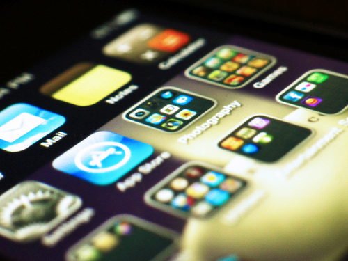
Smartphones are PCs, too – they’re just little ones. That makes managing the applications that grace our homescreens and app trays even more important. We don’t have the room to spread out anymore. We can’t fit as many apps on a screen. We have to make sense of diverse collections, where unrelated items – maps and games and social tools and communicators – lie side-by-side.
Because I find this shift to mobile interesting – and because I have now accidentally downloaded over 600 mobile applications (yes, many of which are for “testing” purposes) – I’m fascinated by this new research which surfaces the many ways in which users are arranging the apps on their smartphones.
The researchers, Mattias Böhmer and Antonio Krüger from the German Research Center for Artificial Intelligence, will present their findings at the ACM SIGCHI Conference on Human Factors in Computing Systems, in May 2013 in Paris. The two analyzed over 1,400 screens from over 130 users, both on iPhone and Android devices, and asked the study’s participants to answer a range of questions related to their behavior.
From the data collected, the team found that there were five high-level concepts which people have adopted for organizing the apps on their phones. And they are:
- Usage-based icon arrangement: This group organizes app icons based on the frequency of the app’s use.
- Relatedness-based icon arrangement: This group (which I find myself in, incidentally) organizes apps into cluster based on functionality. If you have a screen of photo apps, for example, this would be you.
- Usability-based icon arrangement: Some people organize their apps so they can reach the ones they need most often with their thumb, without having to swipe too much or accidentally click on other icons.
- Aesthetic-based icon arrangement: These people organize icons in ways that are pleasing to them. For example, they might keep their first screen sparse in order to see the background image of their girlfriend, or they organize icons by color or patterns.
- External concepts for icon arrangement: Others report using systems imposed on them by external forces. For instance, their icons are arranged by order of download, or they keep the icons in the default arrangement pattern suggested by the hardware maker. One user organized his icons alphabetically.
All five concepts are not mutually exclusive, of course, as the below chart indicates.
![]()
But you can see that the most popular way to organize involves usage and relatedness. A common overlap involves three conceptual areas – the most frequently used apps on the first screen, folders of related apps on the following screens, and rarely used apps on the last.
For app publishers, this kind of data matters because it speaks to the chances of an app being opened and used after download – or in developer-speak, repeat usage and engagement. Some users told the researchers that they reserved the last page of their app screens for “silly apps,” or those they might use “some day.” They also shoved any of their apps that didn’t readily fit into their preferred organizational system to the last screen, too.
One referred to this section as the “land of misfit apps.” Raise your hand if you have a screen like this. Many of us do.
That’s important to note because it could mean that truly unique apps could end up hidden away and forgotten simply because they don’t fit in the structures we have in our minds about how our apps should be organized. From personal experience, I know that being included in a regularly used folder means there’s a higher chance I’ll open that app again (e.g. “photo edits”)
The study also examines some iPhone-specific results, finding that those who organized apps by usage tended to have more apps on their phone’s first screen than others. Meanwhile, those who organized by relatedness were more likely to have folders on their first page. These people also arranged their apps more often. Those who used external concepts were less likely to use folders at all. Folders were generally used to group related apps, or they were used to group apps that share a similar workflow – like shopping apps and payment apps, or photo editing apps with camera apps.
In terms of Android-specific findings, the data was more limited. That’s probably because, to some extent, Android’s operating system design is less about organizing pages of apps, and more about building functional interfaces – some of which include live data in the form of widgets, like weather, stocks, social updates, news, and more. The report did look into the placement of apps versus widgets, however, and found that Android users tend to keep widgets at the top of their screen and icons below, likely for ease-of-access.
What this research tells app designers and developers, is that it’s important to know what kinds of other apps are placed around your app, because it can speak to your users’ needs. For example, if users have put your photo editing app next to Instagram or Facebook, maybe you should add “share with…” functionality to your app. (This is a basic example, of course – most photo-editing apps have sharing built-in.)
This sort of research applies more to apps that are not games, it seems, as those tend to follow different usage patterns. More often than not, games are seen as disposable apps by their users.
Today’s app makers already study engagement metrics for their own apps, and look to maximize repeat usage through push notifications and other reminders. But by learning more about how their apps live on users’ homescreens, what sort of context surrounds them, and where they fit into a user’s workflow, they could increase engagement by becoming a part of more established routines.