The No. 1 thing about the Internet that fascinates me is the fact that information can travel at the speed of light. One moment, something can happen in one part of the world, and seconds later, someone on the opposite side of the world can know about it. That is absolutely epic in my opinion. Be it a video, link or tweet, things travel quickly, but we rarely see how they travel.
We know the “why,” but it’s the how that is the really important part. Any sub-genius can figure out why a video of a cat falling off of a TV can go viral, but how did it get to that point? Who shared it first? Where did it travel to next? This is something Google has been exploring with the “Ripple” part of its social layer, Google+.
When you’re on Google+, desktop or mobile, there’s a section called “Explore” where all of the popular content sits. Either it has a lot of comments or plenty of +1’s, or a mix of both, thus making it “popular.” It’s the area of the destination site that I spend most of my time on, because, well, it’s a time-saver and doesn’t require me to parse through tons of noise. The feature has grown a bit since its launch, but it’s something that doesn’t get used enough, based on feedback that I get from friends and family that use it.
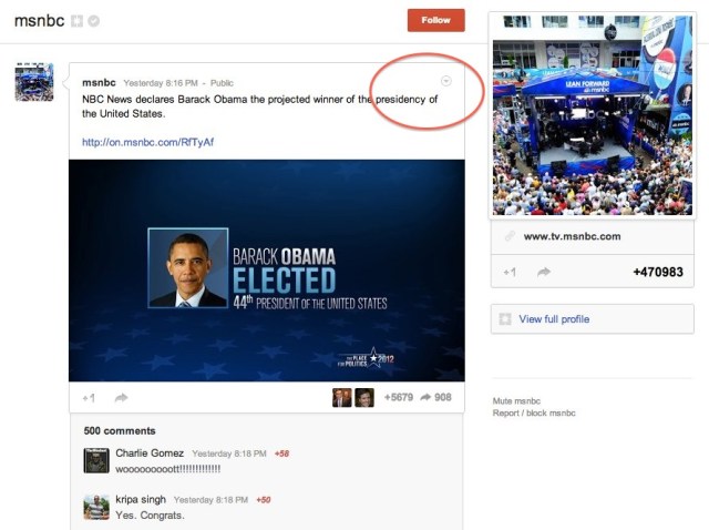
The nice part about this popular content is that you can see how it got popular by using the Google+ “Ripple” feature:
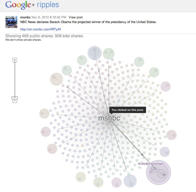
Once you dive into the Ripple for a post, you can see where it originated from and the flow of shares and comments that propelled it to Explore. It’s quite fascinating when you think about it, because how often can you actually look at the trajectory of a popular piece of content? In this case, it was the announcement of Barack Obama’s Presidential victory…a big deal, right?
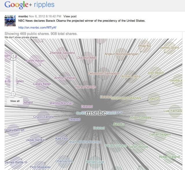
Here’s a deeper look:
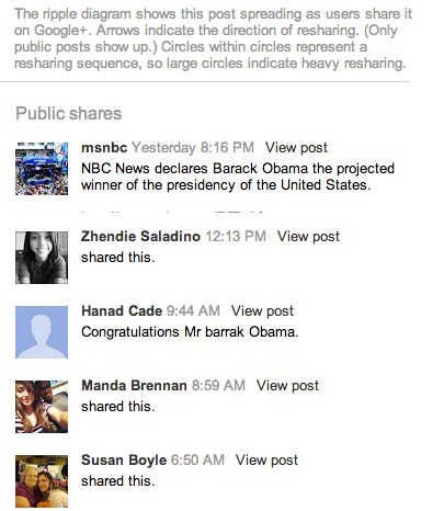
You’ll see the familiar “zoom” bar on the left-hand side that accompanies most of Google’s products, namely Maps. Ripples are completely interactive, in that you can click on any part of the spiraling-out process to see the interesting comments on each leg of its journey within Google+:
So there you have it. The next time you see any piece of content on Google+ and wonder how it got to you, jump into its Ripple and take a look. For marketers and brands, this is great, because you can see who the most influential sharers are, as their bubble is bigger on the Ripple. Since everything is clickable and interactive, you can literally spend hours playing around with this.
You can also play it back and watch how quickly it spread…or didn’t:
Explore and Ripples work hand-in-hand, and it’s always important to learn the “how” and not spend so much time on the “why.”
The feature has been around for a while, but I wanted to share the example with the Obama news, because it’s pretty damn cool. What’s not cool? Google+ comments only go up to 500 per post. Not sure who came up with that one, but please fix it, Google.
[Photo credit: Flickr]


