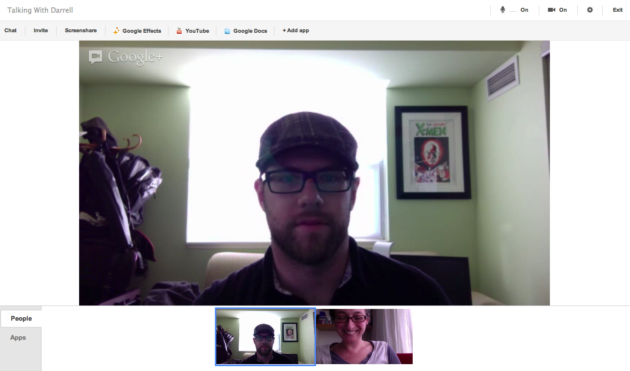
Google has been sprucing up its Hangouts video calling service with an updated API for features like private messages, and the ability to block people and change a Hangout from private to public. A video celebrating Hangouts gives us a glimpse of even more changes that could be coming up ahead. Specifically, a vertical, icon-based menu bar in the left column; and the removal of the menu bar at the top of the screen — simplifying moves that could point to a more touchscreen-friendly version of Hangouts in the future.
The features came up in two quick takes during a minute-long video that Google posted to YouTube on September 20, which is embedded below. Most of the Hangout examples that flash past you look like Hangout does today. Then at 0:23 and then again at 0:48 we see a version with these changes:


We have been through a few Hangouts now amongst ourselves, and I’ve checked with another person trying out the service both on his Mac and then on his new Nexus tablet — and in all of those cases, none of us could replicate the vertical menu bar or the removal of the menu at the top of the main chatting screen.
Here’s what I and the others see right now:

As you can see, the screenshots from the YouTube video have no menu bar at the top, and no icons down the left side. The  vertical icons themselves seem to be visual representations of some of the menu items — for example, a person with a + for “invite”; the speech clouds for “chat”; the screen with an arrow for “screenshare”. It’s not clear what the icon with the timing clock could mean, or where Effects have gone (which let you add hats and other images on to Hangout participants as well as sounds). The + might be for adding more apps, such as YouTube, to further extend the experience. There is also a little arrow in the upper left-hand corner, perhaps pointing to a way to toggle between one view and another — another possible first for the service.
An existing Google Hangout has a Google+ logo straight on the video, while the YT video versions has the logo off the main screen and in the header.
There are a couple of advantages to bigger, icon-based buttons down the left side of the screen. It puts the extra features more closely in view of the hangout user, and the big buttons could make it easier to access the features on a touchscreen device.
You can see where an easier, touchscreen-friendly navigation bar of single icons might come in handy with Hangouts — say if you’re a mechanic with car part in your hands and you are talking with other mechanic friends in a Hangout about it, as in the screenshot above.
It could also point to Google looking to better unify the interface between the mobile and desktop versions of Hangouts. Currently on tablets like Google’s Nexus and the iPad, the default is a full screen with no options for apps, effects or other features.
Update: There are clues to other possible changes ahead — also in the name of more unified services. As commenter Grego Holic points out below the chat window in Gmail behind the hangout window is also on the right side. This is where it has been in Google+ since a big redesign in April. And there are other areas where we might see some more changes: more blue favicons. [Original post continues.]
What we have yet to see is any space for advertising appearing, although creating a border on the left with the new icons could be the first step in shifting the whole video screen to make some space for ads on the right side, the way you get on Gmail.
We’ve asked Google about the UI tweaks, and a spokesperson said: “We’re constantly experimenting with new UIs and making tweaks to make the user experience better. We haven’t announced any changes to the current Hangouts UI but I will let you know as soon as we officially launch anything.”
