Some people love Microsoft’s new logo. Some people hate it. However, most agree it looks like a mashup of Google and Apple’s design elements.
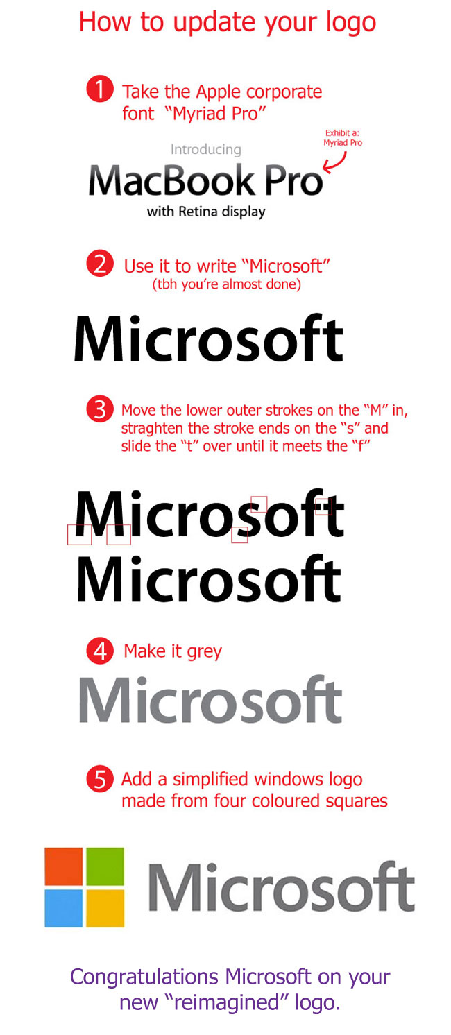
The symbol next to the name looks straight out of Google’s design portfolio. Then, as shown more precisely after the jump, the Segoe font looks very similar to Adobe’s Myriad Pro, most famously used throughout Apple products. It’s hard to argue that Microsoft didn’t look to the other brands for at least a little inspiration.
Brands always face backlash when rebranding. We did. As explained by Amit Vit in a TCTV interview with our Colleen Taylor yesterday, the logo is simply “meh”. It’s not offensive in any way, but not that inspiring either. It recalls previous Microsoft product logos, like ones used for Windows Phone or Microsoft Stores, but also looks very similar to Apple’s as shown by the chart below, made by Andrew Watson, a self-professed Google and Apple fanboi. His clever and simple chart shows the stark similarities between the two brands’ typeface.

