Bing today begins the rollout of a major redesign that separates search results into three panes: pure, algorithmic, text-focused results in the center; context like maps, reviews, and actionable input fields to the right; and social assistance like friends and experts who can help on the far right. The redesign is Bing’s answer to “Search Overload” — the exhausted feeling people get from today’s search results pages that have become a cluttered mess of links, tools, social, maps, and actions.
Microsoft is looking to take advantage of public discontent with Google recent missteps in design and social. Bing aims to frame Google as impure, with its desire to highlight Google+ distorting the quality of search result ranking. If it works it could claw market share away from Google and make search a real two-horse race. The rollout will reach the U.S. over the next few weeks, then the world, but you can sign up here for early access to the new Bing (and unfortunately its newsletter too).
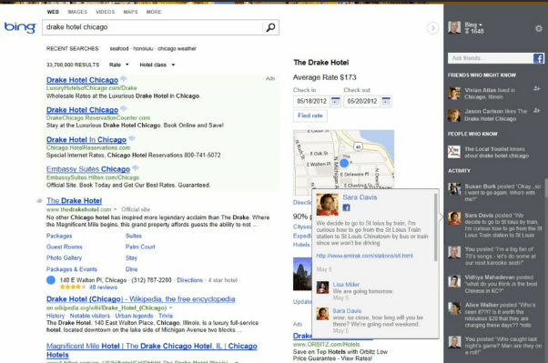
The redesign builds on some tweaks Bing made last week to clean up its search results page. The cleared left sidebar is still present here to lend a calmer, more minimal feel, and offset the denser new right sidebar.

The “Snapshot” section in between results and social does a great job of showing maps, product reviews, restaurant ratings, the ability to make reservations or book flights. This stuff can be very distracting when jammed at the top of the main results the way Google does. Bing is working with restaurant reservation company Open Table and ticket provider FanSnap to help you “get it done faster”.
Beyond the redesign, Bing’s added a lot of new social functionality without making it too obtrusive. That’s crucial because the company’s research says 90% of people consult friends or an expert before making a decision, and Bing aims to be a “decision engine”.
Bing’s Instant Personalization partnership with Facebook means you can see if friends have Liked search results. But instead of those Likes altering search result ranking and cluttering the main pane with names and faces, you’ll just see a little gray thumbs up beside the pure, algorithmic results. You can hover over the icon to see who Liked it.
 In the right sidebar there’s a new “Ask Friends” field, where you can request help sorting through search results. You just put in your question and submit, and Bing will post that and a link to your current search to Facebook. You’ll be notified if a friend point out which of those hotels your search surfaced is their favorite, and see their recommendations in the activity section at the bottom of the right sidebar.
Below Ask Friends you’ll see Friends Who Might Know, which displays Facebook friends who’ve Liked one of your search results who you might want to talk to about your search. With a click on one of those friends you can mention them in a Facebook post asking for their help. There’s also People Who Know, which shows experts in the topic you’re searching about. Hovering on them loads Facebook, Google+, and Twitter updates about the topic.
Bing has even considered an even deeper Facebook integration called “broadcast mode” which you could enable to automatically share all your searches with your Facebook friends. However, realizing this might be going to far, Bing left this out of today’s redesign as it continues privately testing it to see people’s reactions.
I think this redesign is going to be a huge win for Bing. By researching what users want and giving it to them in a way its competitors don’t, Microsoft could narrow the gap between Bing and Google. Getting users to give it a second chance is going to require a massive marketing push, which Bing tells me it’s prepared to do. Now we’ll see how open-minded people really are.