 As you’re aware, I tend to take Apple’s side on almost all matters iPhone versus Android. Having tried over a dozen Android devices ranging from the G1 to the Nexus S, I simply still prefer iOS. And it’s not really close. But there is one argument I absolutely cannot make on Apple’s side: the notification system. On Android devices, it’s good. On the iPhone, it’s awful.
It’s not like I’m saying anything sacrilegious here. Everyone knows it sucks. And that undoubtedly includes Apple, as they have made moves in the past year indicating as such. Moves like hiring Rich Dellinger, the guy who designed the great notification system for Palm’s webOS. And they have been sniffing around some of the Push Notification apps in recent months as possible acquisition targets. But today we bring them all they really need: the idea for how it should work. Please Apple — please — copy this system.
Now, mock-ups of how the notification system should work on iOS are nothing new. But the system Shawn Hickman has mocked up on his site today looks damn near perfect given how I use the iPhone. Gone are the lame, text-message like Push Notification pop-ups. They’re replaced by a new notification bar that appears at the bottom of the screen when a new notification comes in.
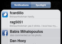
Okay, you might think: the last thing the iPhone needs is a #dickbar. But it’s much more than that — and it actually contains useful information, unlike the #dickbar. While bottom notification alert gives the latest notification coming in, the real key is the new left-most screen, where all of the recent notifications are held for you to go through. Yes, Hickman’s idea is to replace the Spotlight Search area with in iOS this new Notifications area. “Spotlight is a cool feature that I rarely use. That space can be used much more effectively,” Hickman writes. I totally agree.
 And actually, he doesn’t kill off Spotlight, he just makes it a secondary option on the same screen. And he even has come up with a nifty way of highlighting when you have a new notification without the slide-up notification: a red dot indicator in the tiny dot area above the dock on iOS to let you know where you are in the navigation.
On this new Notifications screen, you’ll see all your messages sorted by app (see: screenshot). It’s brilliant. It’s like the excellent Boxcar app, but more organized and with a more native iOS look and feel.
Why put the slide-up notifications at the bottom, rather than the top like on Android? Two reasons: “The bottom of the screen is the best place to have a notification come up. It’s non-intrusive and doesn’t interrupt what I’m doing.” And: “Pulling a notifications tray from the top of the screen is not the easiest thing to do, unless you have large hands. Managing one on the bottom of the screen is super easy, regardless of hand size.”
I completely agree with that as well. While Android’s notification system is good, it’s far from perfect. Being at the top of the screen does make it tricky to get to at times.
That said, I’m not sure Hickman’s system wouldn’t be even a little bit better if it pushed the apps up rather than overlaid on the dock (such a #dickbar thing to do). Currently, iOS services like Personal Hotspot have the bar that pushes apps down in a similar manner, only from the top.
Hickman says he didn’t want to add another icon to the menu bar as it’s already too crowded. And presumably, another stand-alone app would work, but again, that would just be Boxcar — Apple’s system should feel more natively built in.
Boxcar is perhaps now my most-used app on the iPhone and iPad. I’m constantly checking it to get my updates. Apple badly needs to fix their system. And this is the most straightforward and simple implementation of how it could work that I’ve seen yet. Please Apple, copy it.