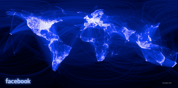
Facebook engineering intern Paul Butler has created the stunning map of international human relationships above, using a ten million friend pair sample size from Facebook social graph data. His methodology?
“I defined weights for each pair of cities as a function of the Euclidean distance between them and the number of friends between them. Then I plotted lines between the pairs by weight, so that pairs of cities with the most friendships between them were drawn on top of the others. I used a color ramp from black to blue to white, with each line’s color depending on its weight. I also transformed some of the lines to wrap around the image, rather than spanning more than halfway around the world.”
Hey Google HR people, Paul Butler. That’s P-A-U-L-B-U-T-L-E-R. Touch base with him on Facebook and/or on LinkedIn here. You’re welcome.