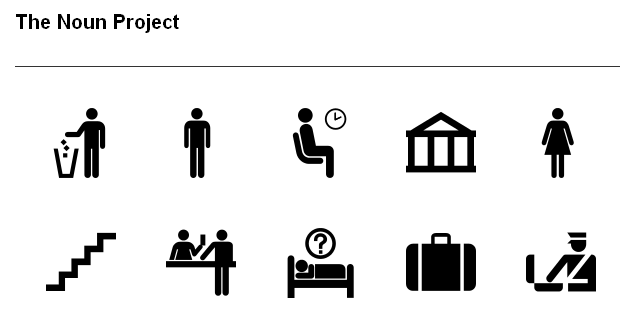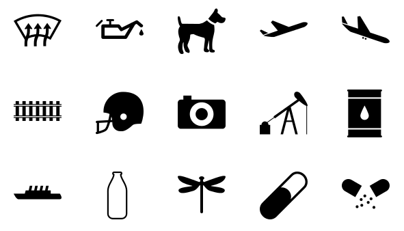
While I doubt that the Noun Project, an effort to make a free library of icons representing every common concept out there, will have a profound impact on your everyday life, it’s a useful service they’re volunteering to undertake, and I think it deserves some attention.
The idea is simple: make a freely accessible library of clear, simple graphics that represent everything from emergency rooms and medications to different kinds of cocktails or entrees.
One could argue that something like Google image search has made obsolete this kind of effort, but I think there’s a place for it. The world is shrinking day by day, and a comprehensive set of symbols like this may grow to be invaluable when providing localized text isn’t feasible, as in internationally-distributed packaging, or a single-domain service that can’t or won’t track their user’s location. What will be the international symbol for URL shortener? Social network? Gluten-free? Apple Store?
They borrow liberally from established icon sets and public domain symbols, of course: there’s no need to create a new, more graphic “biohazard” symbol, or try to improve on the “walking guy with arrow” we see in every airport. But there are plenty of things left un-iconified, or if they have been reduced to glyph form, they’re not all easily accessible at a central location.

Whether for signage or UI, a collection like this could be handy. I’ll be interested to see how some cultural differences affect the intelligibility of some of these things. Concepts that have serious local variations (such as writing up-down and right-left instead of left-right) or where laws and customs differ (left-hand drive, “V” gesture) will require specialized symbols. And there will have to be some specifying where extant symbols (like that for sync), lacking context, could be taken for something else (recycling, maybe). It’s more than just collecting icons, clearly.
I’ve seen design projects like this one come and go, though that doesn’t affect my hopes that maybe this one will be the one everybody uses (besides governments and airports, which likely have their own). I’m guessing it’ll be free forever, as the idea of licensing these graphics, many of which are already in use, seems dubious. They do have a Kickstarter page (where they’ve already reached their goal, I should say) to help pay for the costs of hosting and design, so feel free to drop a buck or two in the jar.
Their site appears to be getting hammered at the moment, but there isn’t much to it that isn’t in the screenshots above (though the background color adjuster is cool). Looks like they have around 500 icons at the moment, but there are lots of duplicates (how many anchors is too many?), and some which are frankly puzzling. Looks like a little curation is in order.
[via NotCot]